Project Details
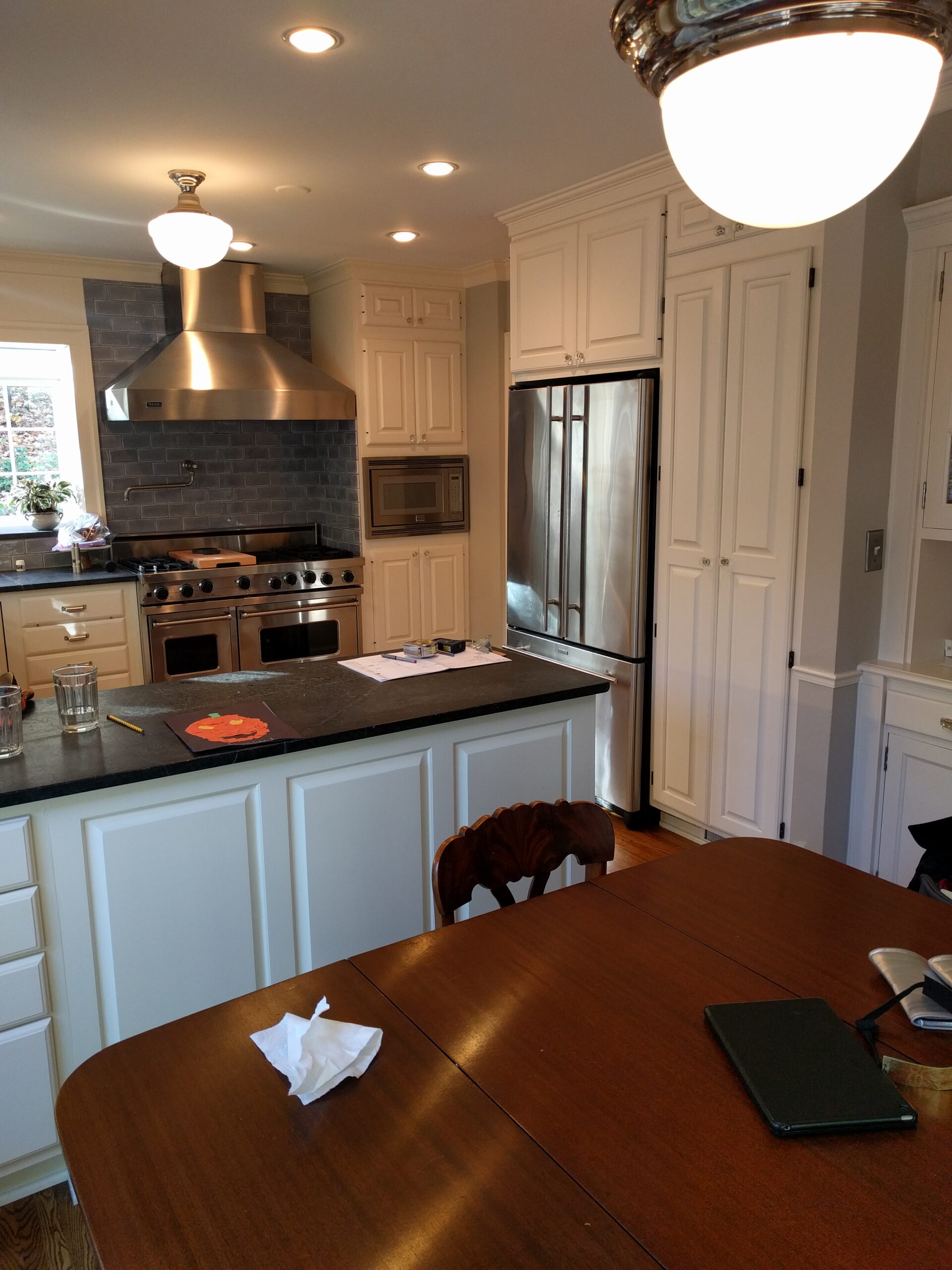
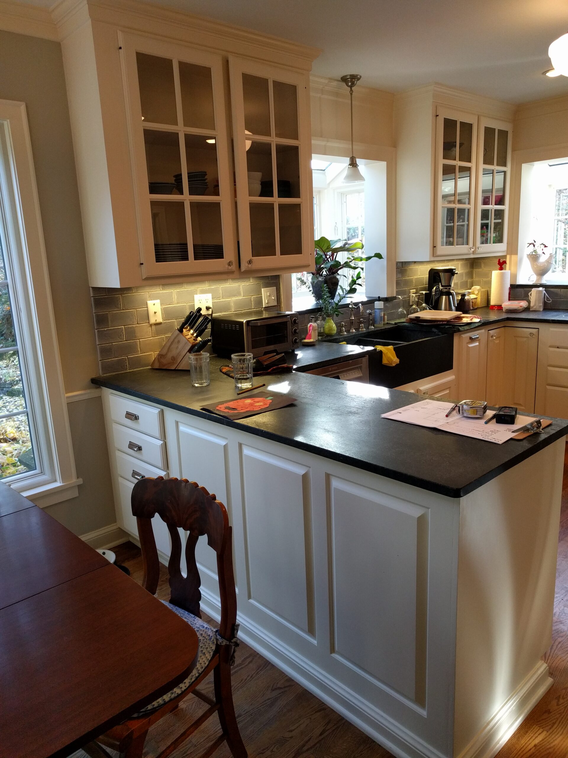
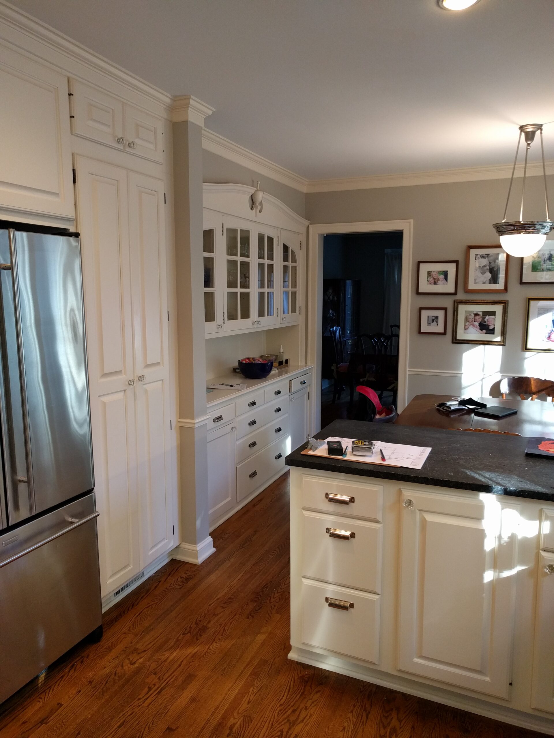
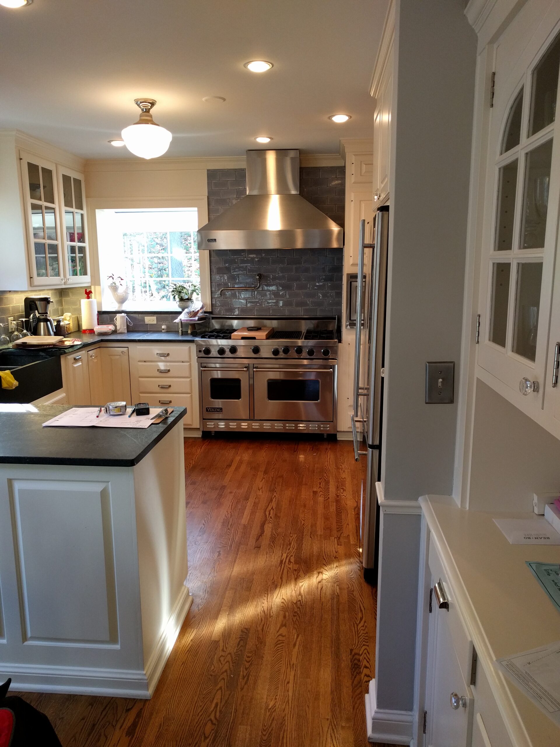
These homeowners loved their neighborhood and 1939 colonial home. It had an expansive living room and generous dining room, but the kitchen was too small for their young, active family. They wanted to create a space for their children to play and where the family could gather together for activities.
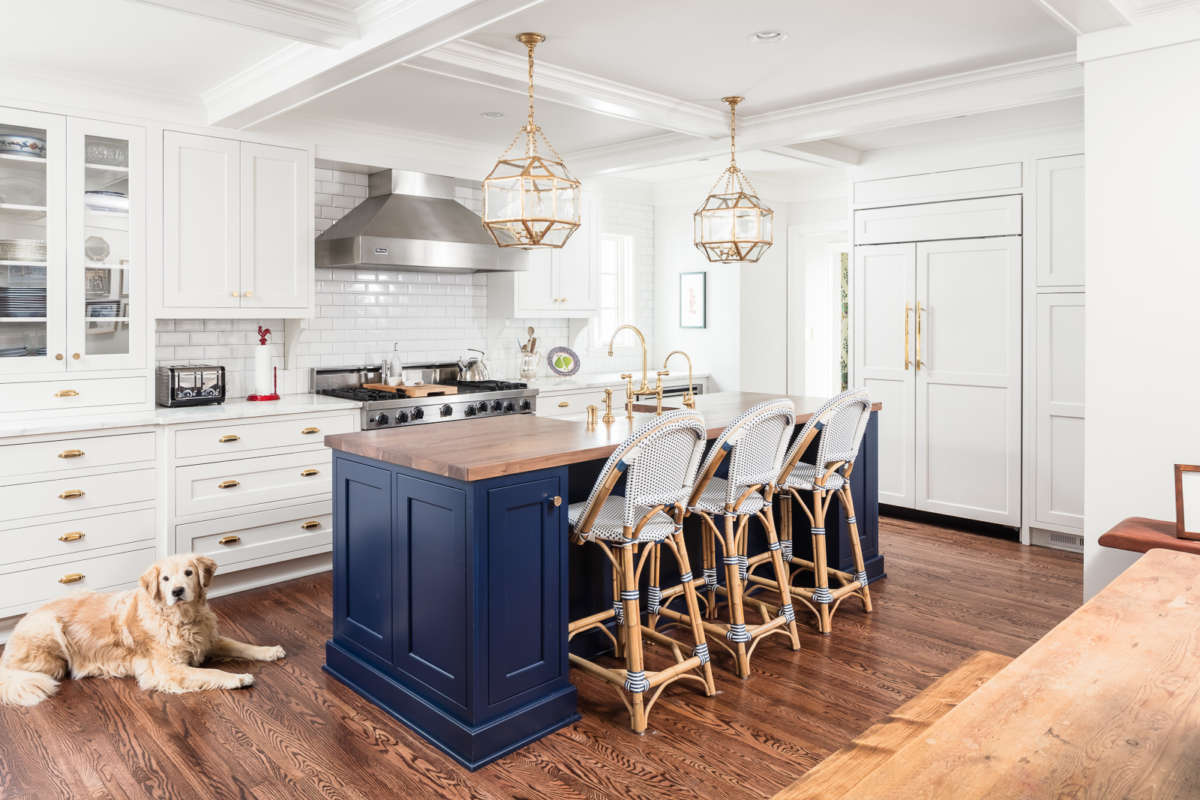
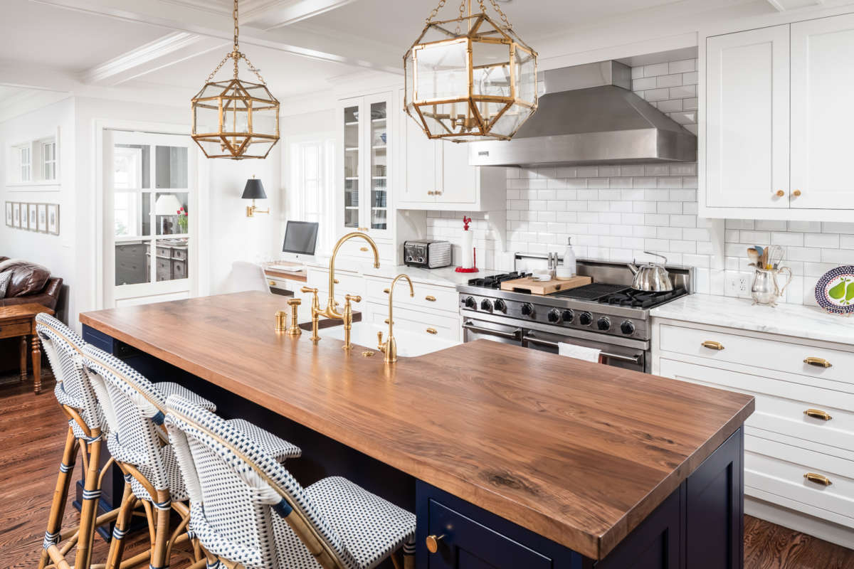
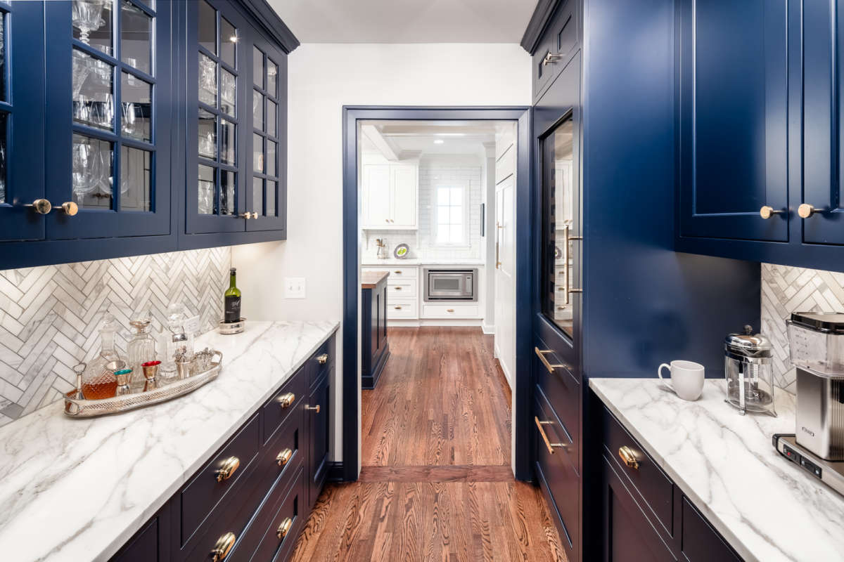
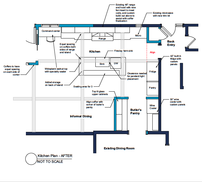
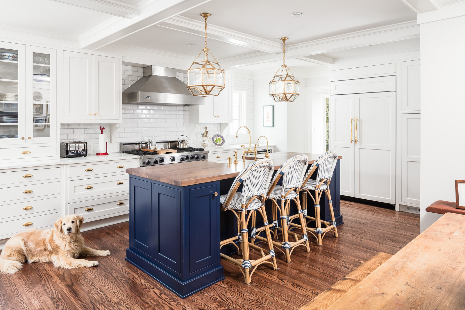
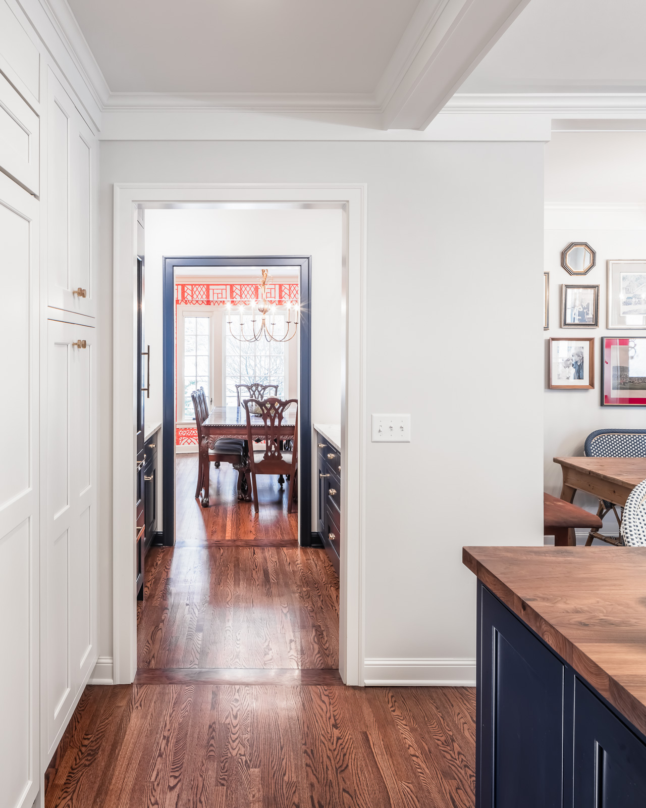
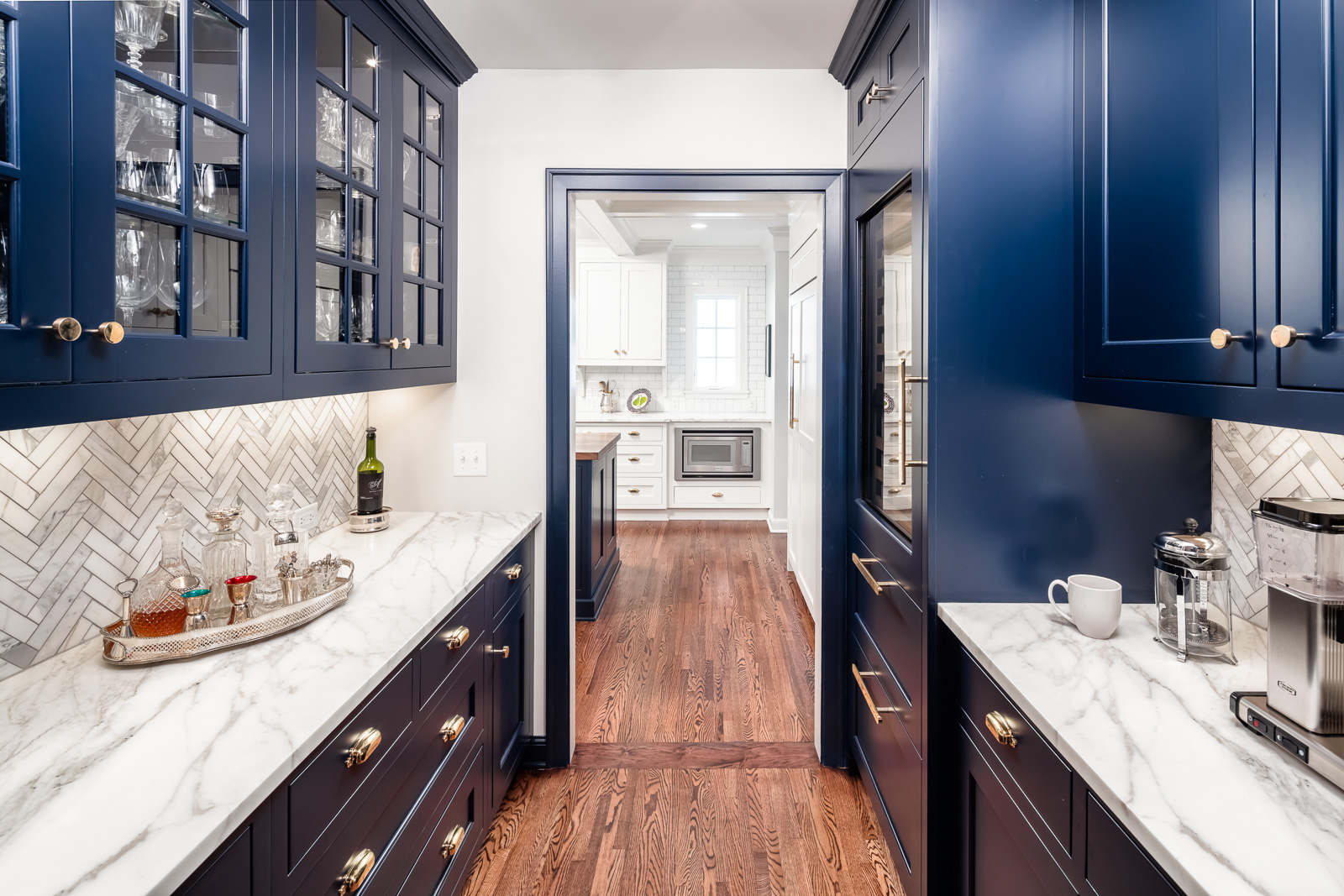
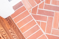
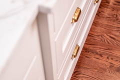
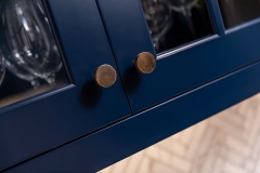
Through careful connections to the redesigned spaces, the formal aspects of the home were retained. The remodeled kitchen with added family room provides a generous area for cooking, socializing and informal get-togethers. A hardworking, beautiful butler’s pantry connects the new kitchen and traditional dining room. Deep blue Greenfield cabinetry with delicate brass “jewelry” keeps servingware organized. In the new back entrance, elegant meets rustic in a herringbone brick floor.
Take a 3D Tour of this home by going here.
This kitchen remodel was featured in the 2018 Luxury Remodeling Tour. See a news clip here.
Click below to learn more about this Edina kitchen addition.
The Kitchen Remodel Story
Built in 1939, this colonial home and its cozy neighborhood had so much of what these homeowners loved. There was an expansive living room and generous dining room, but the kitchen was too small for their young, active family. They wanted to create a less formal space where the family could gather together – with the kitchen at its heart.
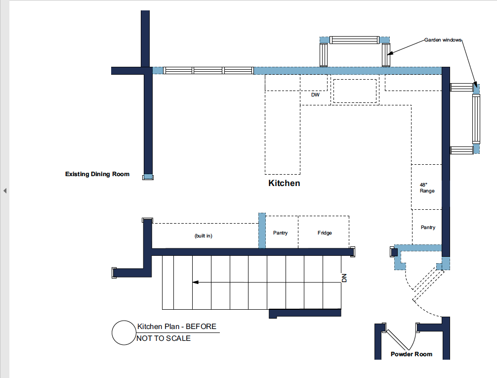
The existing mudroom was in the basement, off the garage. That was fine when driving in, but would not work for kids coming home on the bus, playing in the back yard, or for family and friends dropping by. The formal front entrance would easily clog up with shoes and back packs – almost a hazard. The home’s only TV and hangout space was in the basement, too separated from mom’s watch. Additionally, the cook was either separated from the fun or overwhelmed by friends crowding into the work triangle. To solve the problems and create the spaces they desired, an addition would be needed.
The Remodeling Challenges
The lot itself posed challenges. On a cul-de-sac, the building had to conform to full setbacks on both the front and side. A portion of the existing garage breached the setback. Adding on required an understanding of the building code, precise surveying and sophisticated calculations. Only a small corner of the addition would be allowed to cross the arced setback line without needing a variance.
The whole design hinged on getting it right.
Also, the backyard is nearly a cliff. A steep hillside channels water right to the base of the home. To get flat back patio space, large retaining walls had been previously built. This new addition had to match the first floor, have a full basement, align with the existing patio and keep the hillside from sliding in or flooding the home.
The Design Solutions
The team devised a 20’x20’ addition that met all the criteria. Careful digging and quick concrete work, kept the hillside safe. An integrated exterior drainage plan and well-detailed foundation kept the water were it was supposed to go – outside. The flat roof allowed the existing second story bedrooms to remain untouched and the carefully crafted exterior details integrate the new rectangular shape with the existing sloped roofs. Exterior motifs were borrowed from the sun porch and front stoop to keep the look unified.
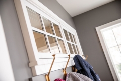
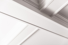
Inside, the kitchen was expanded. The new “working” back door opens into an elegant yet practical mudroom/entrance that serves as clutter catcher, airlock and dog retention zone. Large windows on the east end of the addition flood the new family room with morning light. The whole space is delicately connected to the formal portion of the home with a butler’s pantry that is as hardworking as it is beautiful. A coffered ceiling throughout makes sense of the mudroom and butler’s pantry spaces in opposite corners, unifying and delineating the various functional areas.
A family room addition to the back of the house, right off the kitchen, helped create a perfect new space for the family to all spend time in together.
The Design
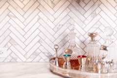
Throughout the design process, the owner had a clear vision of the aesthetic she desired. Her early inspiration pictures had white, navy, gold and warm dark wood. The herringbone patterns she chose for backsplashes and the back entrance floor keep the space fresh yet traditional. The white-walled canvas is brought to life by an eclectic mix of new and old, pattern and color, family photos and fabulous accessories.
The Results
The family spends nearly all their time in this comfortable communal space where they can spread out to do different activities while still being together. From frenetic school mornings, to quiet mid-day coffee, to uproarious game days, the family reports that their new space supports their active, engaged and rich life. It is the perfect completion to their lovely home.
Client Needs
- Family space: open & integrated
- Large kitchen
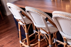
- Informal eating area
- Mudroom and back door
- Command center
- Better access to backyard
- Entertaining support
Aesthetic
- Keep the details of formal home
- Integrate the look and keep it congruent
- Traditional with a little pop
- Crisp white with anchoring navy and golden details
- Luxurious marble and rich walnut
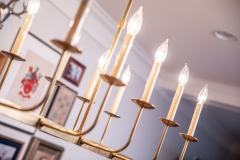
- Coffered ceiling with integrated lighting unifies space flow
- Needed to remain one story and aesthetically integrate with the existing home’s exterior
- Columns, pediments, dentils and frieze connect new exterior with existing details
Functionality
- Fit into corner between garage and slope
- Create new access to backyard with an eye to enabling appropriate drainage for sloped site
- Keep second floor windows and integrate flat roof design with existing home
- Mudroom serves as vestibule and cold-lock to the outdoors
- Kitchen, eating area, and family room altogether for the family
- Butler’s pantry for storage, entertaining and transitioning from formal to family spaces
- Family room addition to back of house
Craftsmanship
- Coffered ceiling design seamlessly integrates with cabinetry and wall planes
- Precision-installed herringbone brick on mudroom floor and portico
- Layers of siding and exterior trim details flawlessly executed
- Fascia aligned with existing and new sloped roofs
READY TO GET STARTED?
A better design-build experience awaits. If you’re ready to re-imagine your home,
contact
us today to discover the benefits of an organized, reliable system with
a truly personalized design approach.
- Customized Design |
- Responsive Communication |
- PERSONALIZED APPROACH |
- Expert Results

