There are many elements of home design that often go unnoticed, yet have an enormous impact on the overall feel of a space.
Often, it all comes down to how well the room’s design achieves balance. Thoughtful attention to balance can make a room feel comfortable. Ignoring the principles of balance can make us feel uneasy. Sometimes, you might not even be sure why a room doesn’t sit right with you – you just know it’s slightly off.
However, balance is both objective and subjective. It can also be simple or complex.
Timothy and Mark Ferraro-Hauck, Bluestem’s co-owners and founders, share some points that can help you understand and apply these design ideas to help you make your room feel just right.
Why is Balance Important?

Our sense of balance in space is formed at a young age. From the moment we take our first steps, to our first bike ride, to activities such as sports and martial arts, achieving balance is essential to our daily function and our passionate pursuits. Balance is woven into the way we move and the way we see. We look for the horizontal and the vertical to orient ourselves in the world. (Ever been on a tossing ship at sea? Look out at the horizon to feel better!) Even our bodies are designed in balance – down a center line that is more or less the same on each side.
So, whether we know it or not, we are wired to seek out balance around us. When balance is ignored in design, a room can just feel wrong – not restful, and sometimes even distressing. Poorly-balanced rooms may look clutteredno matter how tidy they are.
What Happens When There’s No Balance In a Room?
Mark Ferraro-Hauck, one of Bluestem’s co-owners, talks about what happens when there is not good design balance:
“You walk in and don’t even know where to look. It feels overwhelming because there’s nothing to direct your eye.”
Just like the horizon in the distance or the vertical line of a tall straight tree, well-achieved design balance gives your eye and brain visual guideposts. It tells them where to look and what to pay attention to. That gives a sense of order, which in turn helps us feel at peace.
Imagine a frame you are looking through – out at the world. This frame, or visual plane, is like a series of pictures we see moment after moment. As we look around any environment, these “pictures” have an effect on us. From the “pictures” we draw visual cues about the condition of the world around us. These visual cues are incredibly powerful at either stimulating or relaxing our nervous systems.
The degree or lack of balance in those “pictures” changes the visual cues, and thus an environment’s effect on our sense of well being.
The Cultural Background of Balance
It’s important to remember that our visual vocabulary is highly culturally driven, as well as the finer points of how we experience balance in our environment. Certain cultures around the globe value bilateral symmetry, while for others, asymmetrical balance is the highest form of elegance. We will talk about some of these forms next.
How Symmetrical Balance Works
When it comes to interior design, symmetrical balance (also referred to as bilateral symmetry) is easy to recognize. The composition or “picture” has a centerline – typically vertical – with identical (or very similar) elements on either side. The balance here is simple: each side is the same.
Imagine a historic balance scale. When the weight is the same on both sides of the scale, it balances. This is the same with Symmetrical balance. It is easy to have the “weight” (the visual weight) the same on both sides of the center line – the elements match in a mirror image. Many people find this pleasing because it can feel restful and give a strong sense of order.

Where Symmetrical Balance is Useful: Although many grand historic buildings use a very rigid symmetrical balance, think Parthenon or the MN State Capitol, small spaces can also benefit greatly from symmetrically-balanced elements. It’s also useful for small spaces, which can easily feel cluttered. Having a clear order to the visual weight and clear center line to the picture can give a small space a much more ordered, restful, and even larger feel.
Tips for Achieving Symmetrical Balance: You could create those pictures – or moments – by mirroring two sofas, having two light fixtures flanking a fireplace, or aligning windows along the centerline of a room. These types of moves give that sense of balance and may make a space feel larger.
Imagine This
You’re remodeling a small powder room. It has always felt cramped and cluttered. You could use a “formal” symmetrical arrangement at the sink, with two pendant lights on each side of a mirror and the faucet is right in the center line. The pattern of the tile on the wall is exactly balanced on the centerline of the room. When your guests straighten their hair in the mirror, the symmetrical balance they experience (both of their own reflection and the room) will be orderly and restful.
When Symmetrical Balance Doesn’t Always Work: Bilateral Symmetry is also called “Formal Symmetry.” There is a simple rule: things are the same (mirrored) on both sides of the centerline. Sometimes, however, the formal element can be too formal and make a room feel static or rigid. And while formal symmetry can feel restful, it can also create a room that lacks energy and feels lifeless, or even boring or stuffy. Very large symmetrical elements can feel grand when used well, but can also overwhelm a room and dominate the space too much. Getting the picture just right is not quite as easy as keeping each side the same.
How Asymmetrical Balance Works
It is not always possible, or practical, to lay out our homes with perfect symmetrical balance. And even if we could, it may not be a place that would feel good. For functional reasons, rooms have complex elements of differing sizes, shapes, and textures. Think about a kitchen: there’s cabinetry, appliances, plumbing, doors, windows, walkways and lighting – oh my!
You may have seen – or lived with – a kitchen that felt as if all the elements were thrown (or crammed) into the room. Nothing made sense, and it felt chaotic. While we could employ symmetrical balance design elements (such as cabinets on each side of the range hood), it’s usually just not possible to get all the elements that way. Yet, we want our spaces to “feel” good.
Enter Asymmetrical balance.
Where Asymmetrical Balance is Useful: Asymmetrical balance is far more subjective. It does not have one simple rule to follow, and it is not always experienced by everyone the same way.
So what is it, exactly? To understand, go back to the image of a balance scale. If we take two identical items and put them onto each side of the scale, it balances – no problem. But now we have different items…so what do we do? What is the balance in this case? Designers like to talk about “visual balance” and “visual weight”. How “heavy or light” does an element feel in the space? Now let’s imagine the balance scale again, and pretend that we have a special one that measures that visual weight. What elements would make that visual weight scale balance?
Tips for Achieving Asymmetrical Balance: In an Asymmetrically-balanced design, we might put a window on one side of the scale and a door on the other. A cabinet might balance with a chair, or, almost magically – a large staircase could balance with open space. (Yes, empty space has visual weight!) Another pairing: a large, light object could visually balance with a small, dark one. Or, an object of bold color and intense texture might need a big, blank wall to balance it.
Imagine putting the different elements on the scale: How does the visual balance feel?
That imaginative process is how designers achieve asymmetrical balance in a room.
Imagine This
You’re thinking of a new kitchen design. The fridge is always the hardest element to place, and to fit into a balanced design. It could be placed at the end of a row of cabinetry where there’s a door at the other end. The shape of each is similar – a vertical rectangle. This could be a great way to balance very different elements into a composition that feels balanced.
How Does Radial Balance Work?

True radial balance is based on a circle. You’ll often see this in garden and landscaping design, where a central element, such as a fountain, is placed in the center of the circle and paths go out – like spokes. In between the spokes are areas of planting that are the same size and shape. If you looked from above, you would see the radial pattern. As you stand in the garden, you would experience balance. This would be an example of formal radial balance.
Very few rooms could achieve this kind of formal, radial balance. (And a bunch of round rooms would not be very practical!) So how do we apply the idea of radial balance to practical design? Think again about visual weight, but this time, not just static pictures (the visual frame mentioned above). We don’t live in static picture. Think about the visual weight as you scan AROUND a room. Do the elements give a sense of equal weight?
Perhaps the piano in one corner is balanced with a large framed painting in the next, and an arm chair in the third corner. Just as we can create a balanced picture with asymmetrical (informal) balance, so can we achieve a type of informal radial balance.
Creating Balance With What’s NOT There
Yes, less is often more. Cluttered arrangements are hard to balance. It could be that the best way to make the design of a room work is to remove something. That could be furniture, artwork, or more substantial elements like cabinetry, wall sections, windows, or doors. Getting the visual weight balanced might start with less weight in general.
Size matters too. Larger-scale elements are often visually heavier. Many older homes – such as the historic revival homes from the 30s, 40s, and 50s, often found in South Minneapolis, Edina, and along Summit Avenue, have smaller rooms and simply can’t handle the furniture found in today’s big box stores. If you put that huge sofa in a modest Cape Cod living room, you can immediately feel the imbalance in the room. In this case, choose smaller pieces with less visual weight.
“The key is finding the things you love, those pieces that give you a strong sense of well-being,” says Mark. “Does the room highlight those things, or are they overwhelmed by other elements?”
If this is your home style, pick fewer, more meaningful elements. Edit out the items that don’t bring joy and you are well on your way to creating a perfectly-balanced room.
How Do I Know What Brings Me Peace?
As we said before, although there are design rules to follow, much of the experience of balance, and the peaceful feelings that go with it, are subjective. The answer varies from person to person. To find out what kind of design solutions will resonate with your soul, try doing some visual research. Look at photographs of spaces and allow yourself to respond organically, either by speaking it aloud or jotting down notes.
Sharing images (and your responses) with your designer will greatly help the planning process. Even if you can’t put your finger on why an image is making you feel a certain way, that is valuable. Something as simple as “This feels off to me” or “These feel good to me” helps your designer understand what works for you.
Our goal is for your home to provide a sense of well-being, and give you energy as well as a sense of calm. Perhaps there are places in your home that make you feel that way? Jot those down and take a picture or two to show your designer.
A Real Project Example
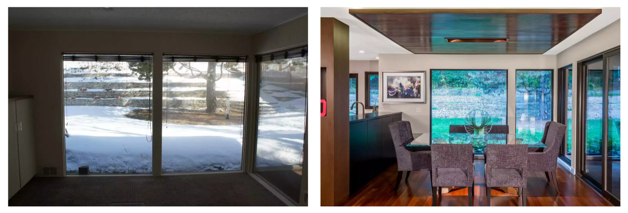
The original design of this home featured huge panes of glass. Our Bluestem design team immediately felt that the massing of the glass was off by two feet.
The team reordered the sizes of the windows, aligning them across the room from each other, and changed the fenestration (openings). These little tweaks made a huge difference.

See more details and photos of this project!
Balance Your Own Space
You might notice areas in your home that feel unbalanced to you. If you’re thinking about making a change, contact us and request a consultation. The Bluestem team uses our unique artistic and problem-solving perspectives to create spaces that bring you comfort and peace at the end of a long day.


