Project Details
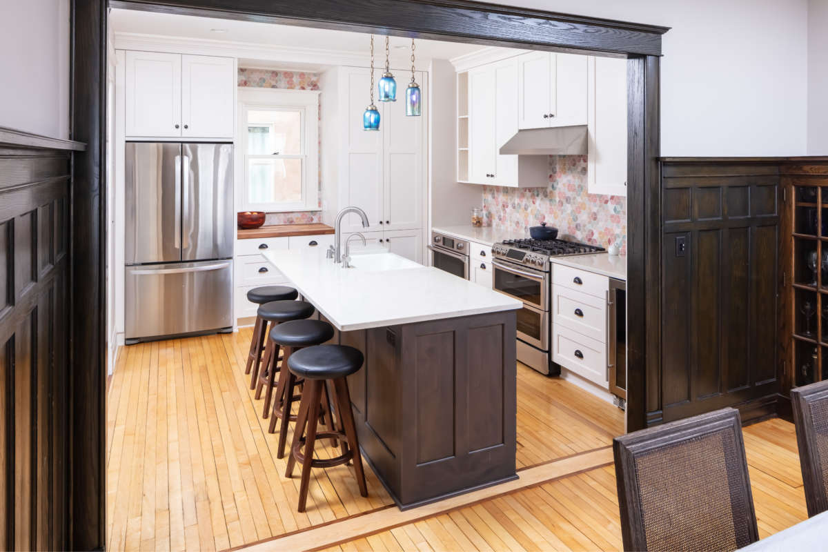
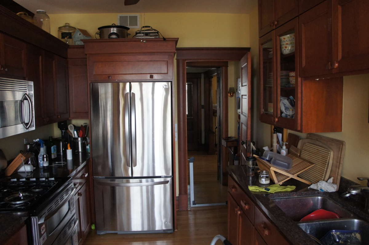
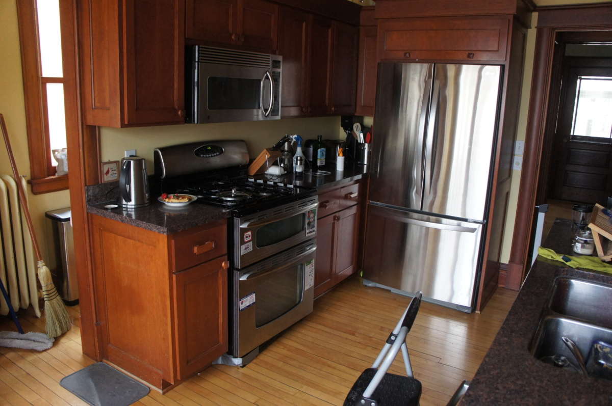
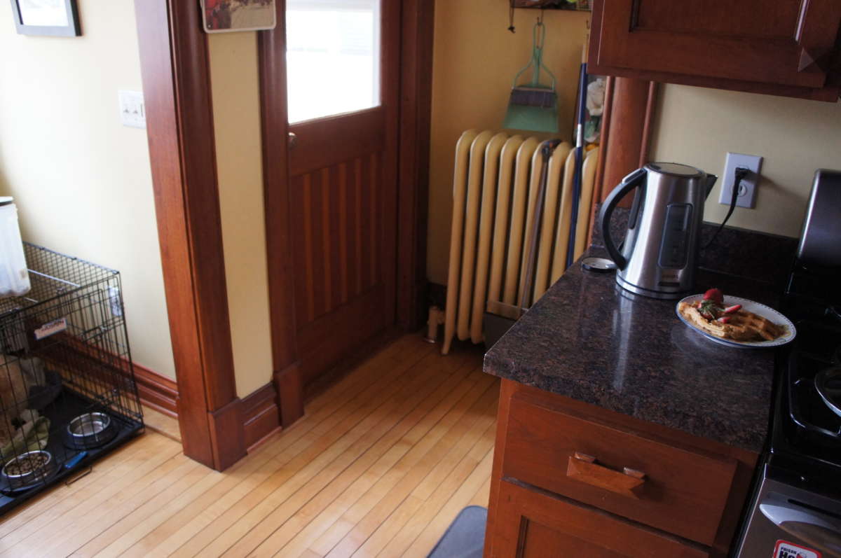
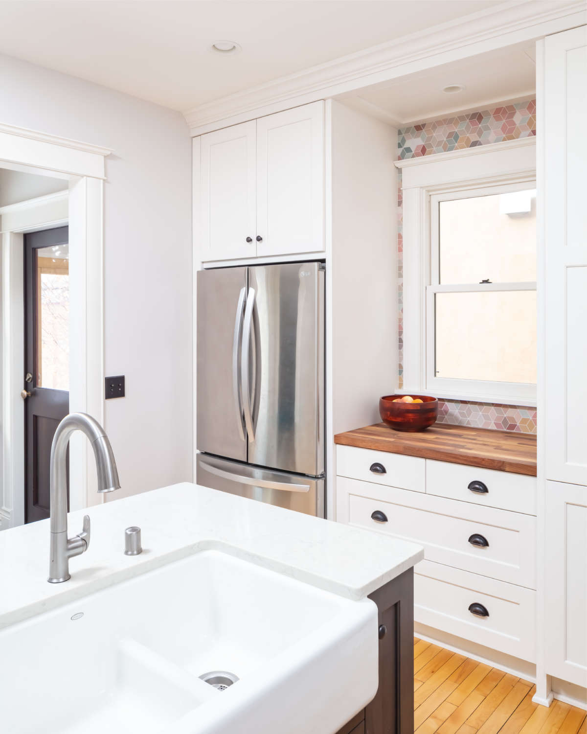
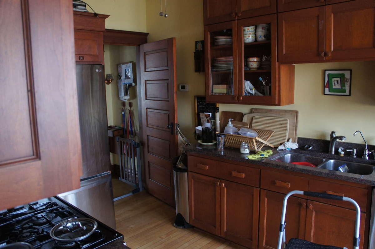
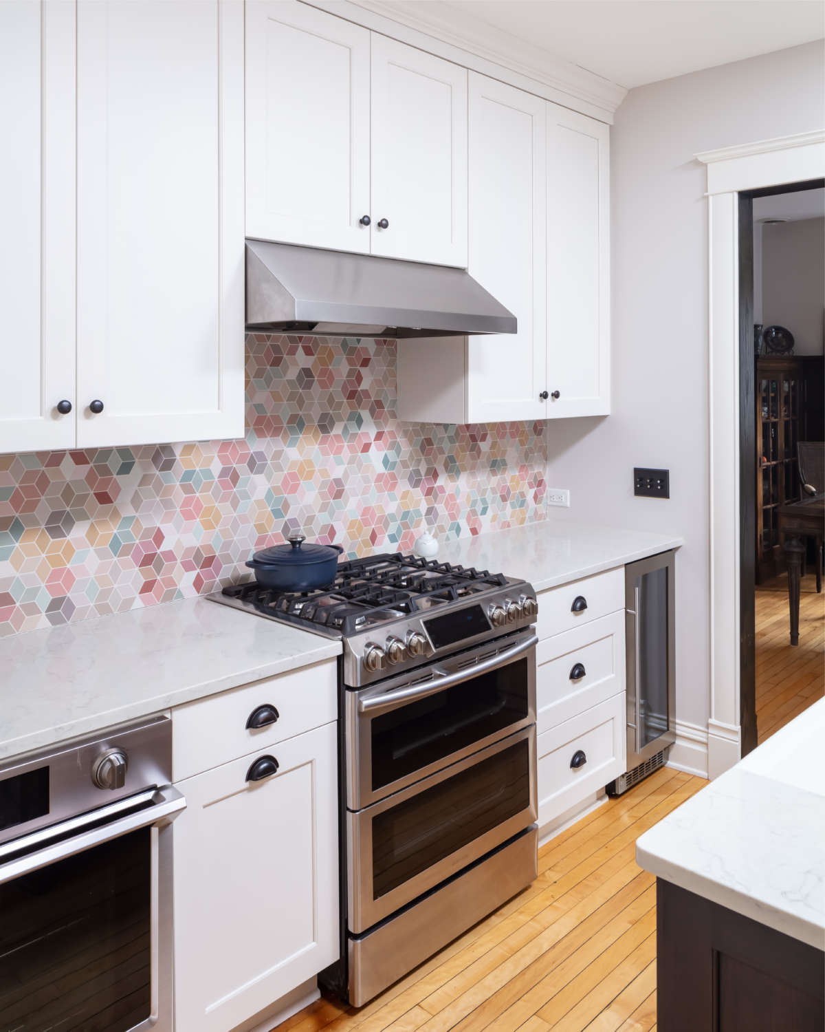
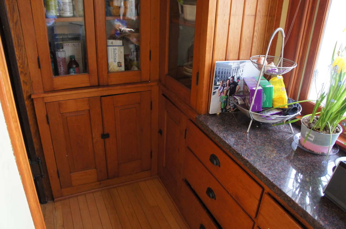
The rear-entry kitchen in this 4-square Minneapolis home had been dreadfully remodeled in “the 90’s” with oppressive colors and a tortured floor plan. Nothing worked. The challenge: create a kitchen suitable for a modern family while also honoring the historical aesthetic the owners loved. The Bluestem design team modified the flow of space and created an inviting, functional and bright kitchen with ample storage, a hard-working back entrance and a practical powder room. By reusing and recreating historical details, and then adding in modern textures and colors, a fun blend that is both pleasing and a little edgy was created.
Click below to learn more about this Minneapolis kitchen remodel.
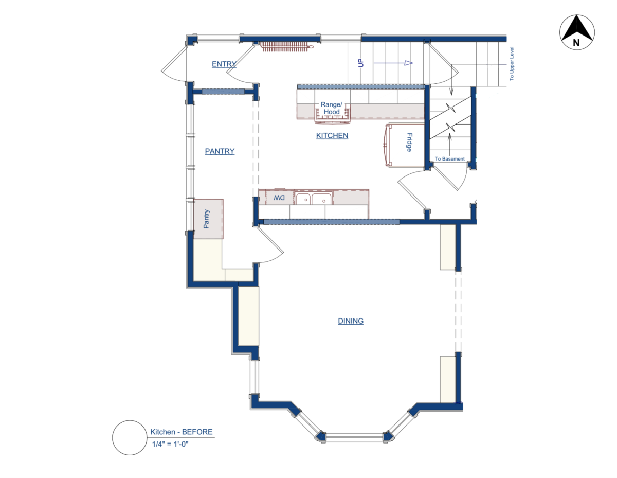
This vintage 1910 Minneapolis home was full of great, classic details. Unfortunately, the kitchen had endured a prior remodel that left it dim, hard to move in and oddly configured. The dark-cherry kitchen with ill-placed appliances and fixtures had awkward corner connections to the dining room, front parlour and backyard.
It was a daily frustration, and the family longed for a large, functional, eat-in kitchen with appropriate storage and appliances. They envisioned morning-before-school breakfasts in a bright, airy space with views of the backyard and lake beyond; a light-filled space that contrasted with the darkly-paneled rooms of the adjacent living spaces, but coordinated in the overall traditional feeling. They desired a powder room to serve guests and family on the first floor, better access to outdoor spaces and a more open floor plan rounded out their functional requests. The family was eventually inspired to seek out a new kitchen and powder room to serve their needs.
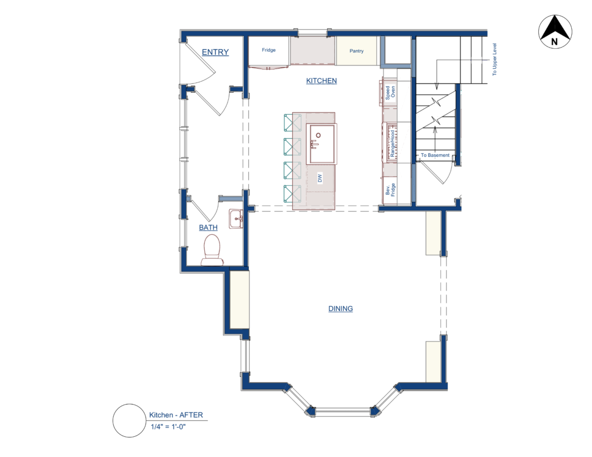
As we started re-imagining the kitchen experience, the spatial solution was found in rotating the plan so that the major features and openings were relocated 90 degrees from their original position. The previous remodel had fought hard to preserve the secondary stair from the second floor, but this family had long since abandoned it and only used it for storage. It was easy to choose to just remove it and get more room and light.
The old pantry connection to the dining room then became a perfectly-sized petit powder room.
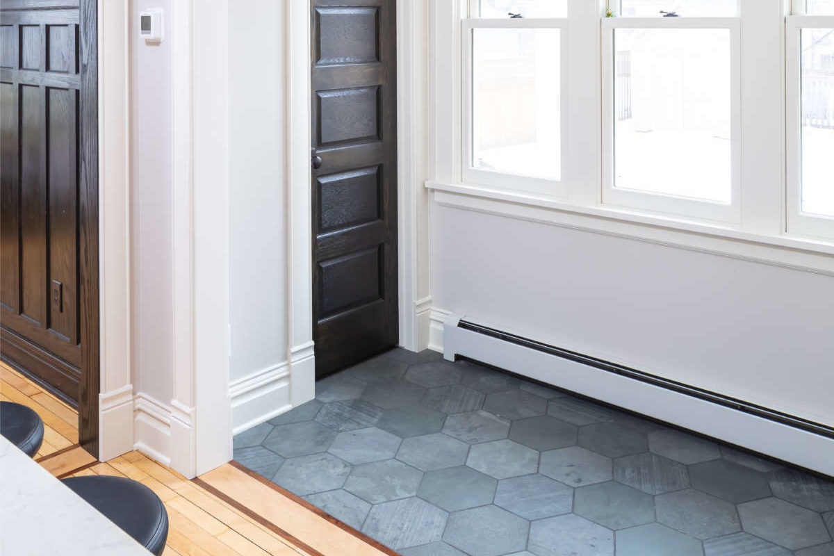
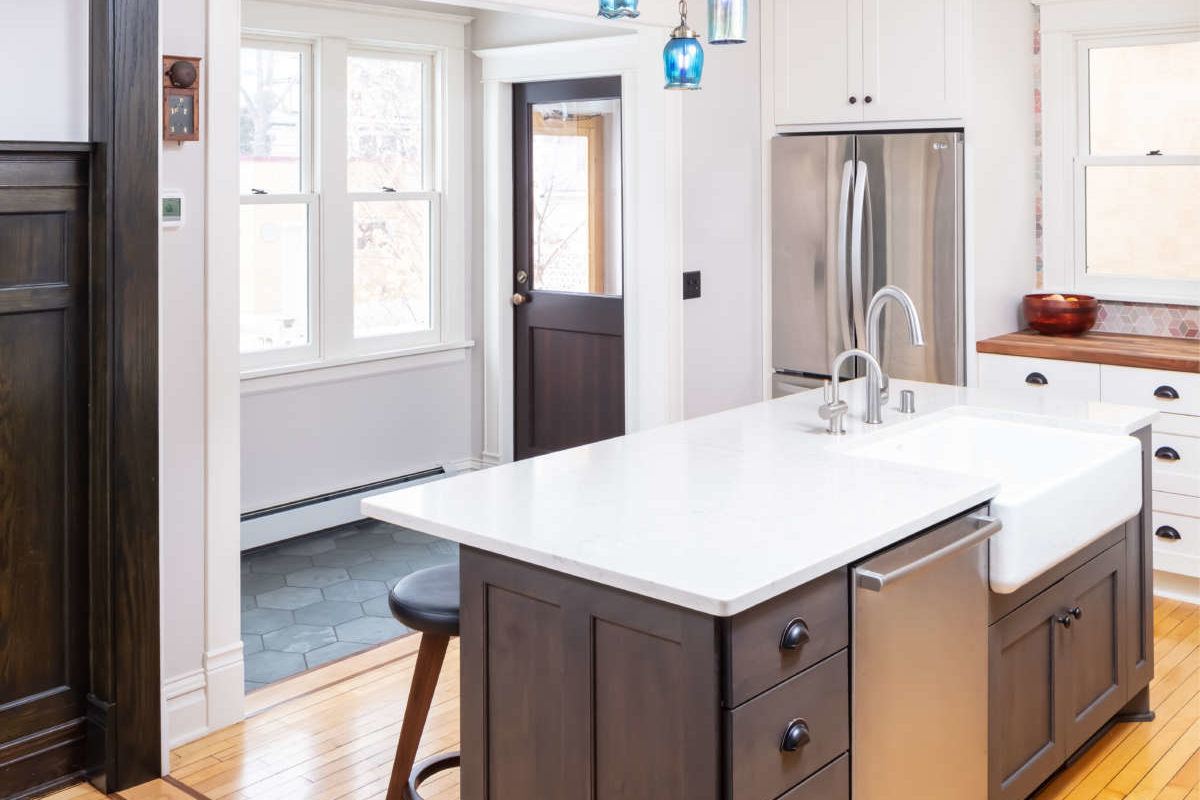
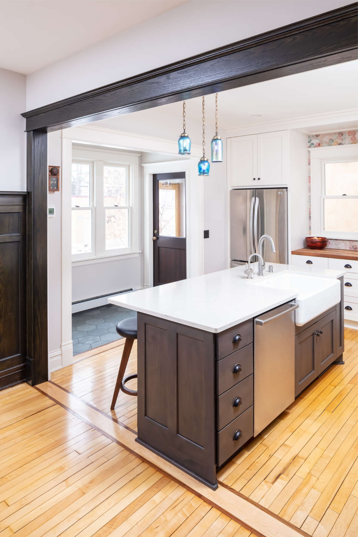
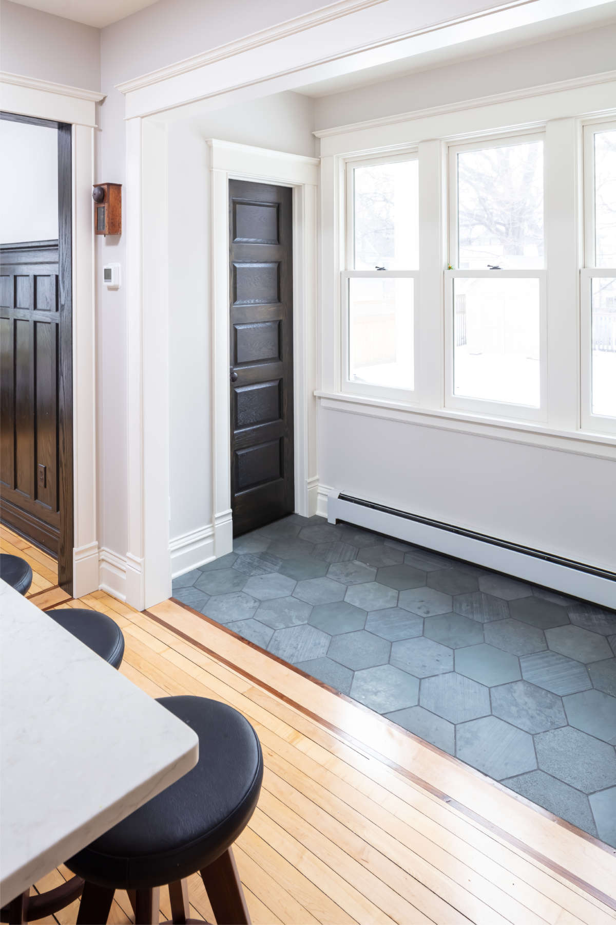
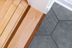
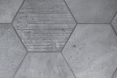
The back door was moved from the east wall to the south wall of the vestibule. This move not only provided an end wall for the fridge cabinet, but oriented the entry into a wide but shallow area that transitions from outdoors to indoors. This circulation space is completely open to the kitchen but visually separated by a wide cased opening and a change in flooring material from a durable, deep-charcoal, hexagonal tile in the entry to the traditional warm wood floors of the kitchen and beyond.
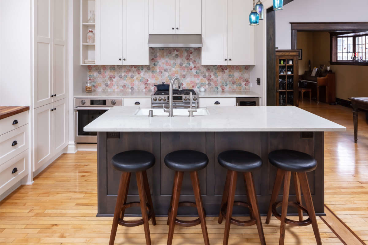
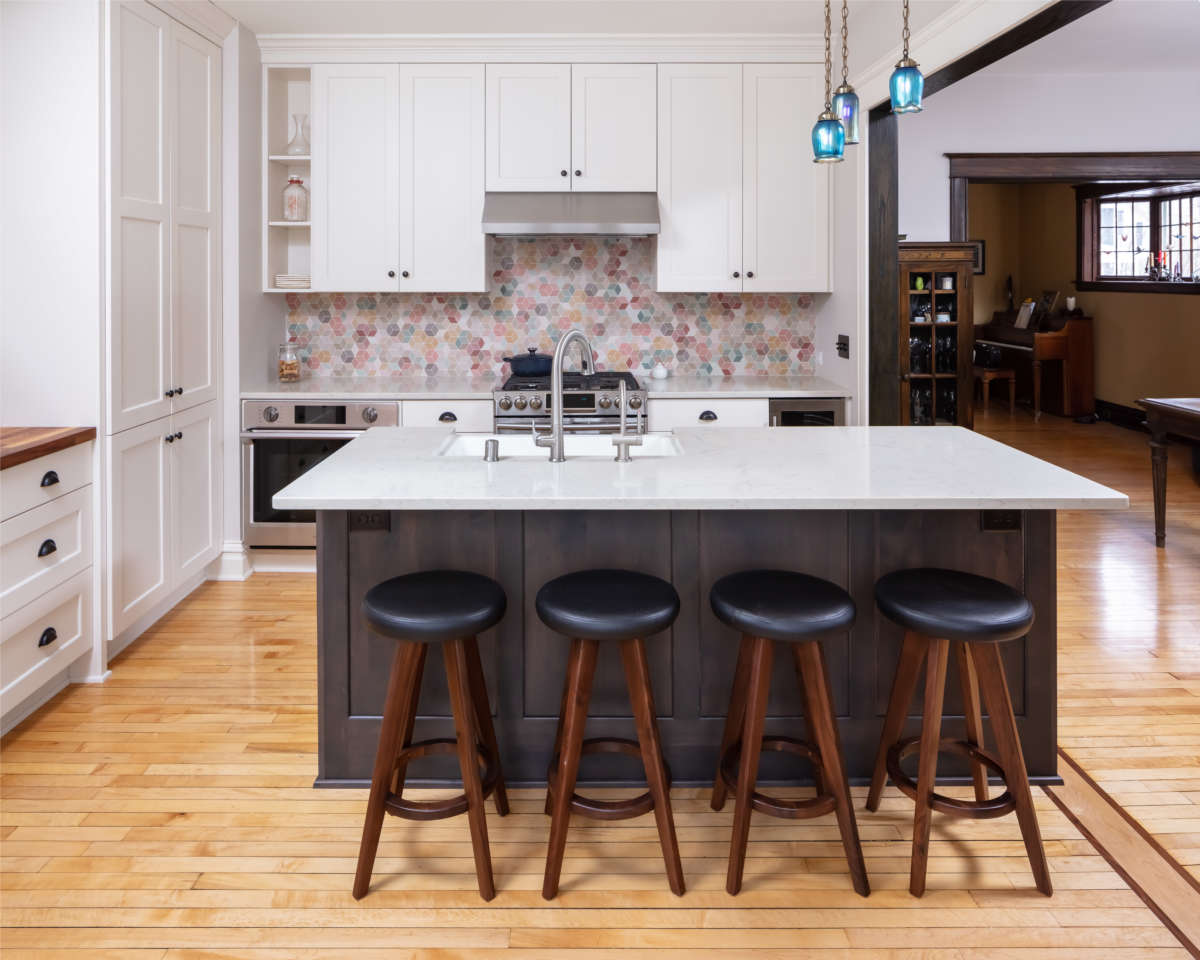
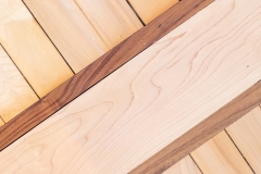
Rotating the kitchen layout closed off a doorway to the front parlour but allowed a wide connection to the dining room. Opening the dining room wall required relocating several asbestos covered radiator pipes before a new structural header was installed. Detailed craftsmanship was required to patch and replicate the 100-year-old wainscot in the dining room. The turn board details at both wide-cased openings include thin strips of dark inlay sandwiching light oak to match the field. With this rotation of the plan, the north and east walls are able to house all the appliances, ample storage, and good-size spans of countertop for work space. The sink in the island takes advantage of the light and view through the windows to the west.
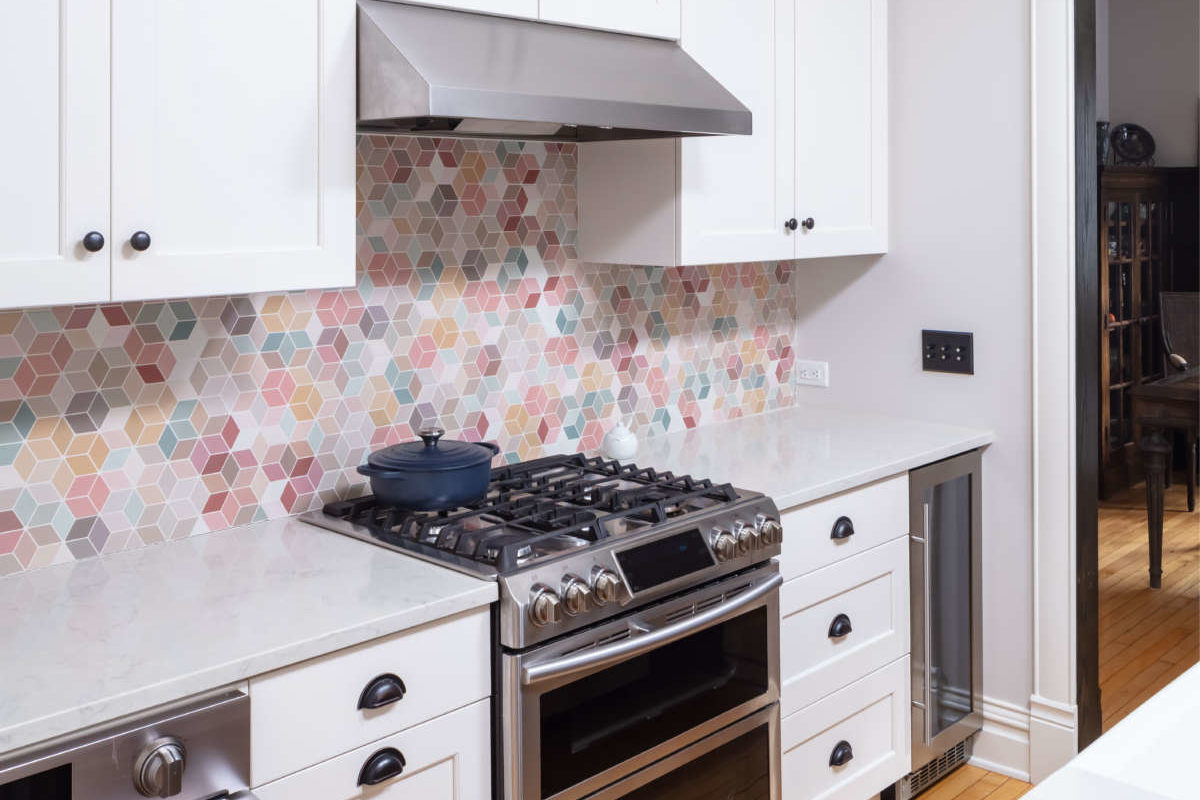
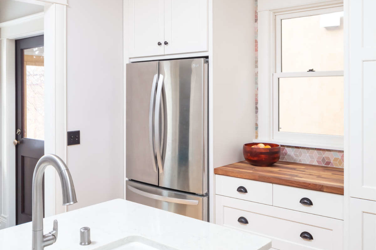
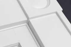
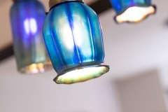
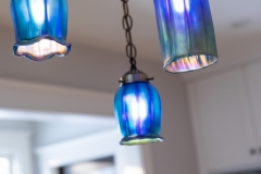
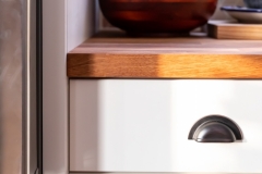
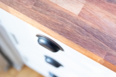
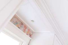
White cabinets on the perimeter walls and white painted trim brighten this formerly dark and drab space. The dark-stained island provides contrast while coordinating with the dark trim in the rest of the living spaces. The paneled end detail is a nod to the wainscoted dining room walls that frame it. Light colored quartz countertops and a deliciously colorful geometric backsplash gives texture and life to the light and dark palette. A vintage-inspired iridescent glass triple pendant light fixture coordinates with the original dining room fixture and traditional oil-rubbed bronze cup pulls and knobs finish off the cabinets with a classic look.
Our clients couldn’t be happier with their new spaces. The back entry and powder room add the needed functional updates, while the reconfigured kitchen has become the hub of everyday life. The modern conveniences are wrapped in traditional layers but then washed with a fresh outlook that brings this home into the current century while remembering its roots.
Client Needs
- Kitchen with more work space
- Good natural light
- Connection to dining & living area
- Eat-in function
- Ample storage
- Powder room
- Views to backyard and beyond
- More functional appliances
- Light & airy, bright & fun
Aesthetic
- Clean & bright
- Contrasting dark and light final finishes
- Good lighting – natural & illumination
- Fit into traditional home
- Young, fun colors & textures
- Spacious feeling
Functionality
- Eat-in island
- Full height storage
- Back entry/powder room space
- Multiple work areas
- Connections & circulation
- Bathroom plumbing incorporated into ceiling/cabinetry
- Great natural light and ventilation
- Modern convenience appliances
Craftsmanship
- Complete reframing of the ceiling system.
- Clever chases to hide both horizontal and vertical mechanicals to bath above.
- Major structural beam in new wide opening with precise footing work in basement.
- Solving insulation problems under floor of powder room while the floor framing was open. The old foundation did not allow access. Floor had always been freezing.
- Custom milled and on site crafted casing, trim, and crown.
- Patch and match wainscot details – careful disassembly, reconfigure and reassembly.
- Ordering the cabinetry before the framing was complete meant precision framing of openings.
Return To Kitchen Portfolio
READY TO GET STARTED?
A better design-build experience awaits. If you’re ready to re-imagine your home,
contact
us today to discover the benefits of an organized, reliable system with
a truly personalized design approach.
- Customized Design |
- Responsive Communication |
- PERSONALIZED APPROACH |
- Expert Results

