Project Details
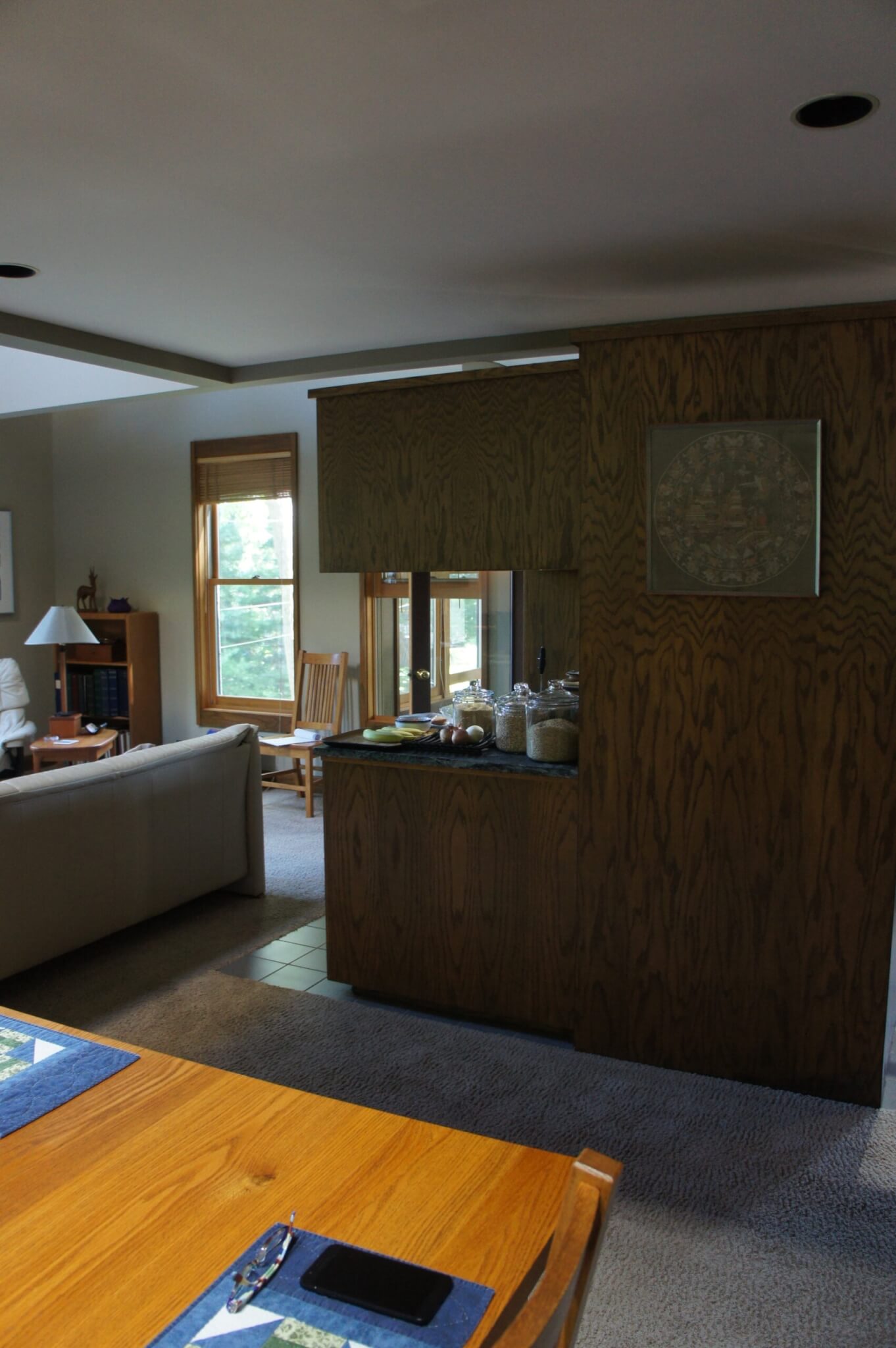
Although this beautiful, architect-designed Minneapolis home had a large, light, lofty great room, the placement and design of the kitchen almost wrecked the whole plan. Not only was the kitchen dark, cramped and cut off, it prevented circulation to key features of the home. After years of being frustrated, inconvenienced and aggravated, the homeowners – whose impending retirement would mean many more hours in their home – were ready to make a change.
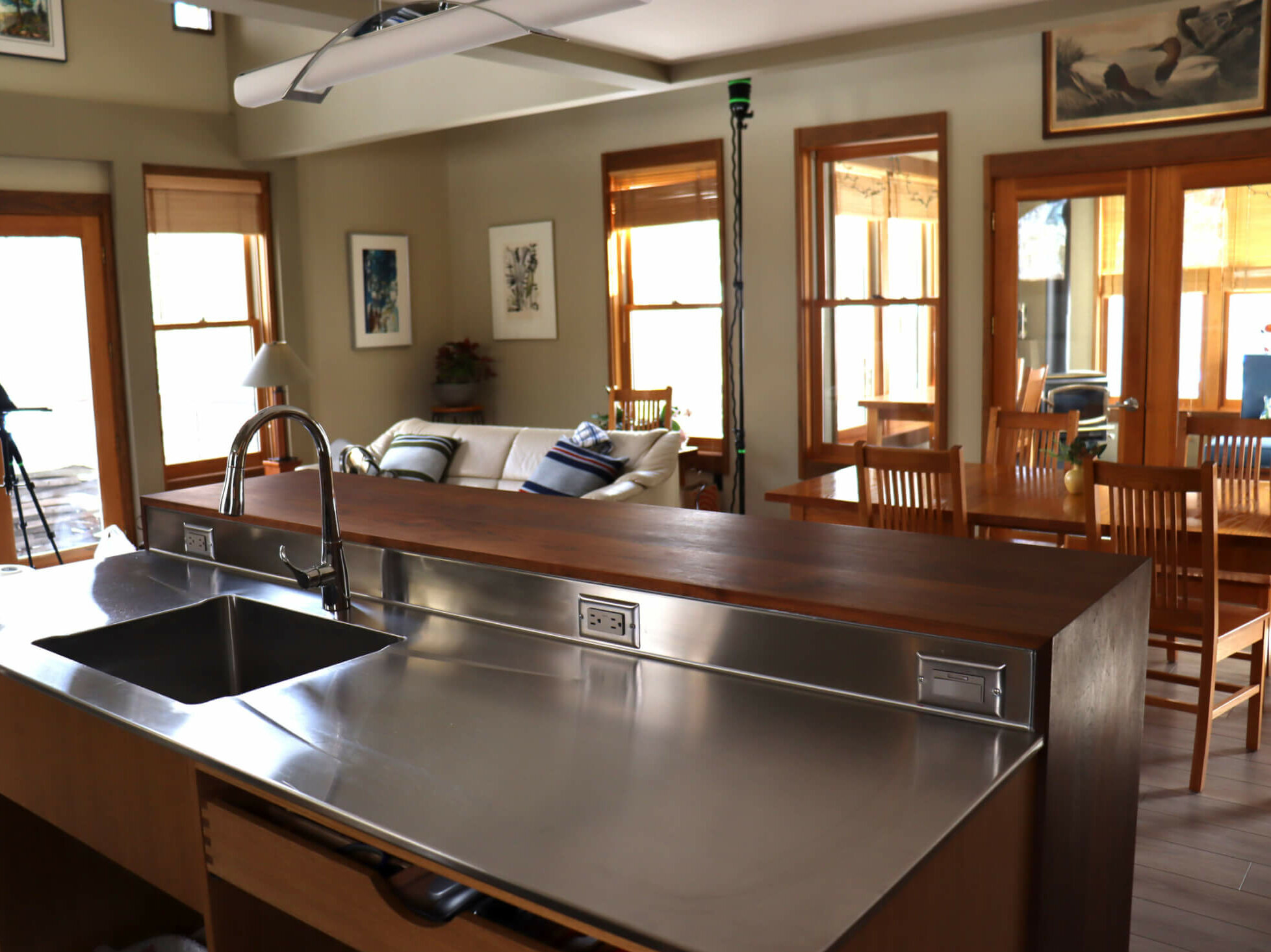
The final remodeling solution was inspired by the homeowners’ idea of swapping the kitchen with the dining space and opening up the entire room. The result looks like the home should have always been that way!
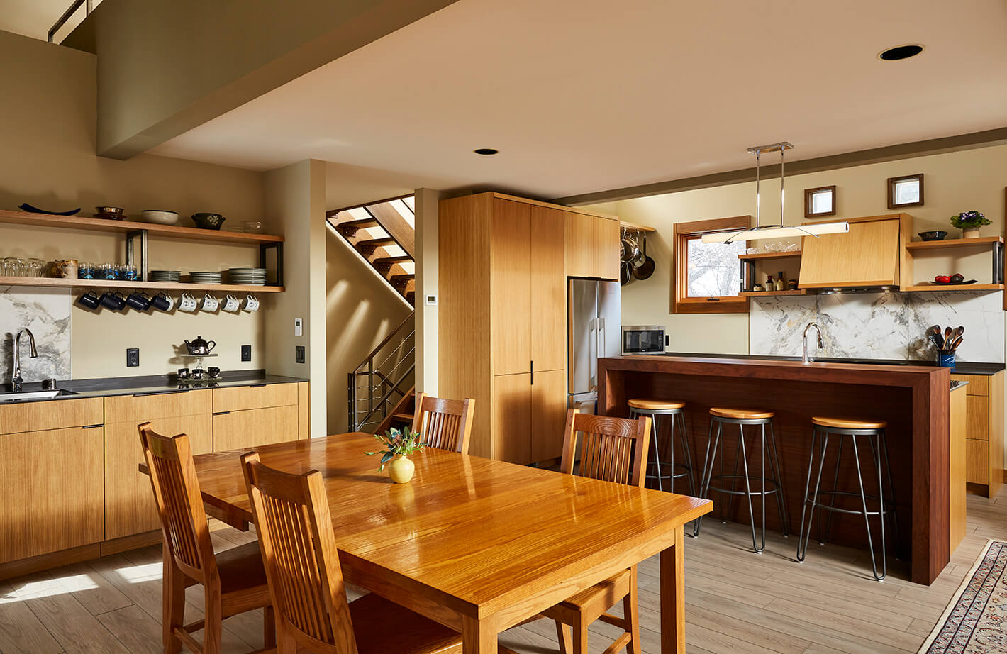
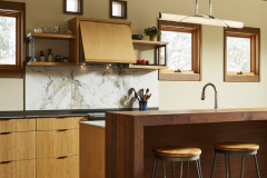
The new kitchen is a wonderful mixture of warm wood tones and hard-working features, all encompassed in a refined layout that has the homeowners enjoying every aspect of their new spaces.
Click below to learn more about this Minneapolis kitchen remodel.
The Mystery of the Misplaced Kitchen
This 90’s-era architect-designed Minneapolis home took full advantage of an unusual & hilly site that afforded great views of the downtown skyline at each of the several levels. When the homeowners purchased this house five years before, they were overjoyed with the vaulted spaces, airiness and location of this one-of-a-kind home.
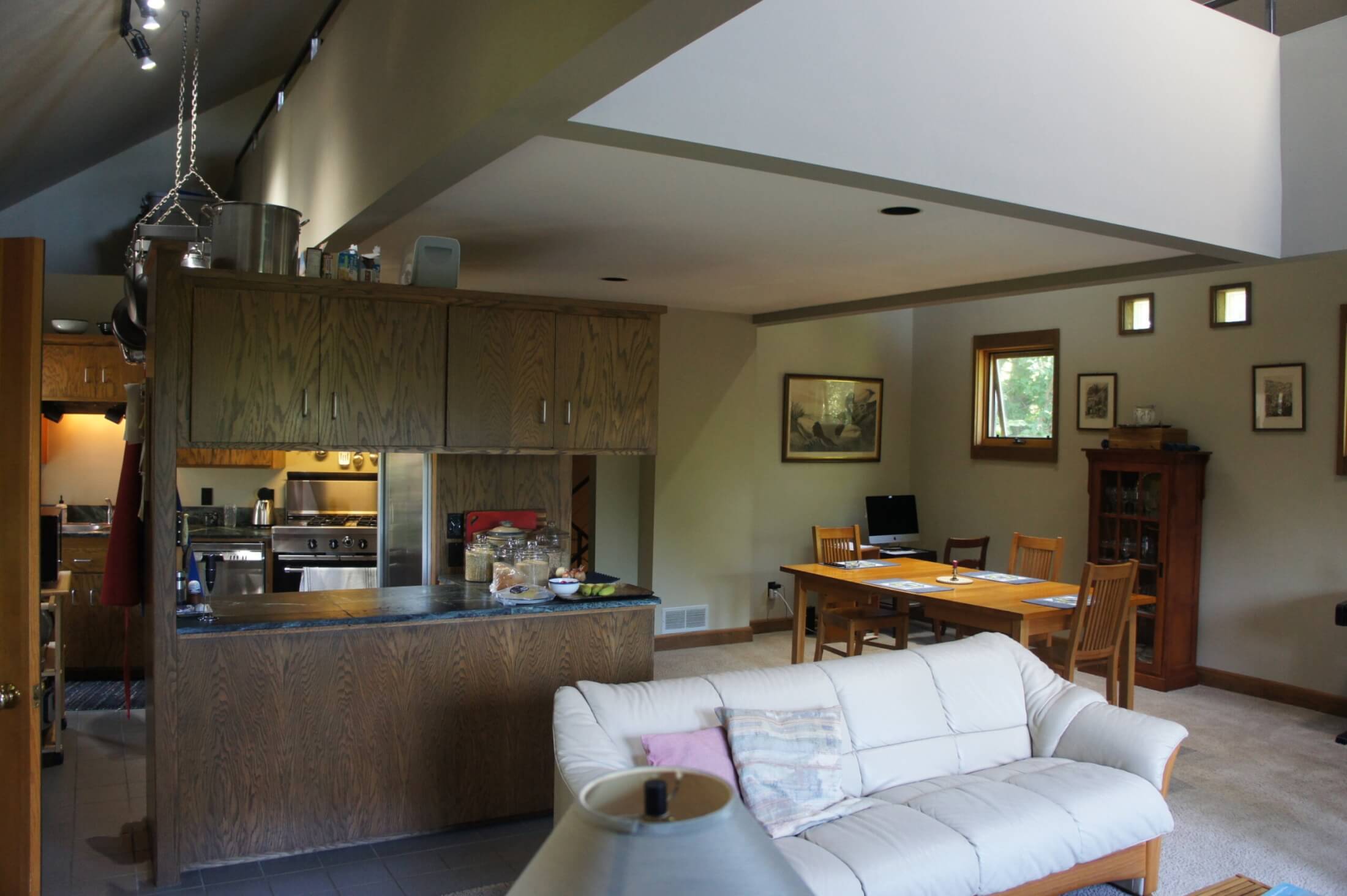
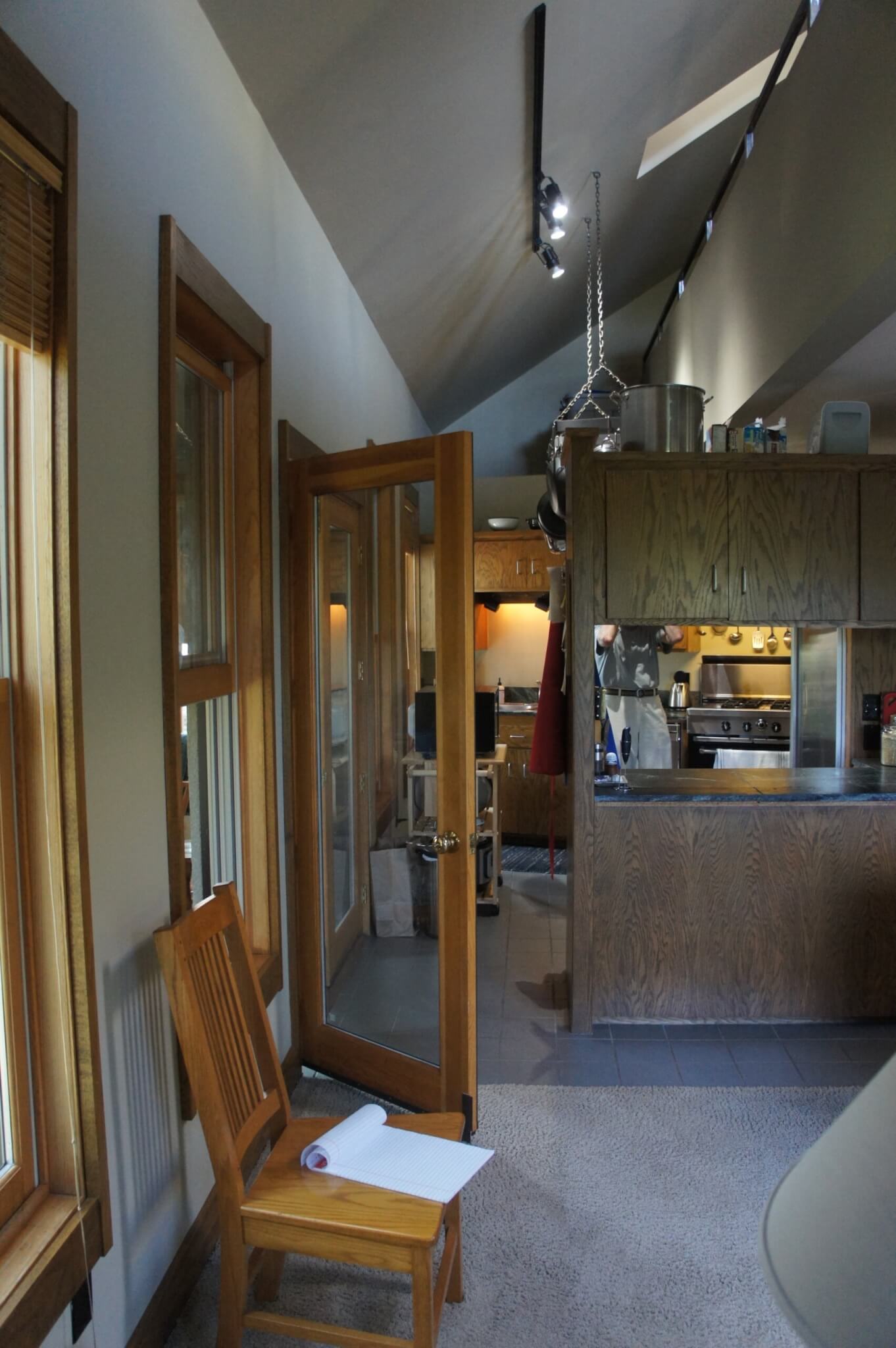
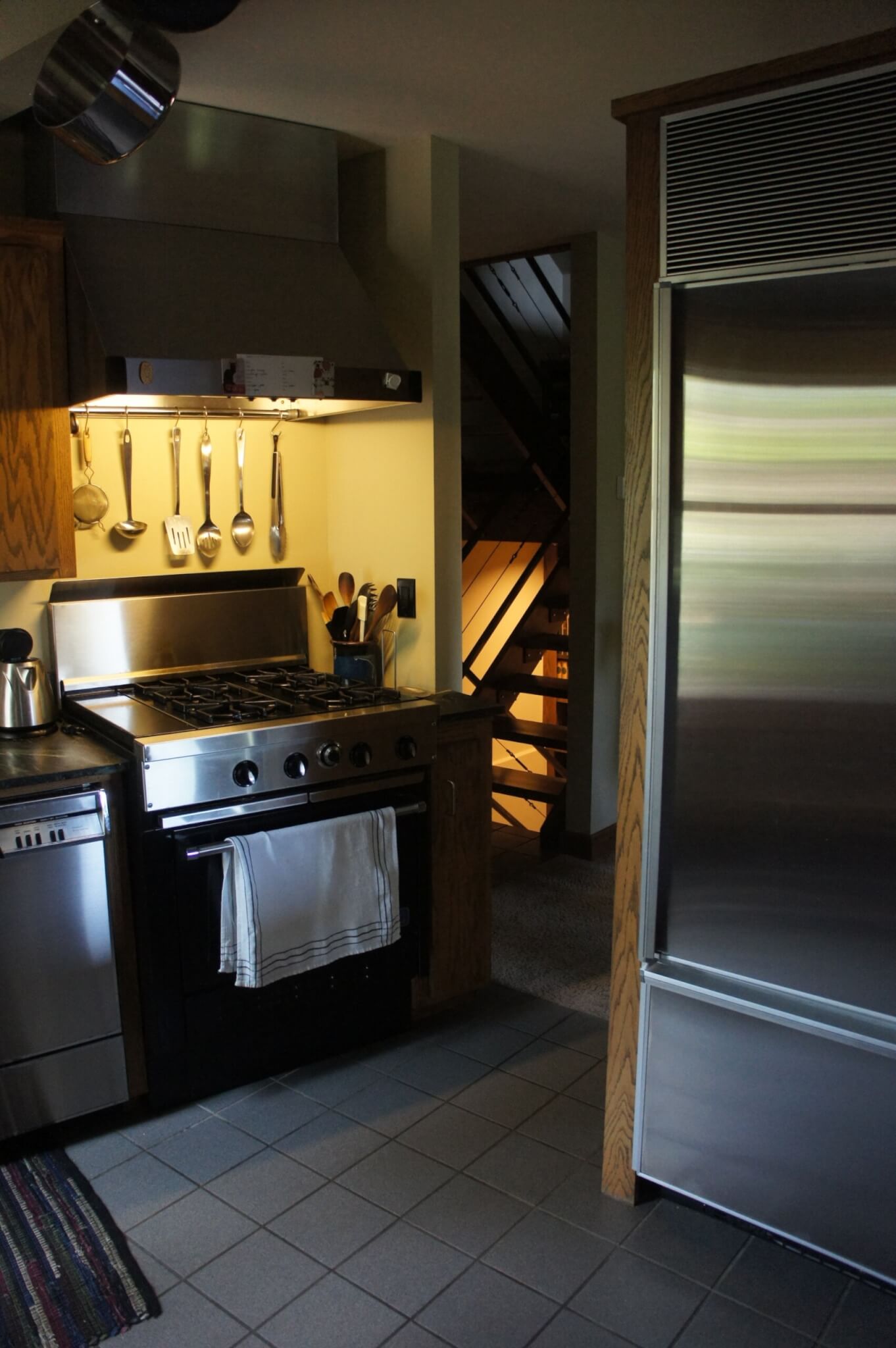
The kitchen design hadn’t looked so bad when they first moved in, but after actually using the space, they realized it was a true mess – dark, tiny, odd-shaped and cramped – out of sorts with the rest of the home. It frustrated the homeowners daily.
“Why would someone wreck such an elegant room with such a dreadful kitchen?” they mused. In fact, its placement was so strange they wondered if the architect had forgotten to add a kitchen in the plans, and the builder just threw something in after the rest of the house was built! Or, perhaps the original owners insisted on the change? It made no sense – and remains a mystery.
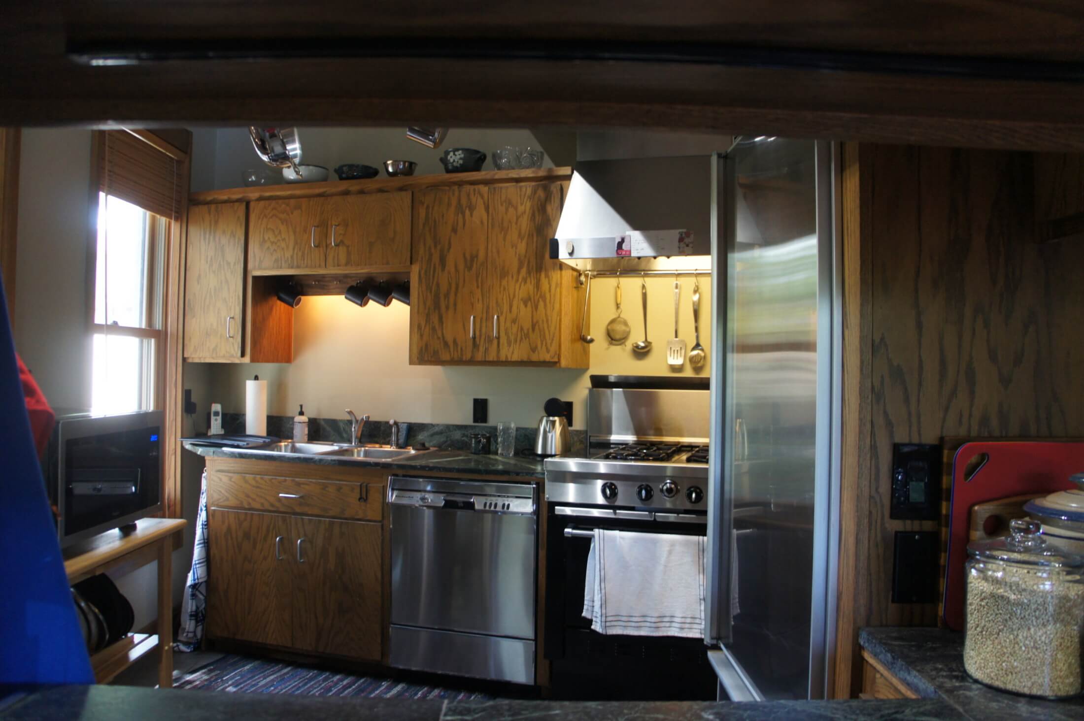
BEFORE
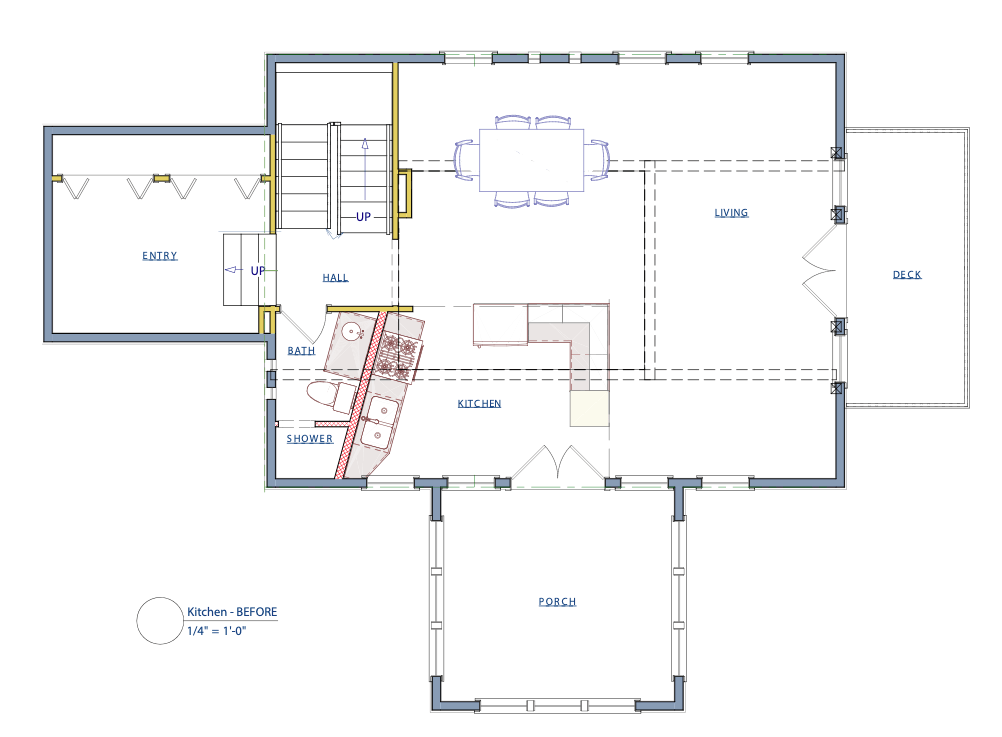
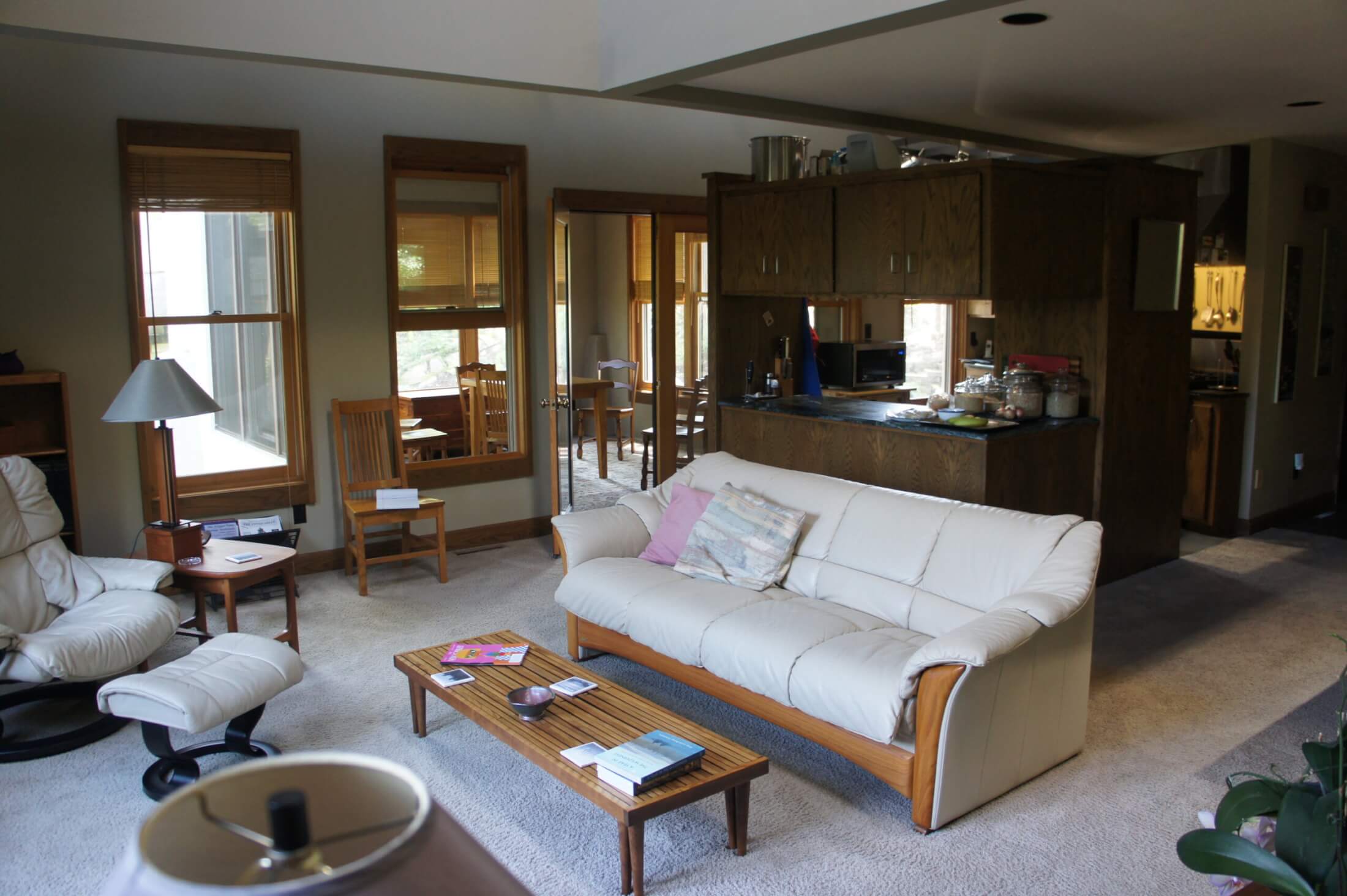
Not only did the kitchen placement cut off access to the wonderful sun porch and chop up the flow of the great room, but it did not offer much in the way of good kitchen function. Little counter space, odd adjacency of appliances and work surfaces, overhead peninsula cabinets that cut off the connection to the great room and, dark, dark, dark.
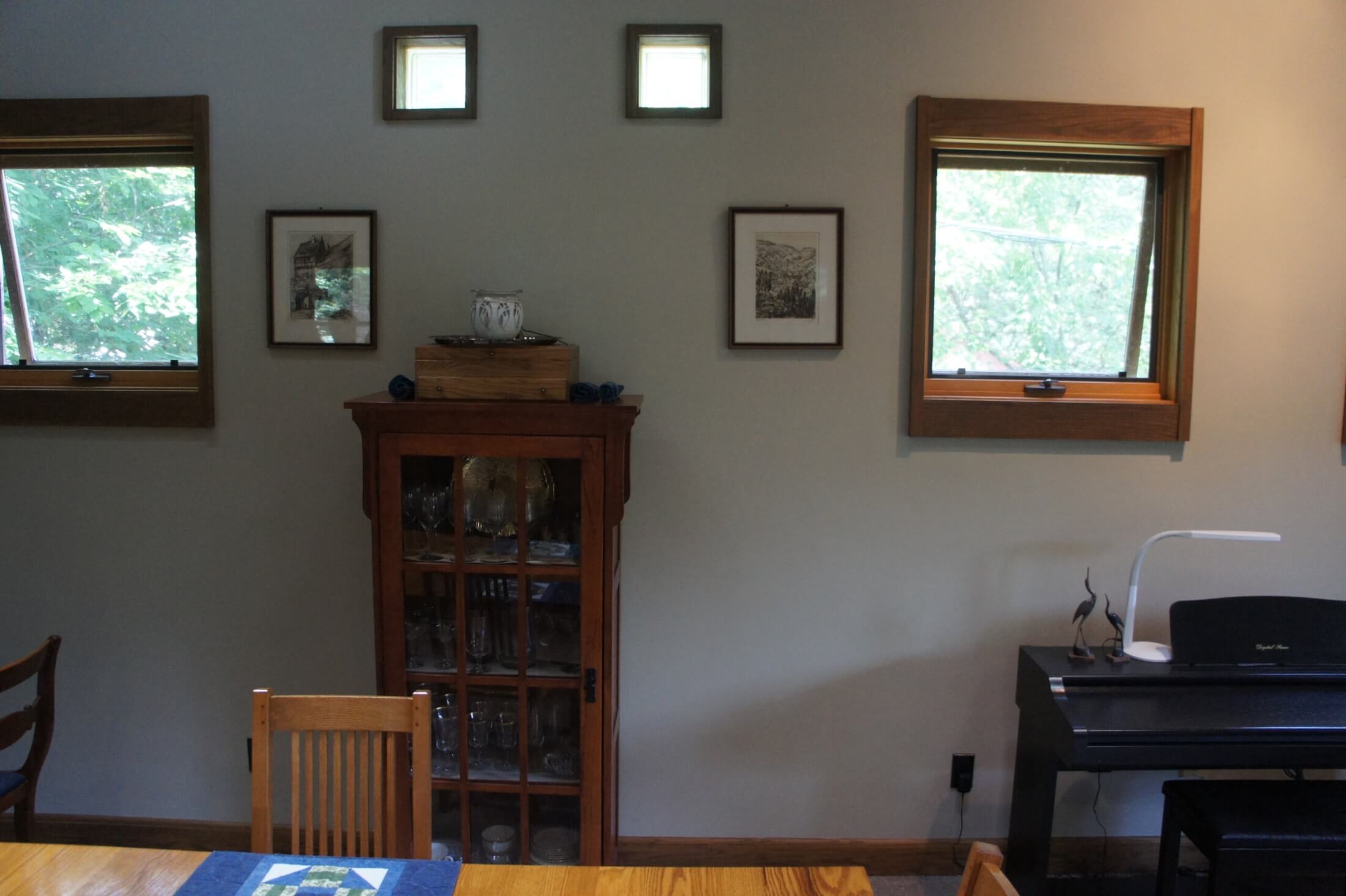
The design needed to favor function and “make-life-easier” cooking features above all else. But, it also had to solve the mess. In true collaboration with the owners, the designer explored their suggestion that the kitchen location could be swapped with the dinning room and take advantage of the existing window configuration there – where it looked as though the kitchen was always meant to live.
Challenges and Solutions
The first major design constraint: none of the window or door openings could be altered. The stucco exterior was an unusual and heavy texture, meant to reference adobe. It would have been extremely difficult to match, and the owners’ budget would not support re-dashing large areas of the home. The next practical challenge was a very constrained space below the kitchen for altering mechanicals. The lower level was completely finished, with squat height, considerable existing soffits, and the owners’ bedroom. Plumbing and heating changes would have to be very carefully considered.
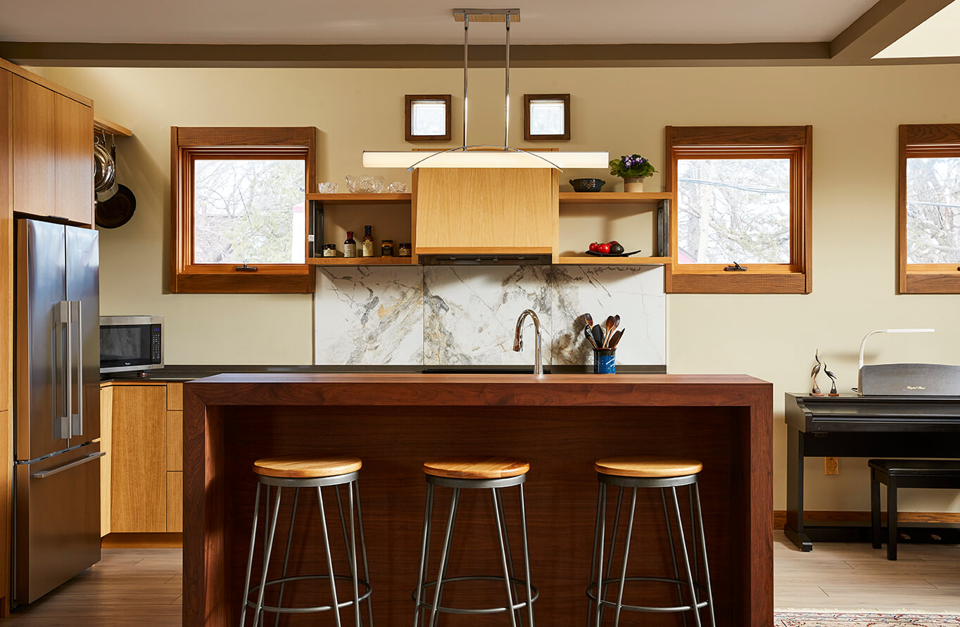
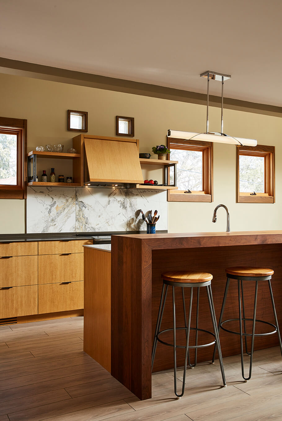
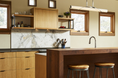
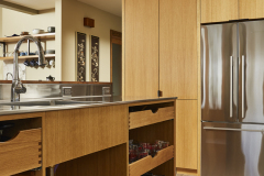
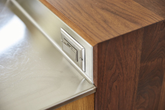
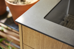
This final solution does swap the kitchen and the dining room spaces and utilizes the existing windows perfectly. The L-shaped plan with a lengthy island keeps the kitchen function well defined and yet completely open to the view and conversations. The island is heavy on function, including: a seamless, integrated stainless steel counter and sink (with built-in drainboard), rollouts that keep utensils at hand, a compost container solution that really makes sense, and an open back – without cabinet doors – that reduce the number of motions the user needs to make. This island is really a little slice of hard-working commercial-style kitchen function tucked into an elegant package.
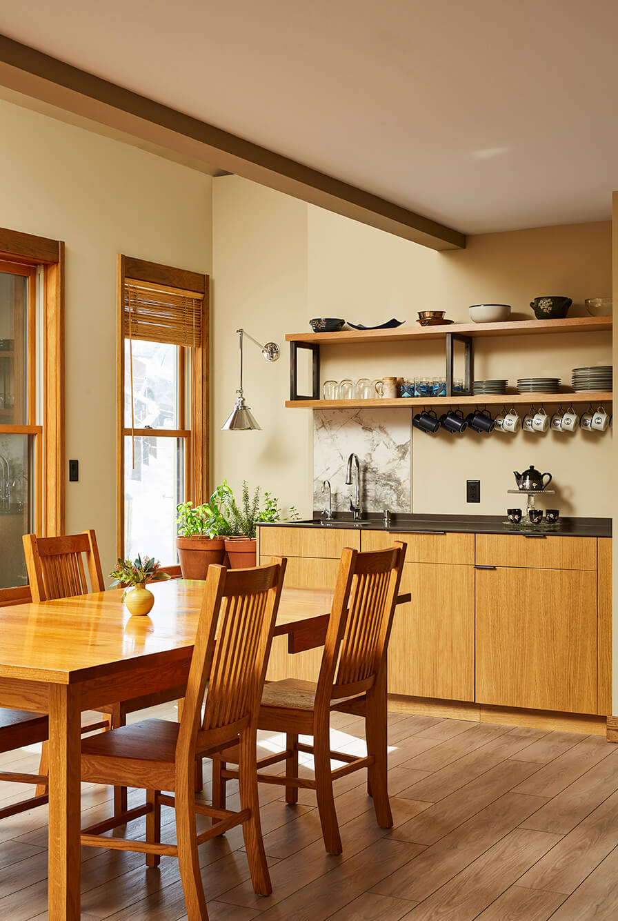
The unified pantry and fridge arrangement keeps these heavy functions out the way and creates a perfect tucked-away space for small appliances (as well pots and pans storage) that is partially obscured from view. The dining room is now in the much-preferred location with easy access to the sun porch. The odd-angled wall in the old kitchen was reworked (by touching the opposing bathroom) to allow room for a second entire workspace – a great coffee and beverage bar. This added benefit also allowed better flow of light from one of the existing, southern windows.
Design Details
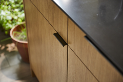
Finishes needed to complement both the existing wood tones and colors of the home as well as the practical sensibilities of the owners. New mixed wood tones integrate with the existing color pallet and bring more warmth to the palette. The smooth panels fit the era and the aesthetic of the rest of the home and really anchor the aesthetic of the great room. The luxury vinyl plank floor gives the easy-care demanded by the owners and will stand up to coming and going from outside spaces. The execution of the details in the modern, clean form, and the ability to make major layout changes with very minimal effect to adjacent spaces, give testament to the commitment of the craftspeople to care and refined work.
At the end of this project, these homeowners were both pleased and excited with the final results; beautiful, balanced and elegant!
Project Highlights
Client Needs
-
- Fix the kitchen! Make it work better (and look better)
- Turn a small, uninviting kitchen into a working one suited to the space and their needs
- High function for both daily use and entertaining
- Get kitchen away from the screen porch to improve flow, circulation and access
- Ability to cook in the kitchen while conversing with guests
- Accommodate two people working in the kitchen together
- 3-season porch more accessible
- Second sink, open shelving, large work spaces
- Light & bright – no more dark & dim
- Compost and recycling solutions
- Remove weird shapes & angles – create a space that made sense
- Ability to enjoy the light and views of the yard while dining/hosting
Functionality
-
- New kitchen layout dramatically improves the plan –makes sense in the context of the great room
- Hardworking, practical and comfortable
- Better connection to dining and living spaces – cook not isolated from guests
- Good circulation
- View of yard & outdoors from kitchen, dining, and living spaces
- New plan is open for light and connection
- Improved circulation means more ease in coming & going
- Kitchen no longer cut off from the main floor, but integrated fluidly
- General illumination and very specific task lighting carefully placed to complement the open feel of the room
- Aging in place considerations – improvements such as removing pinch points, and one, smooth floor
Aesthetic
-
- Warm tones with lots of wood
- Clean lines and modern look
- Elegant yet inviting
- Open and accessible
- Kitchen updated from dark & dingy to bright & inviting
- Open concept and contemporary style owners loved
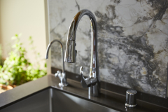
- Stone accent backsplashes provide splash of texture without overwhelming the space
Features
-
- Induction range
- Compost pull-out
- Raised bar at island provides casual dining space while concealing kitchen mess from dining room table
- Hard-working island has intense cooking tools right at hand. Seamless stainless-steel sink and counter can handle serious cooking messes with ease
- “Flip out” hood gives more refined look when not in use and provides excellent ventilation cover when extended
- Coffee bar area provides secondary kitchen work area, entertainment support and needed storage
Craftsmanship
-
- Cabinetry carefully crafted for clean, modern look by local artisan cabinet shop
- Refined functional details of the stainless-steel sink/counter/backsplash – a difficult fabrication and install
- Attending to changes in layout without damaging the living space below – mechanical changes challenging
READY TO GET STARTED?
A better design-build experience awaits. If you’re ready to re-imagine your home,
contact
us today to discover the benefits of an organized, reliable system with
a truly personalized design approach.
- Customized Design |
- Responsive Communication |
- PERSONALIZED APPROACH |
- Expert Results

