Project Details
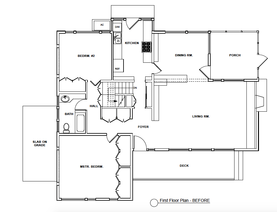
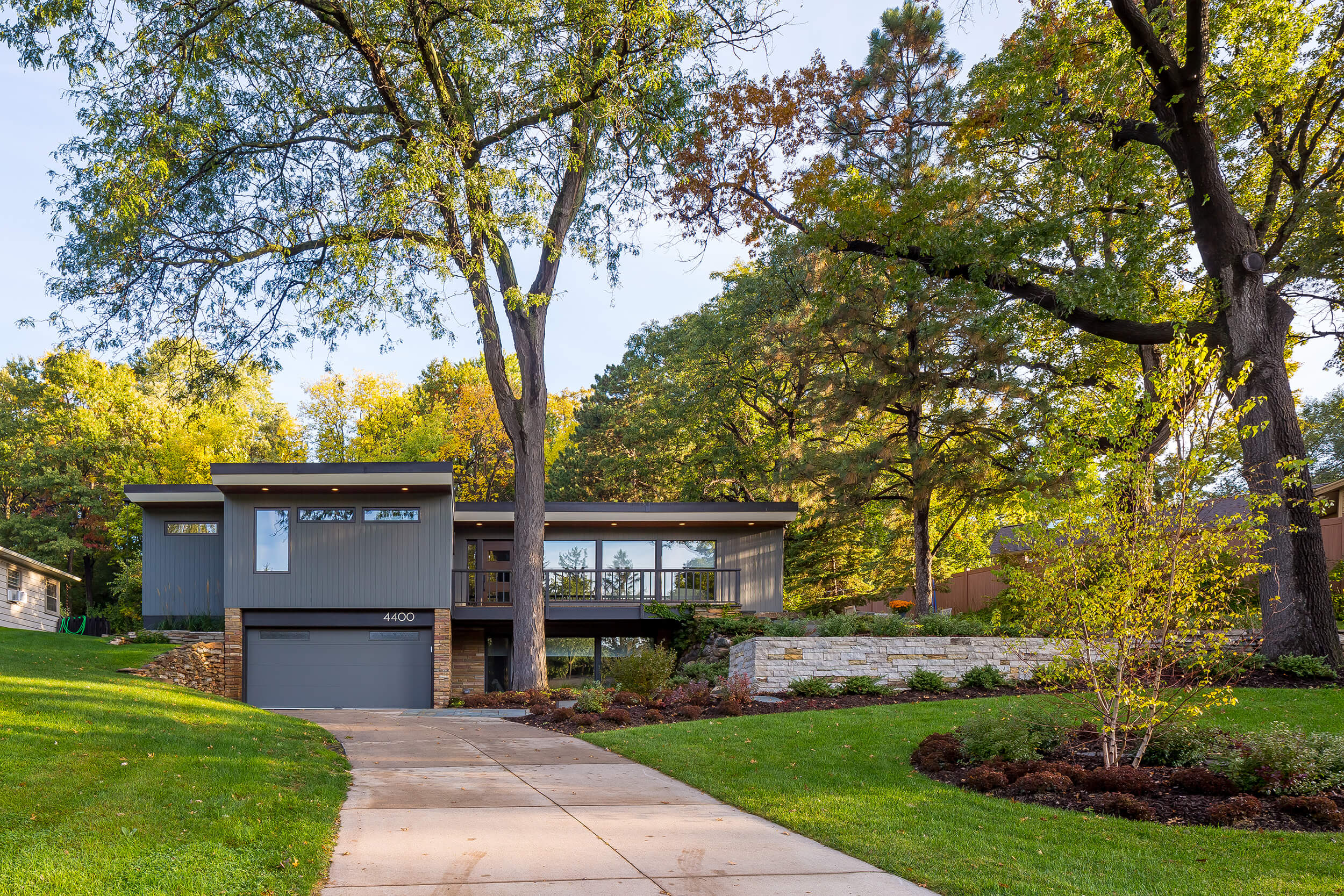
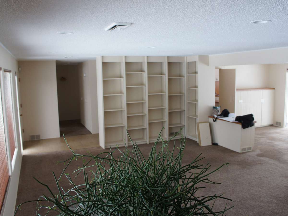
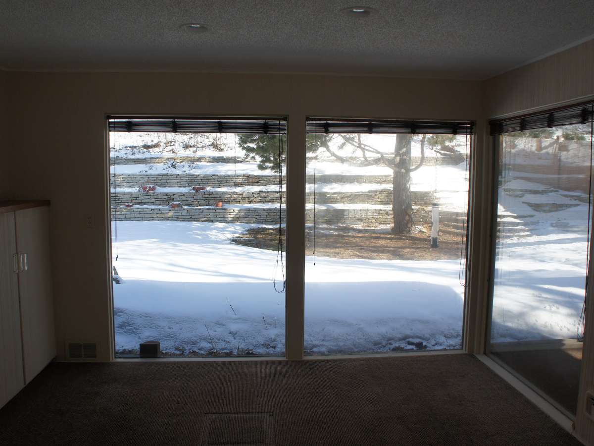
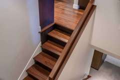
Our retired homeowners were drawn to the compact house size for it’s simplicity of living spaces and the leafy enclave just minutes from downtown and outdoor recreation. The enclosed and divided main living spaces, unresolved alignments of windows in the great room, lack of master bath space, and future plans to add an elevator for aging-in- place needed a solution. And then the dark and cavernous central staircase and hallway…something needed to change.
Click below to learn more about this complete remodel of an aging St. Louis Park modern home.
Homeowners’ Dreams:
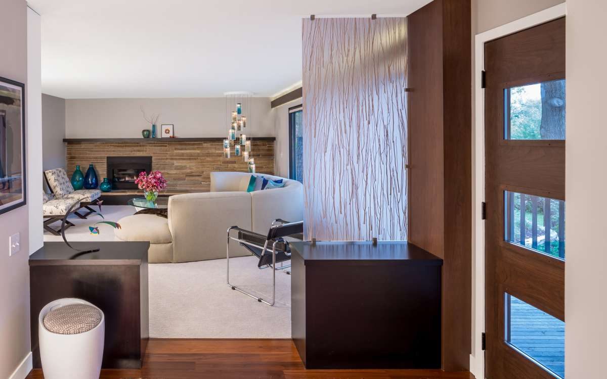
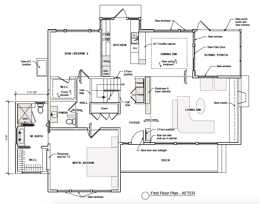
- Open up the rabbit warren of hallways, staircase, and small rooms while creating a greater sense of “entry” at the front door. (And a mail slot drop and cupboard that would receive mail in tidy fashion).
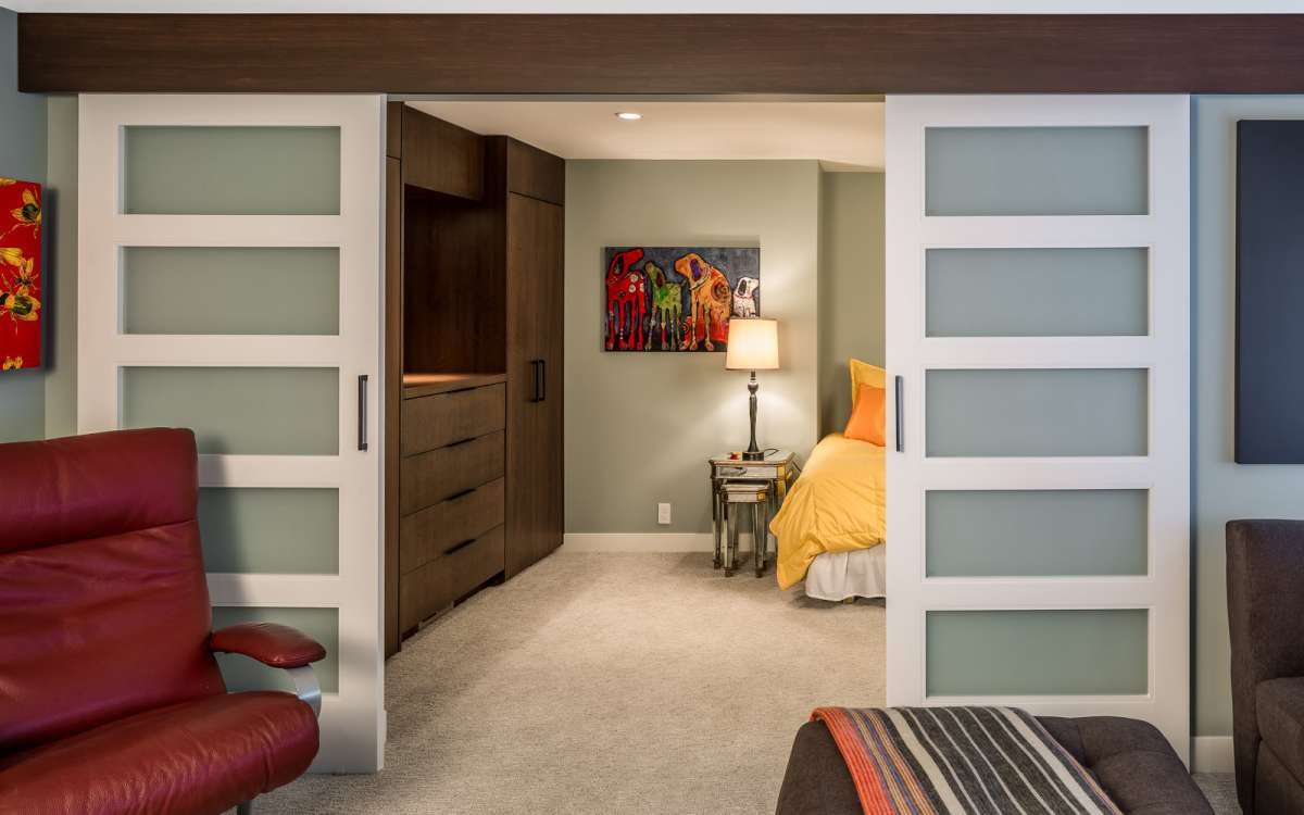
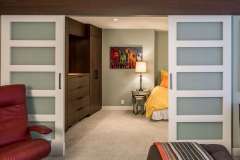
- Mudroom off the garage entrance and a flexible basement guest suite.
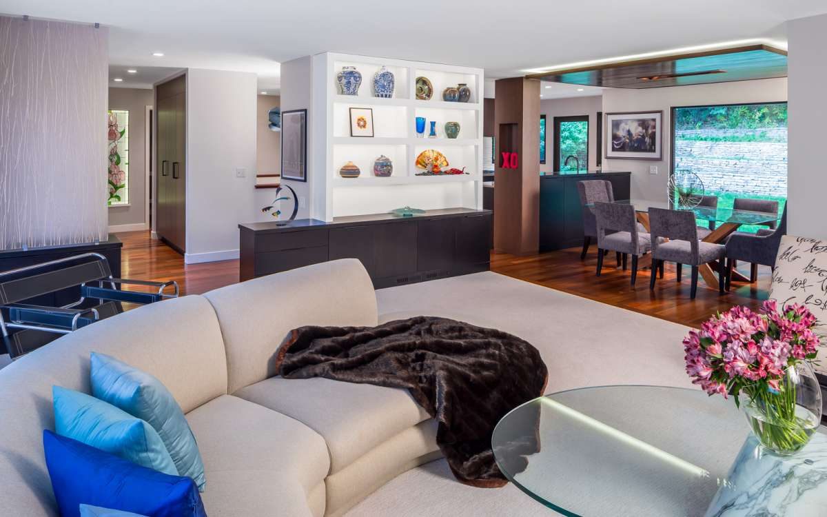
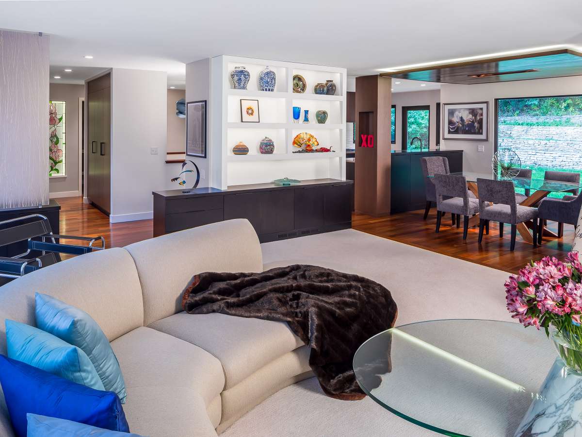
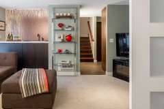
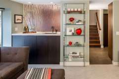
- Display for collectibles and an heirloom stained glass piece.
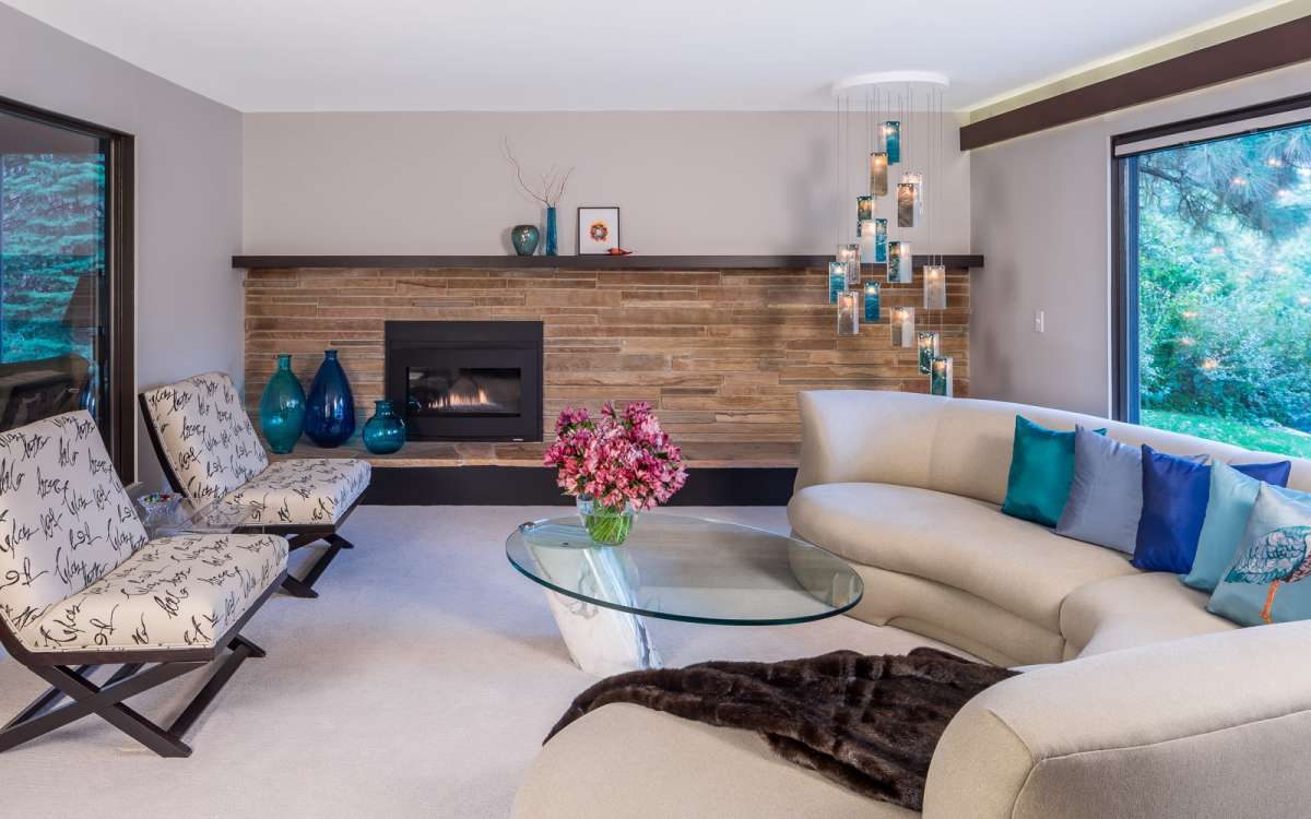
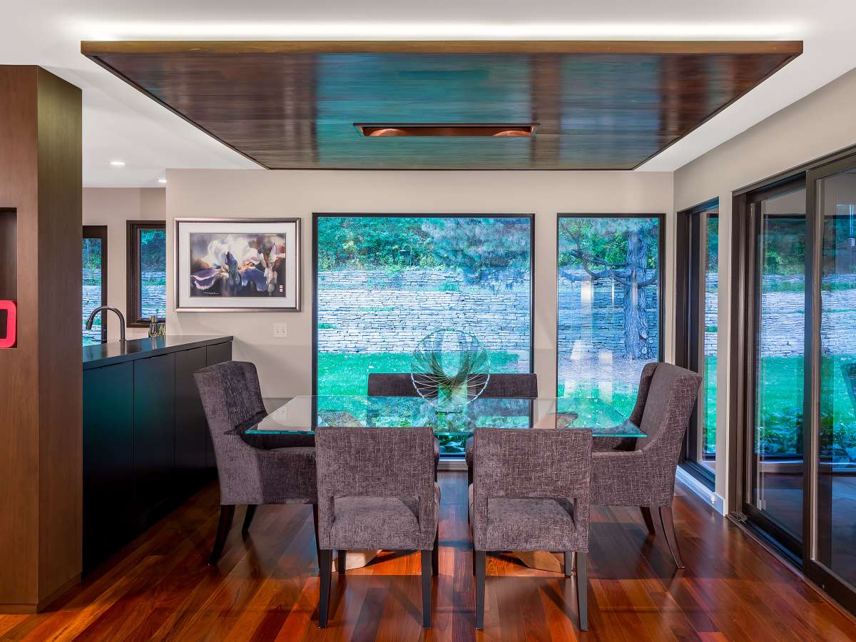
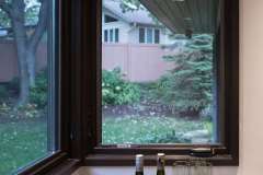
- Unique lighting solutions (no chandelier to obstruct the backyard view).
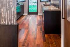
- Thoughtful material use adding texture, warmth, a sense of plush, modern comfort but preserve the stone exterior accents and fireplace (and able to stand up to 100 lb. dogs!)
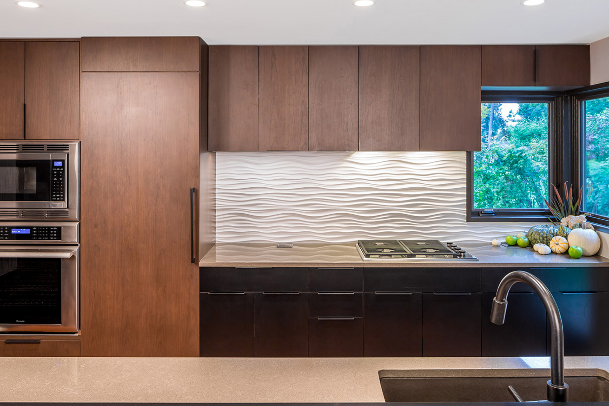
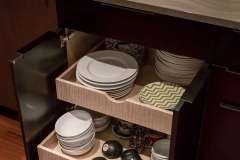
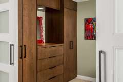
- Closets, pantry, and freezer off the kitchen and entrance that are unobtrusive and clean-lined.
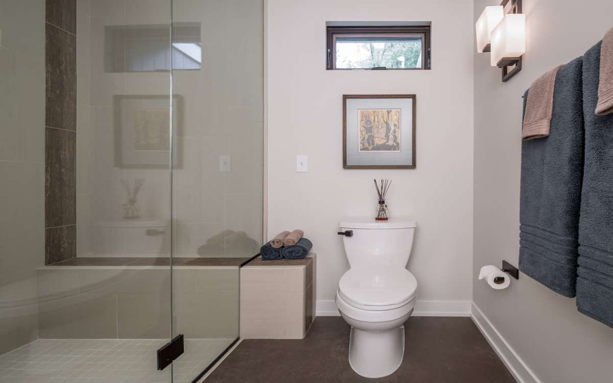
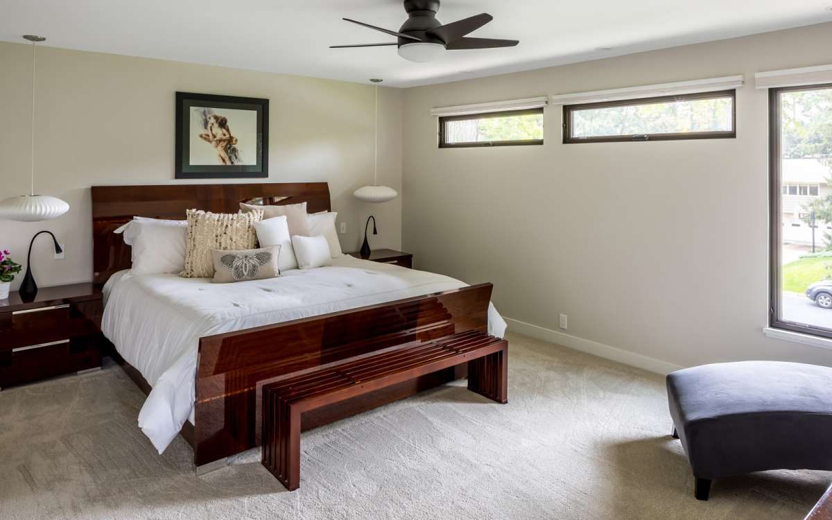
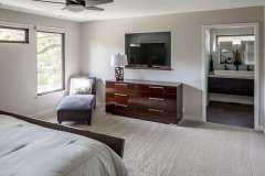
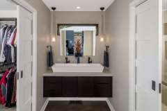
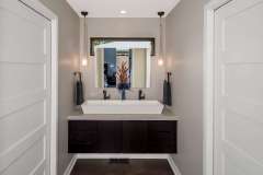
- New master bedroom closet and bath.
- Area for future elevator.
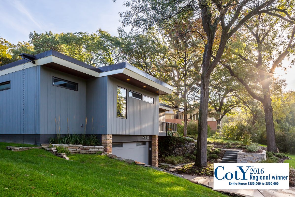
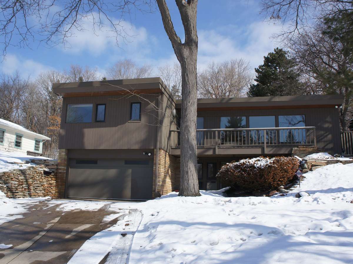
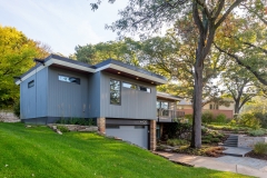
- Restore exterior finishes including the redwood soffits and vertical cedar siding and add rain chains and a new entrance approach.
Unique challenges:
The flat roof, held up by an awkward room-dividing beam between the living and dining room, had a significant sag and required an engineered solution that allowed us to recess the beam and improve the thermal performance and drainage plane of the roof. The floor joists had also developed a significant sag that required a new beam (located between the mudroom and downstairs stair hall) and jacking up the floor that was over 3⁄4” out of level over 6 feet.
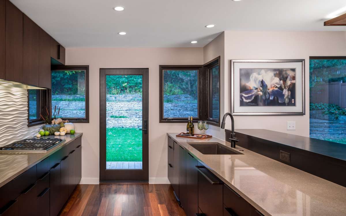
Vents, windows and ductwork were haphazardly planned in the original home and needed “rationalization” (the homeowners description). We prioritized which alignments we would correct (front window and back windows across the dining/living room) and still aesthetically-accommodated for areas where the budget would not allow corrections (the kitchen door alignment off the central hallway).
READY TO GET STARTED?
A better design-build experience awaits. If you’re ready to re-imagine your home,
contact
us today to discover the benefits of an organized, reliable system with
a truly personalized design approach.
- Customized Design |
- Responsive Communication |
- PERSONALIZED APPROACH |
- Expert Results

