Project Details
The phone call was unexpected. “We think we need to start now.”
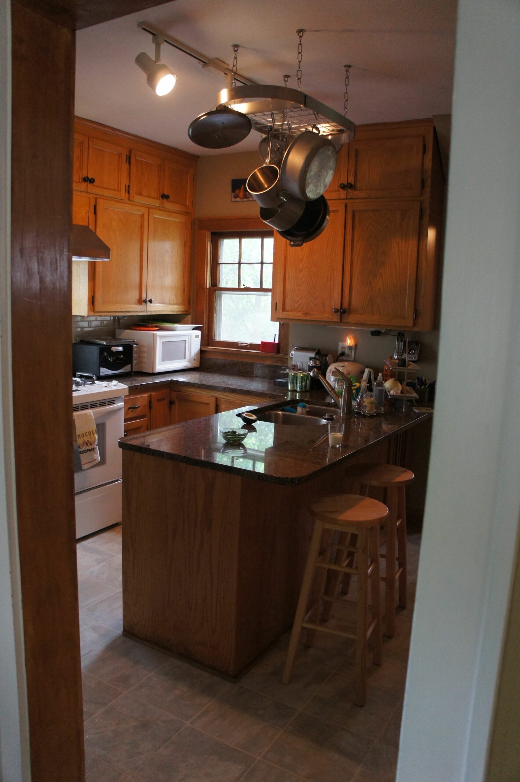
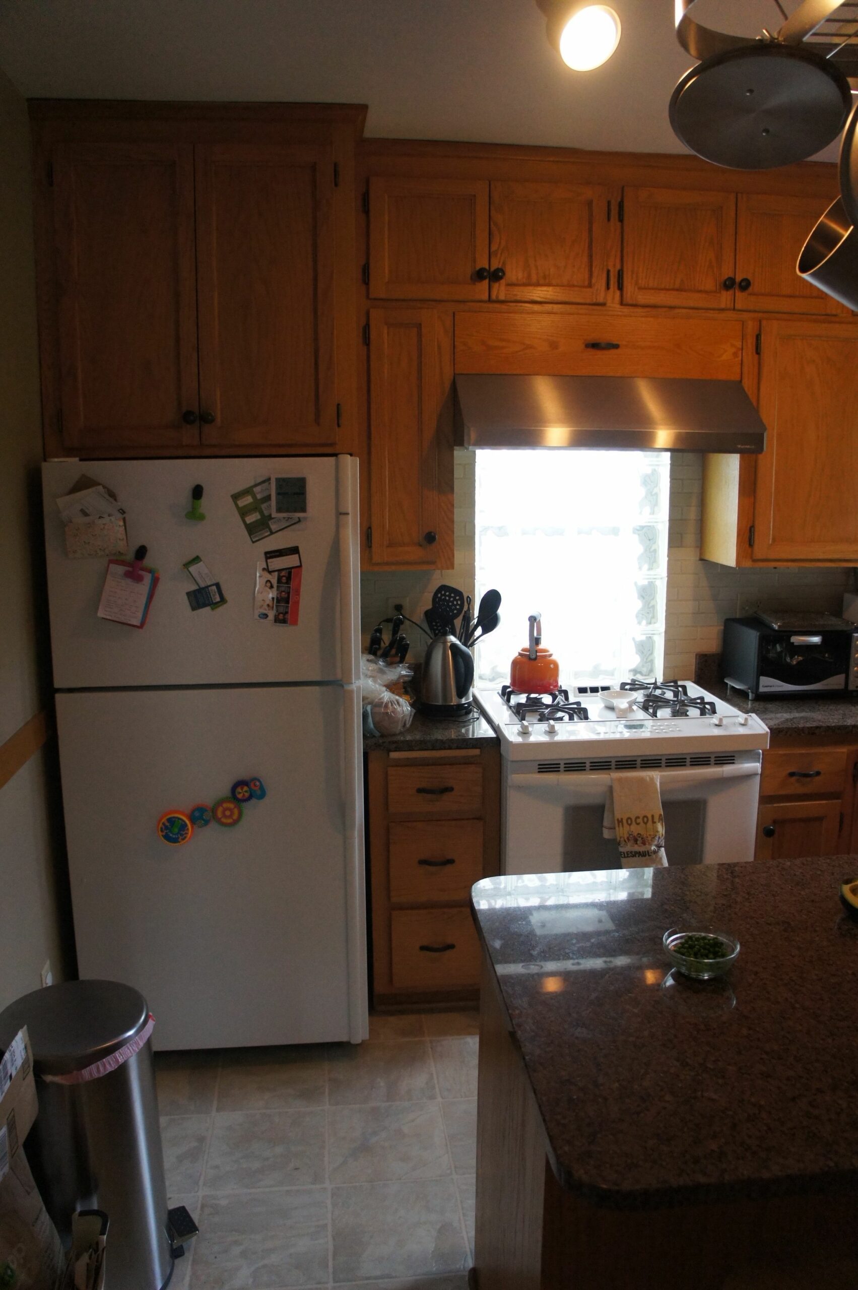
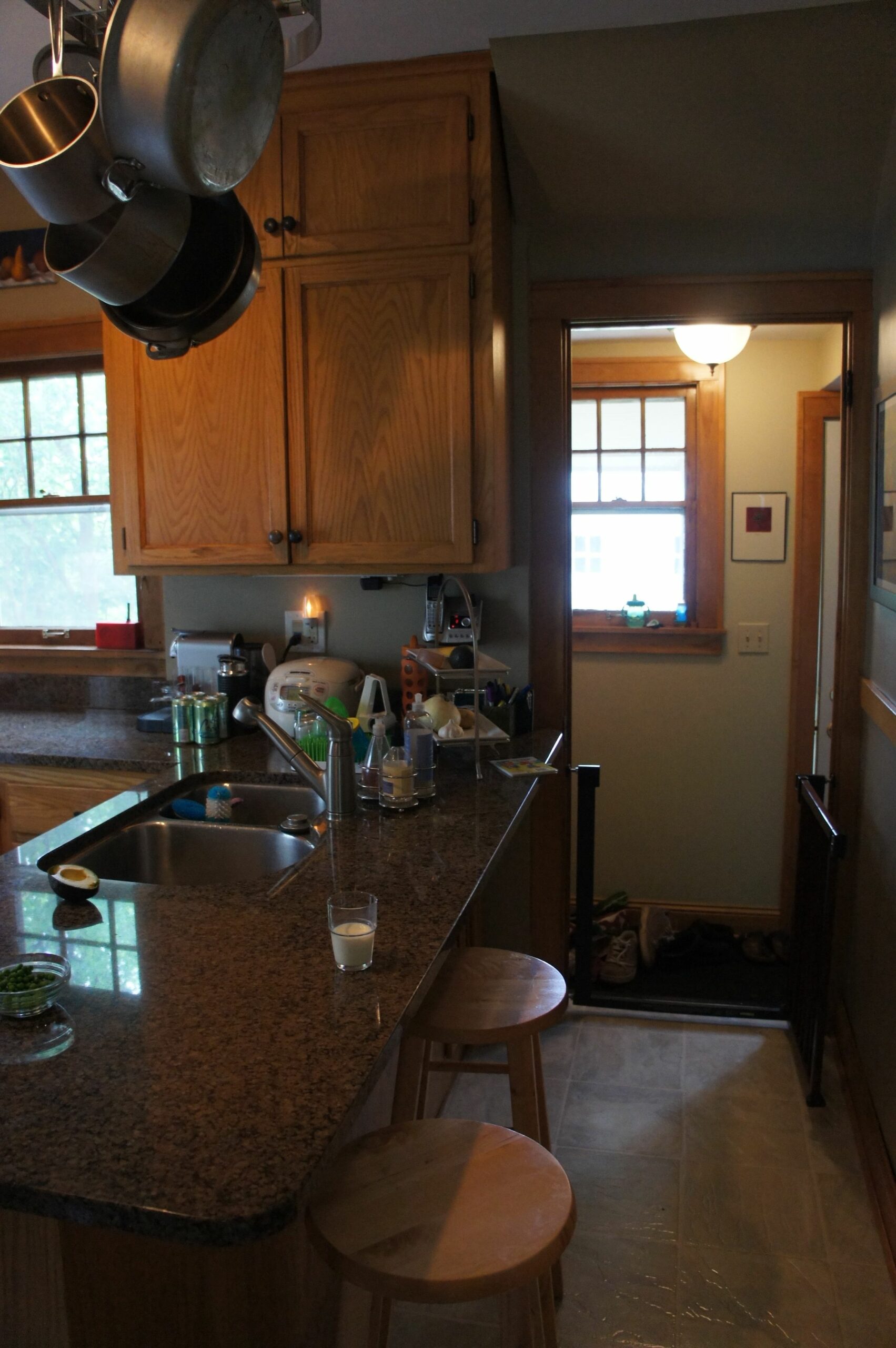
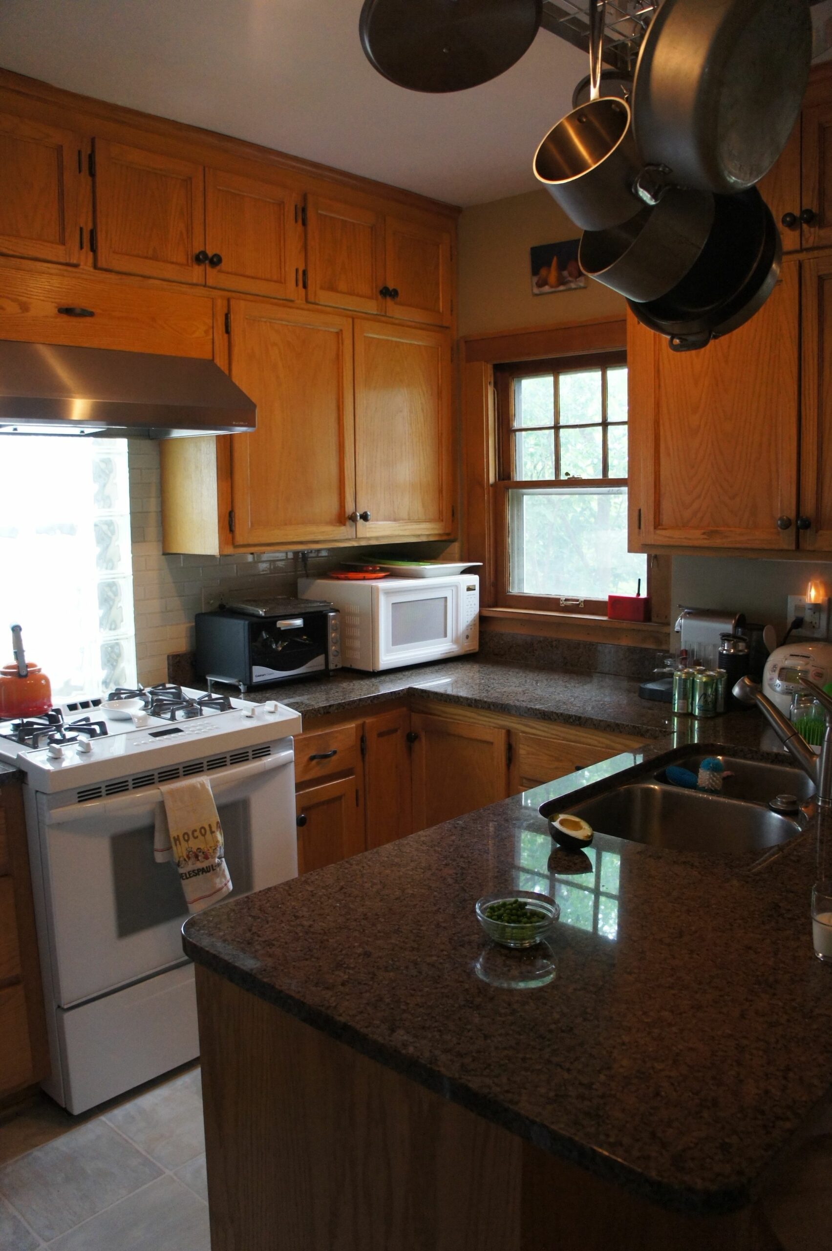
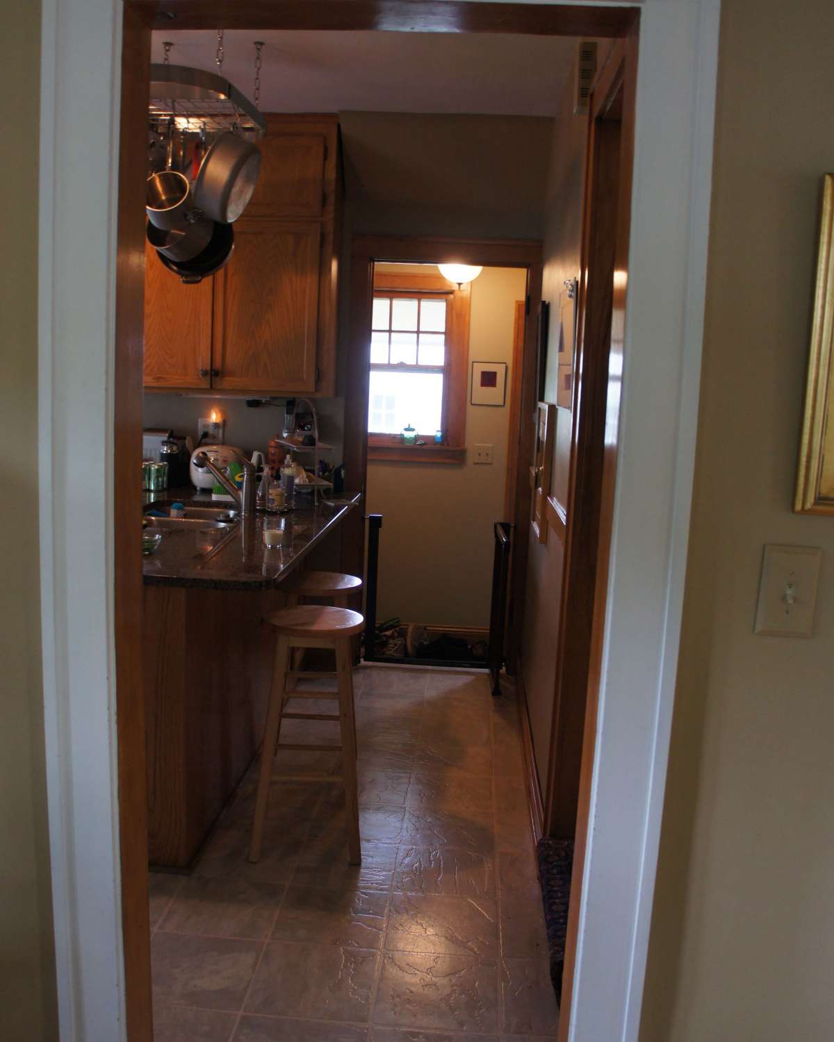
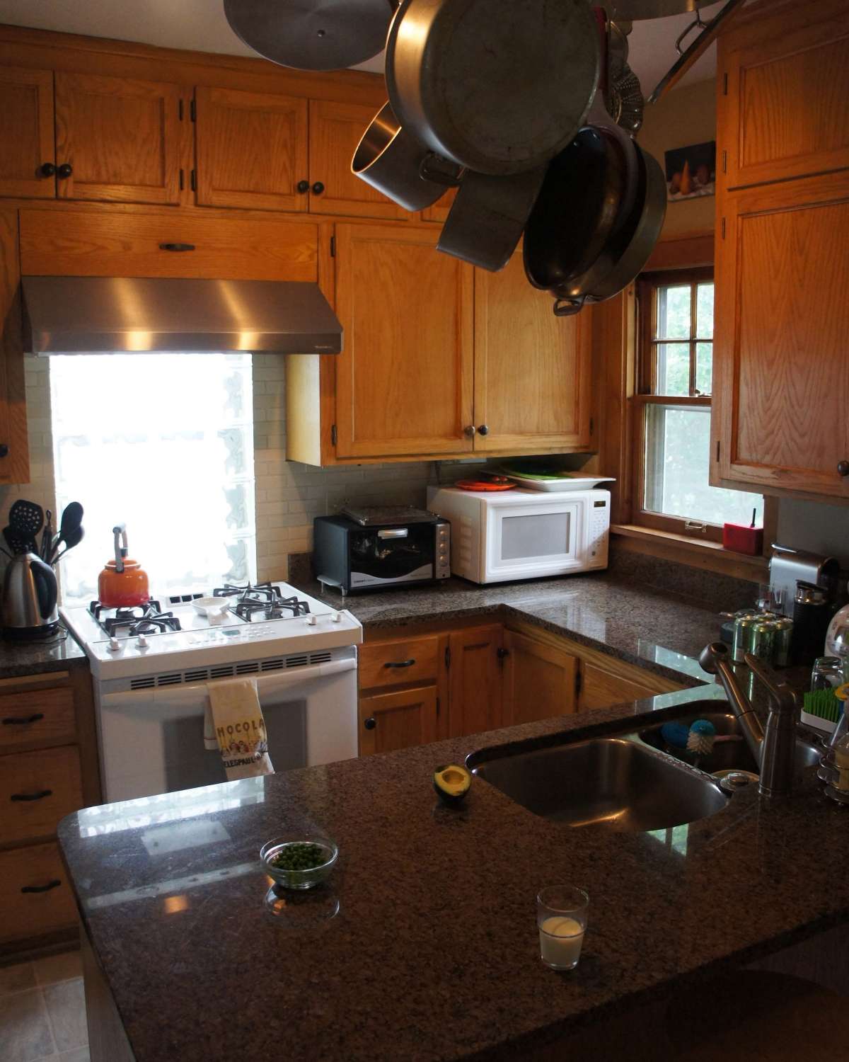
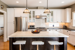
We had been developing some preliminary design concepts for the young professional couple when they decided to put the project on hold while awaiting the birth of their second child. Two weeks after the baby came home it was clear that the cramped kitchen and lack of first floor play space and mudroom needed to change.
Click below to learn more about this Twin Cities kitchen addition.
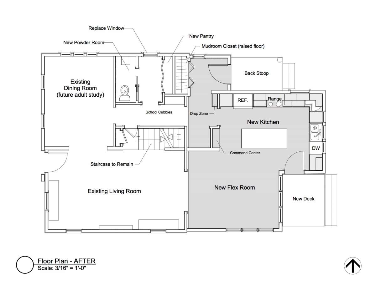
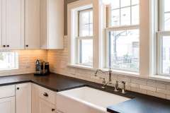
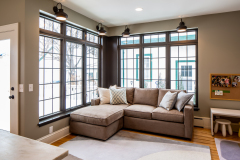
We fast-tracked the design process in order to start construction as quickly as possible. The program was challenging–expanded kitchen, a flex room that could serve as a play/family room while the kids were young and then become a dining space when they were older, a future basement teen retreat space, a mudroom, better access to the backyard, powder room, storage, and all under a roofline that would not block existing second story windows or the neighbors gardens from sunlight. And the staircase had to stay.
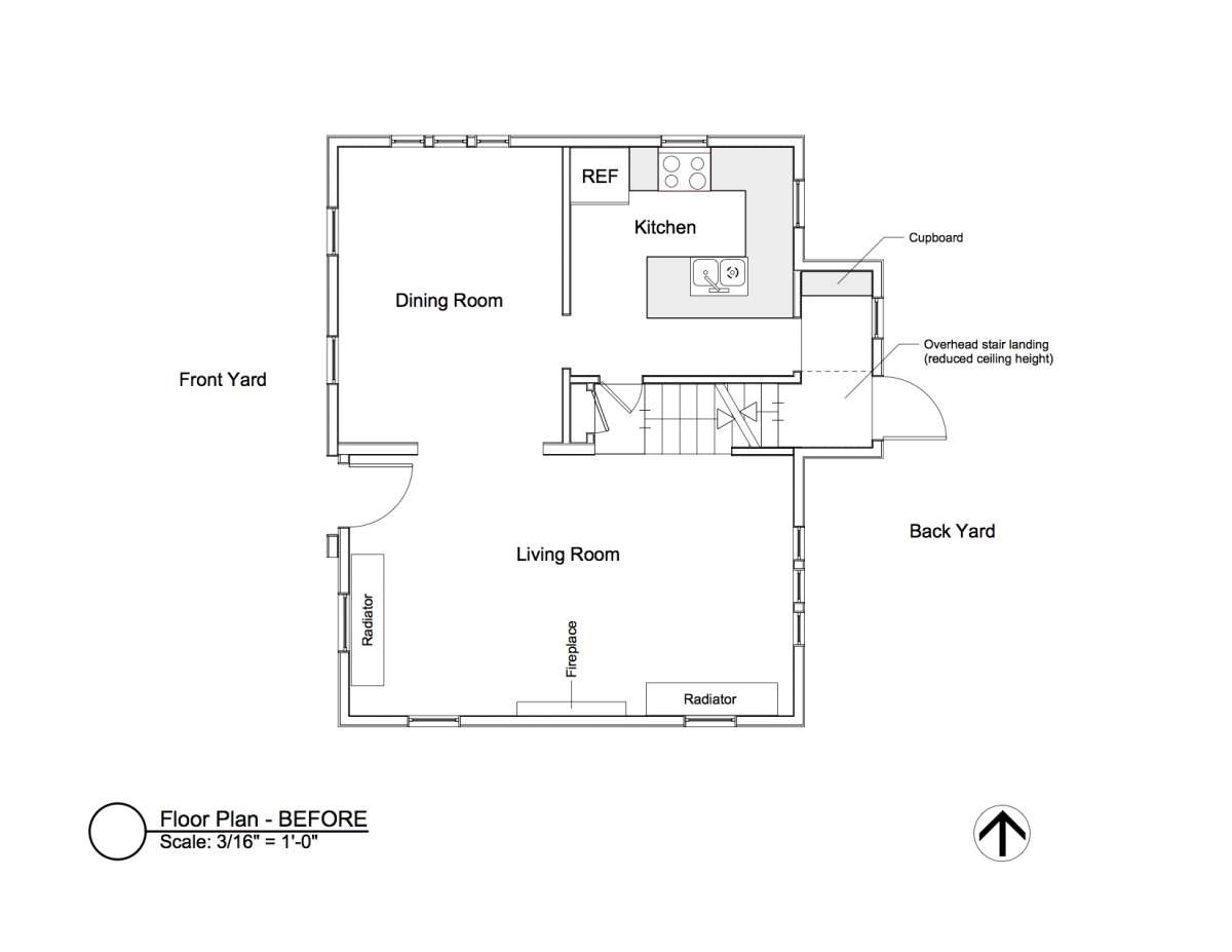
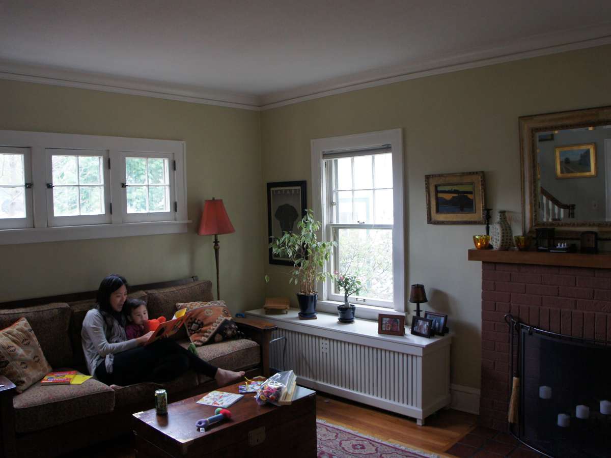
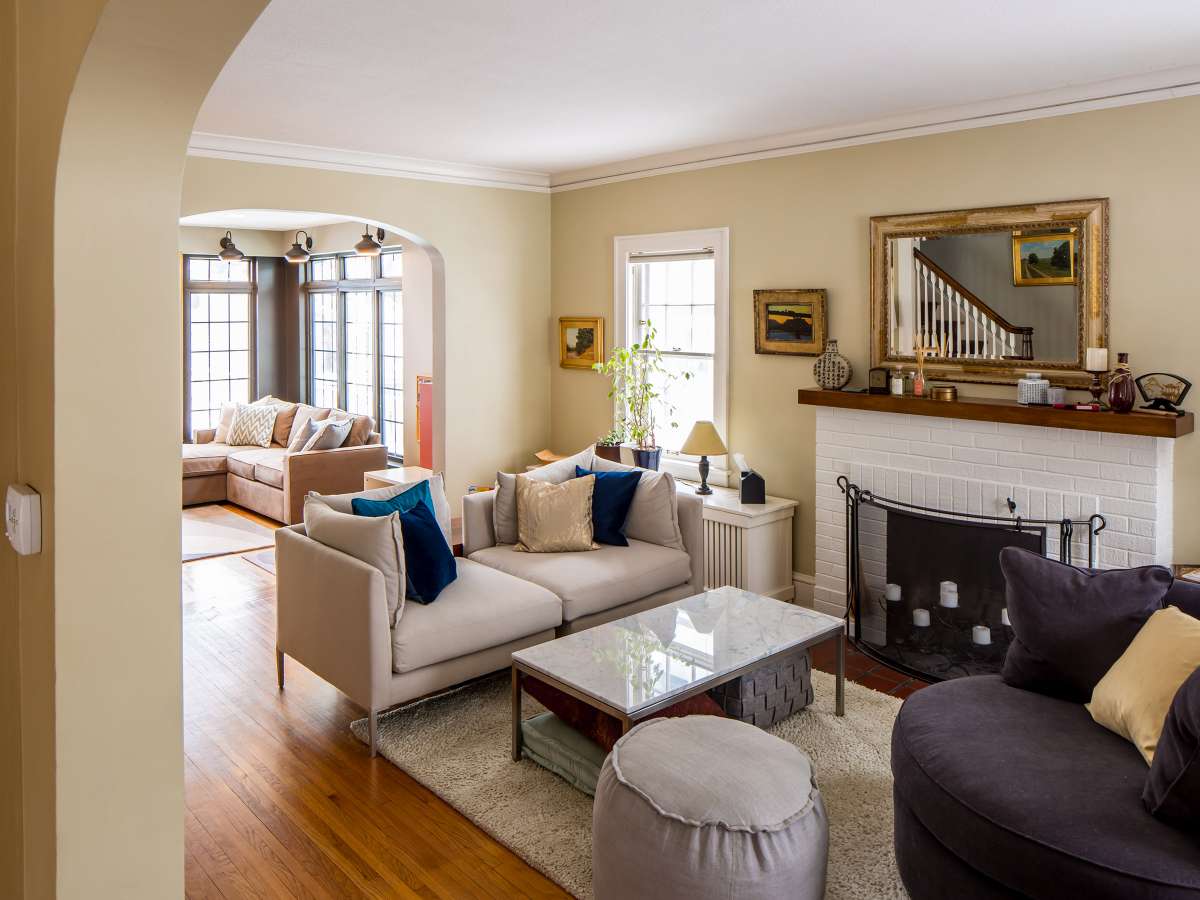
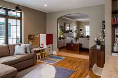
The staircase was the first challenge. The stair bumped out of the main envelope of the house and had very tight head clearance under it. As a major connection to the addition, this “pinch point” needed careful consideration. When the homeowner suggested that they liked the idea of some separation between the existing living room and the “flex” room, we decided that a level change could solve two problems (But, it did complicate the desire for a full basement, teen-retreat under the addition).
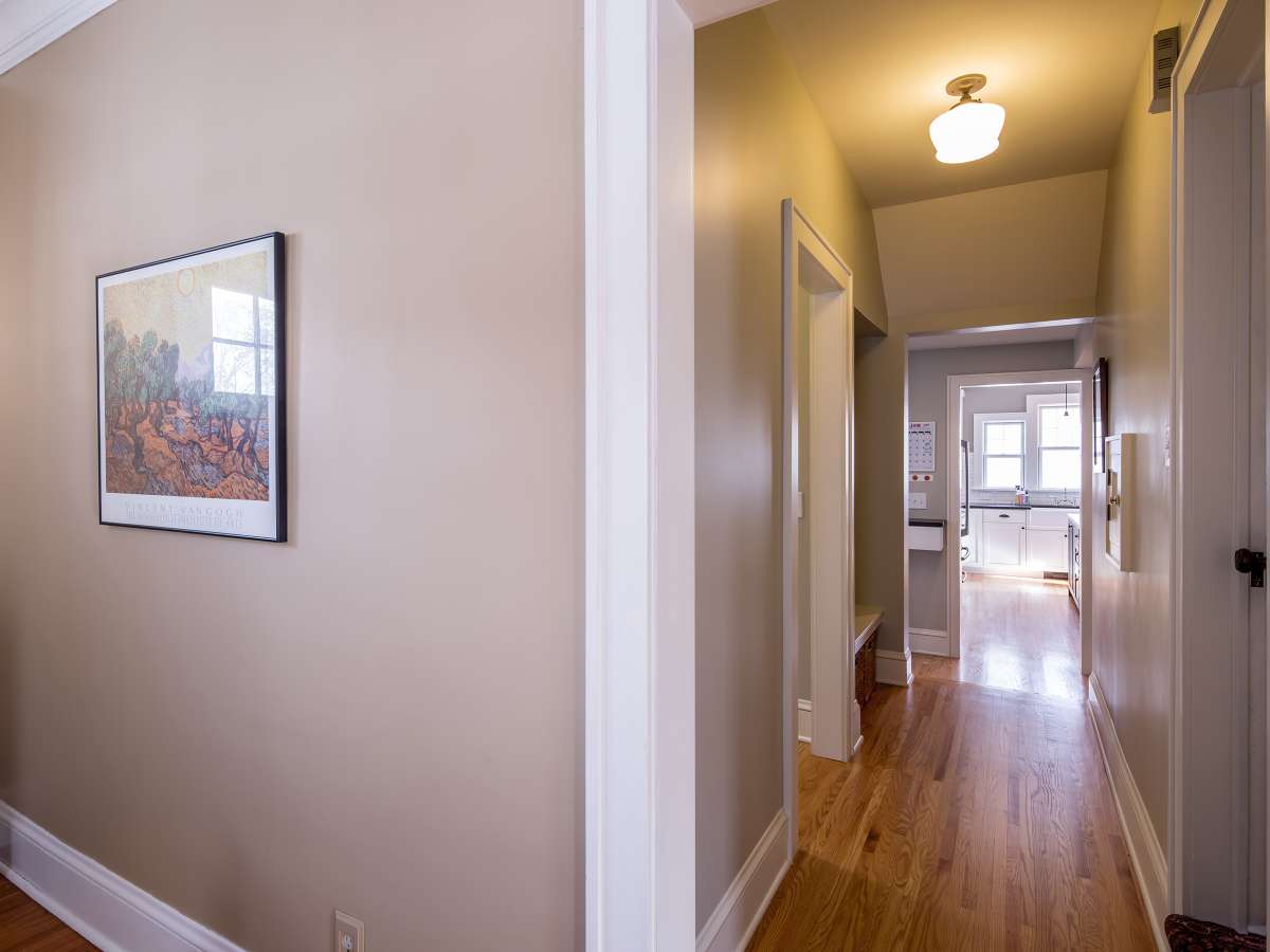
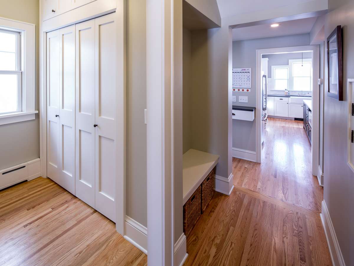
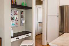
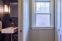
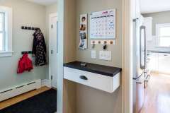
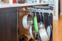
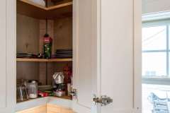
The existing kitchen was repurposed as part of a utility core with a powder room, storage, and home organization features adjacent to the new mudroom. The dining room will retain its current purpose until the children are older (and wanting to play away from mom and dad) when it will become an adult study/library and the “flex” room will become the primary dining space.
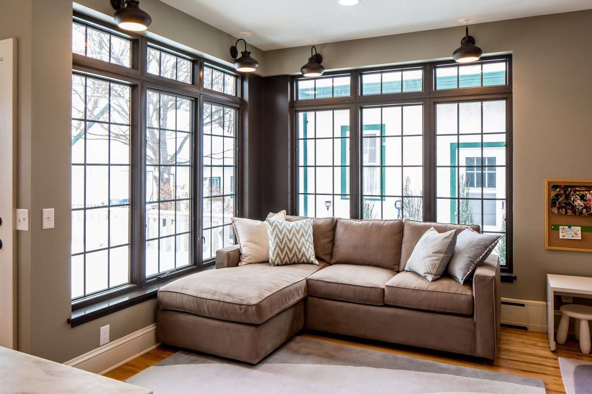
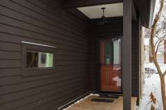
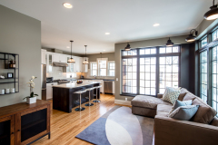
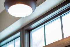
The homeowners wanted a design that felt modern and loft like, while maintain a clear dialogue with the existing house. They were also eager to get more southern and eastern light in to the home and to increase the connection to the outdoors. Factory style windows were on the wish list, but price and energy efficiency concerns led to a clever innovation. Standard pre-finished Pella windows were set in to special trim-less returns that were color matched to the bronze color. The look is reflective of factory windows at a fraction of the cost and with high performance glazing.
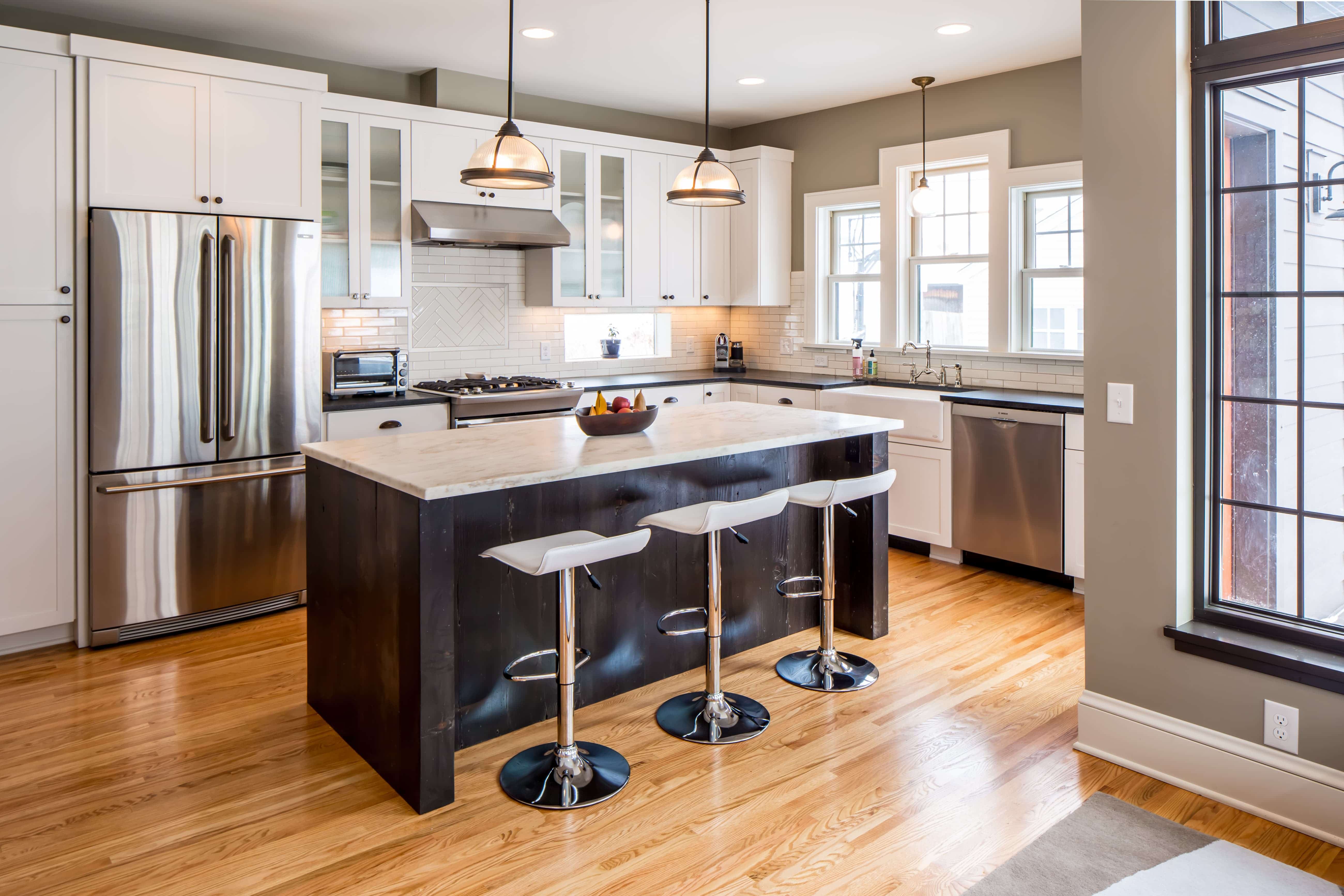
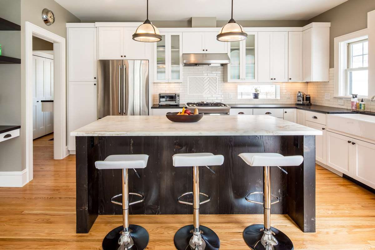
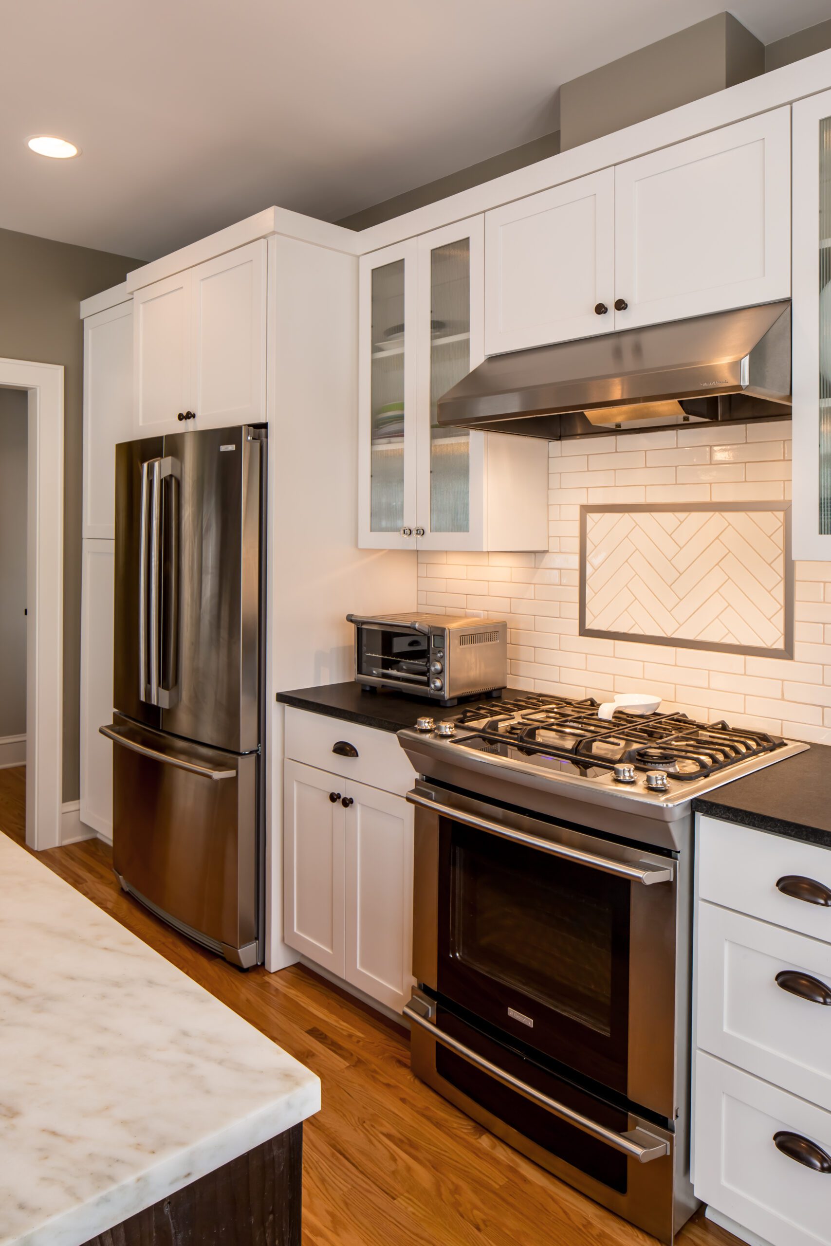
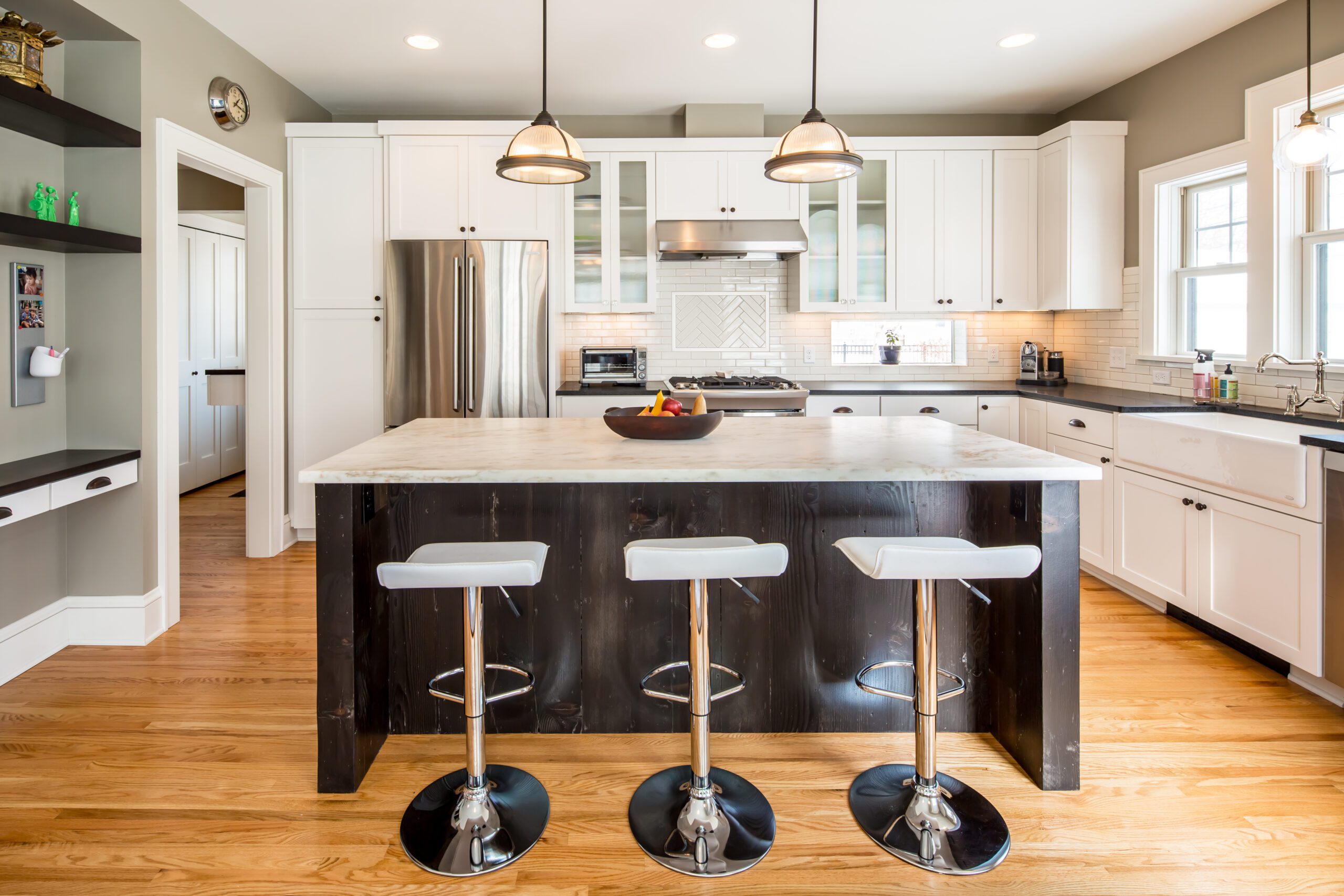
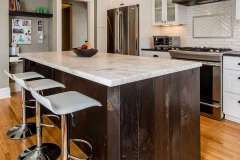
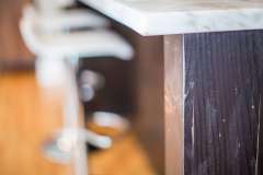
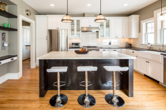
The kitchen has a special secret. The rustic, dark stained island was built from the old growth, wide fir boards uncovered when the exterior stucco was removed. It is a favorite gathering place for friends and family, and connects the old to the new
Key Client Needs
- Kitchen and Flex Room that could adjust to changing family needs. Mudroom, powder room, and future “teen retreat.”
- Modern exterior feel that respected existing house and neighborhood aesthetics and sun access.
- Extensive eastern and southern glazing.
- Kid friendly spaces with an adult feel.
- Low VOC materials, efficient construction, reuse of materials and space.
READY TO GET STARTED?
A better design-build experience awaits. If you’re ready to re-imagine your home,
contact
us today to discover the benefits of an organized, reliable system with
a truly personalized design approach.
- Customized Design |
- Responsive Communication |
- PERSONALIZED APPROACH |
- Expert Results

