Project Details
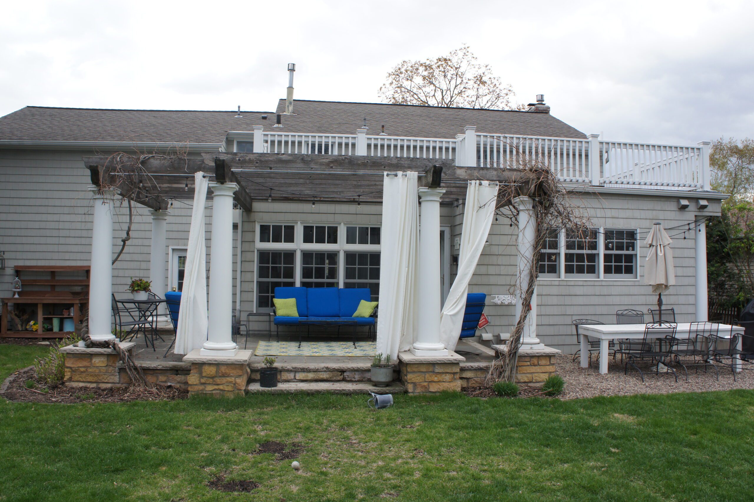
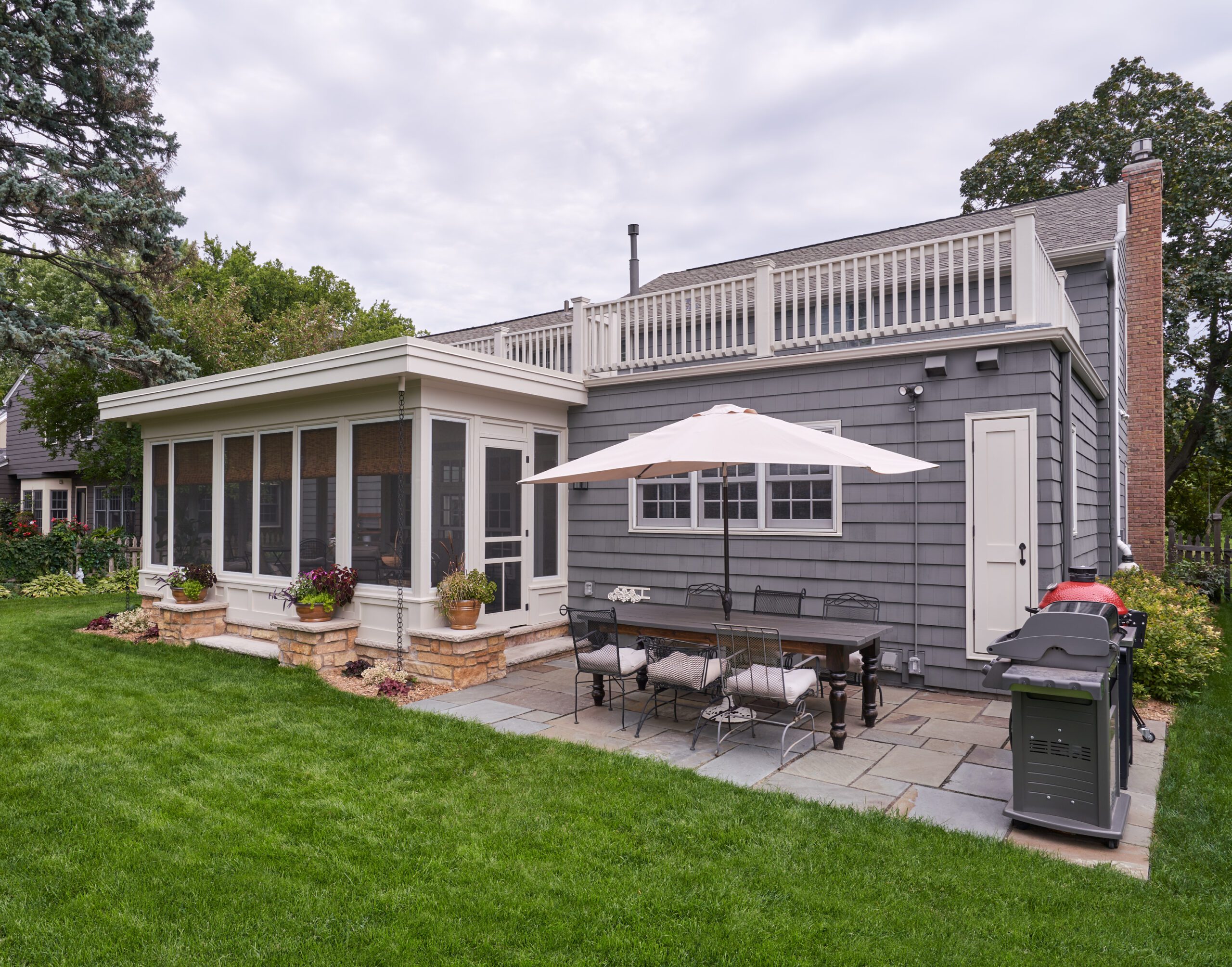
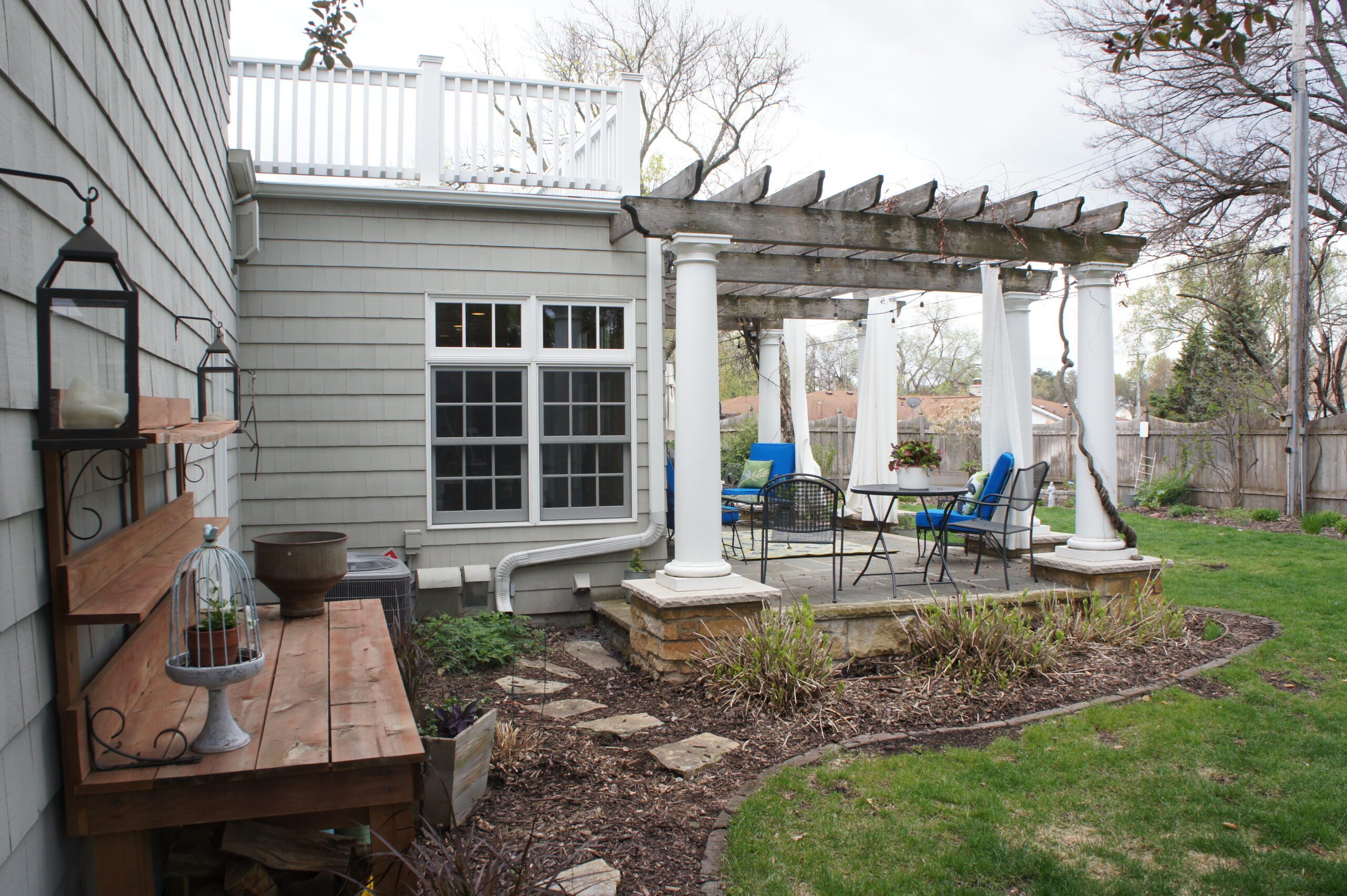
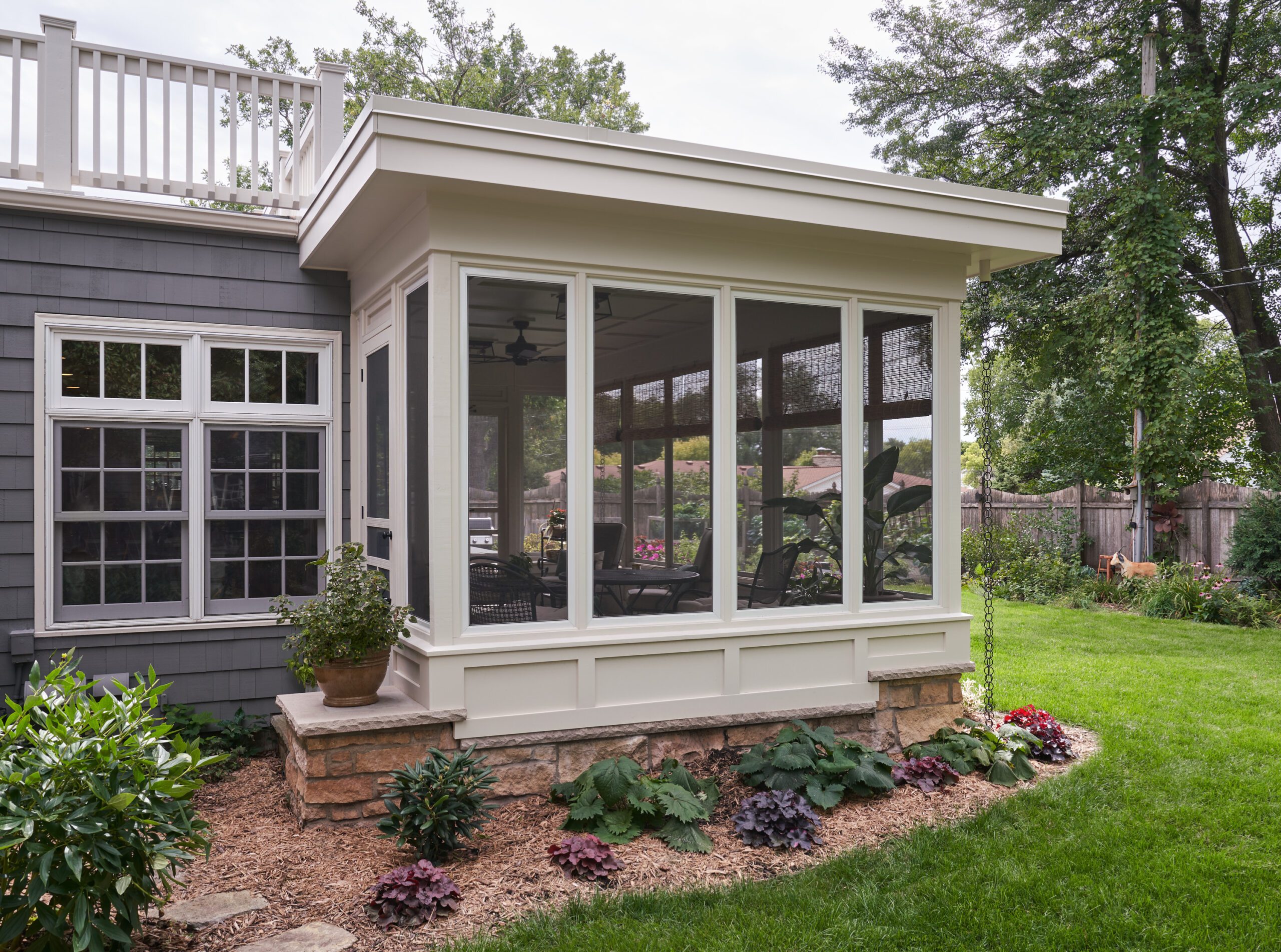
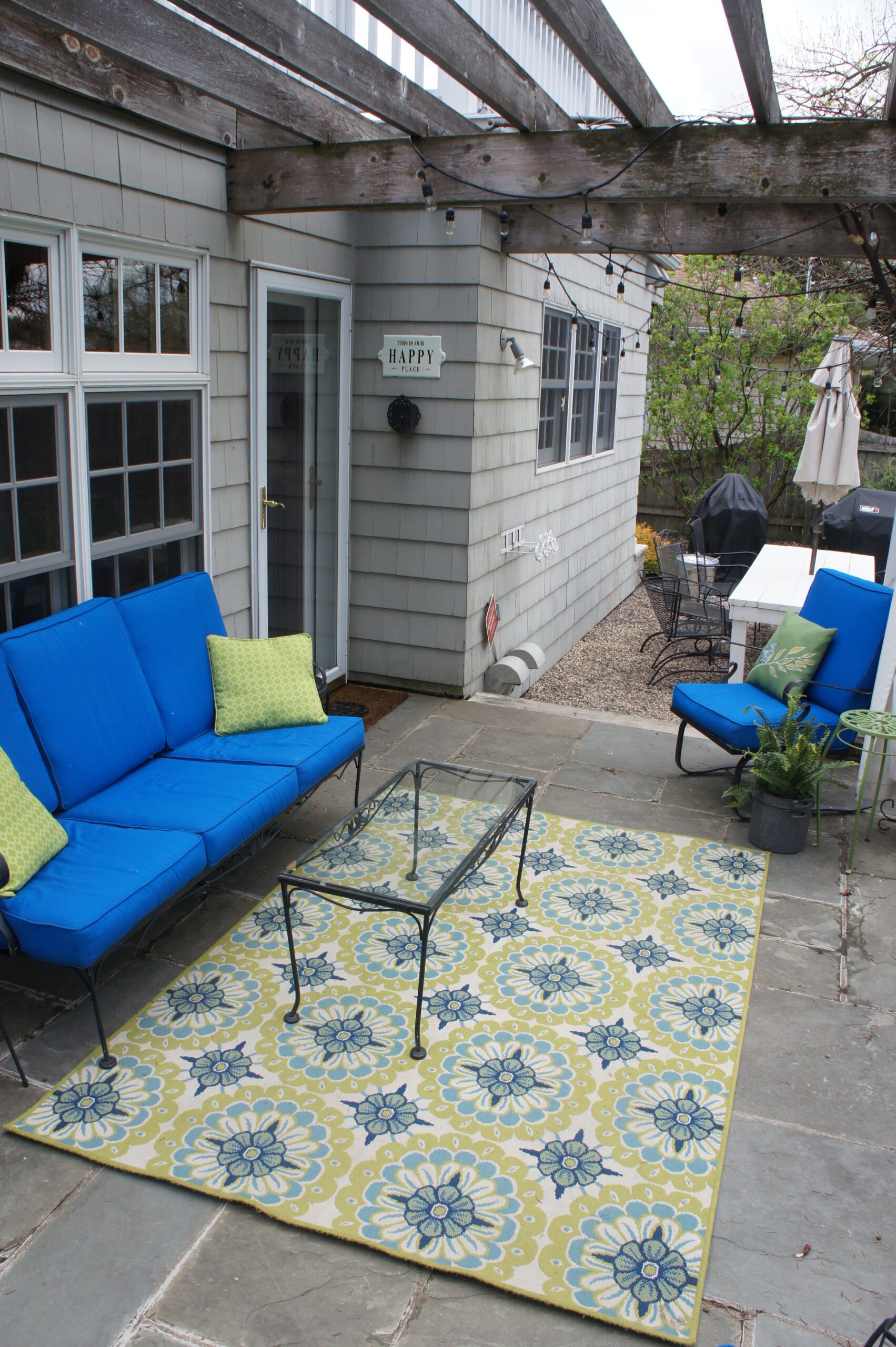
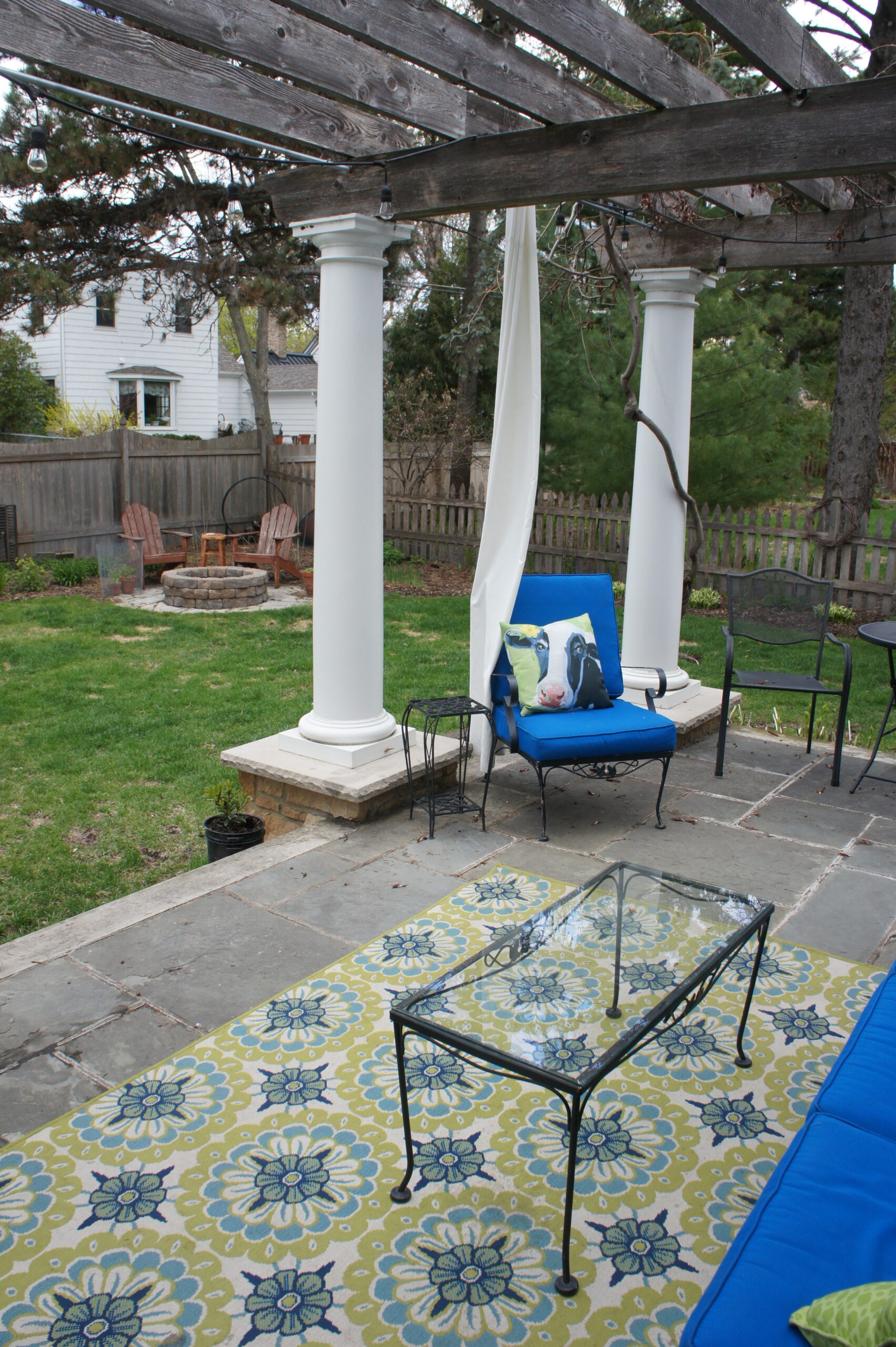
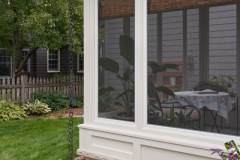
A busy family dreamed of a space to enjoy fresh air while reading, eating, or entertaining friends. Removing the rotting pergola while retaining the limestone column plinths and bluestone terrace was the starting point of creating this cozy screened-in oasis. The existing stone base is topped with 3-layers – a paneled wall base, custom-sized screens, and classically-detailed flat roof. Incorporating the existing into the new presented many construction challenges but creative planning of openings, circulation, and the roof structure used these constraints as assets in the final composition. This porch has become a family-favorite for enjoying nature’s beauty in bug-free bliss.
Click below to learn more about this St. Louis Park screened-in porch addition.
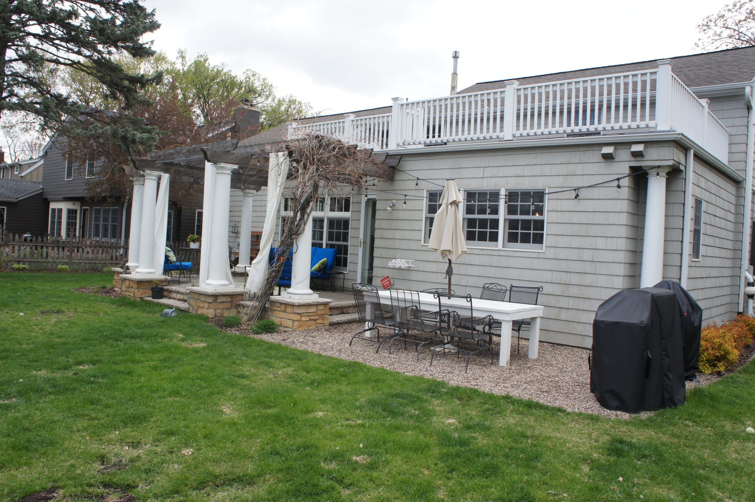
A busy family of five sought to reimagine the exterior of their traditional, colonial-style home after previous owners had adorned it with a plethora of Greek-revival columns and outdated gingerbread trim. A key piece of this redesign was transforming the rotting, vine-covered pergola atop a bluestone and limestone terrace into a cozy screened-in oasis from which to enjoy their backyard in bug-free bliss. Their dream was to create a space where they could enjoy the fresh air while reading, eating, or entertaining friends.
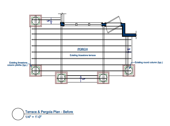
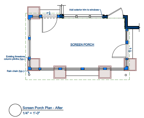
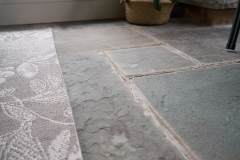
To mitigate cost and disruptions to the backyard, it was decided to reuse the limestone column plinths and bluestone terrace for the porch. Fortunately, the terrace was built with appropriate frost footings. Unfortunately, this created the challenge of incorporating this terrace/ pergola base into a new porch plan regardless of its misaligned nature. The main central steps of the terrace were abandoned to make less circulation and more habitable space within the porch. The steps to the south and east were retained and used as the locations of the primary exits – one to the adjacent ground-level bluestone patio and the other toward the garage entrance.
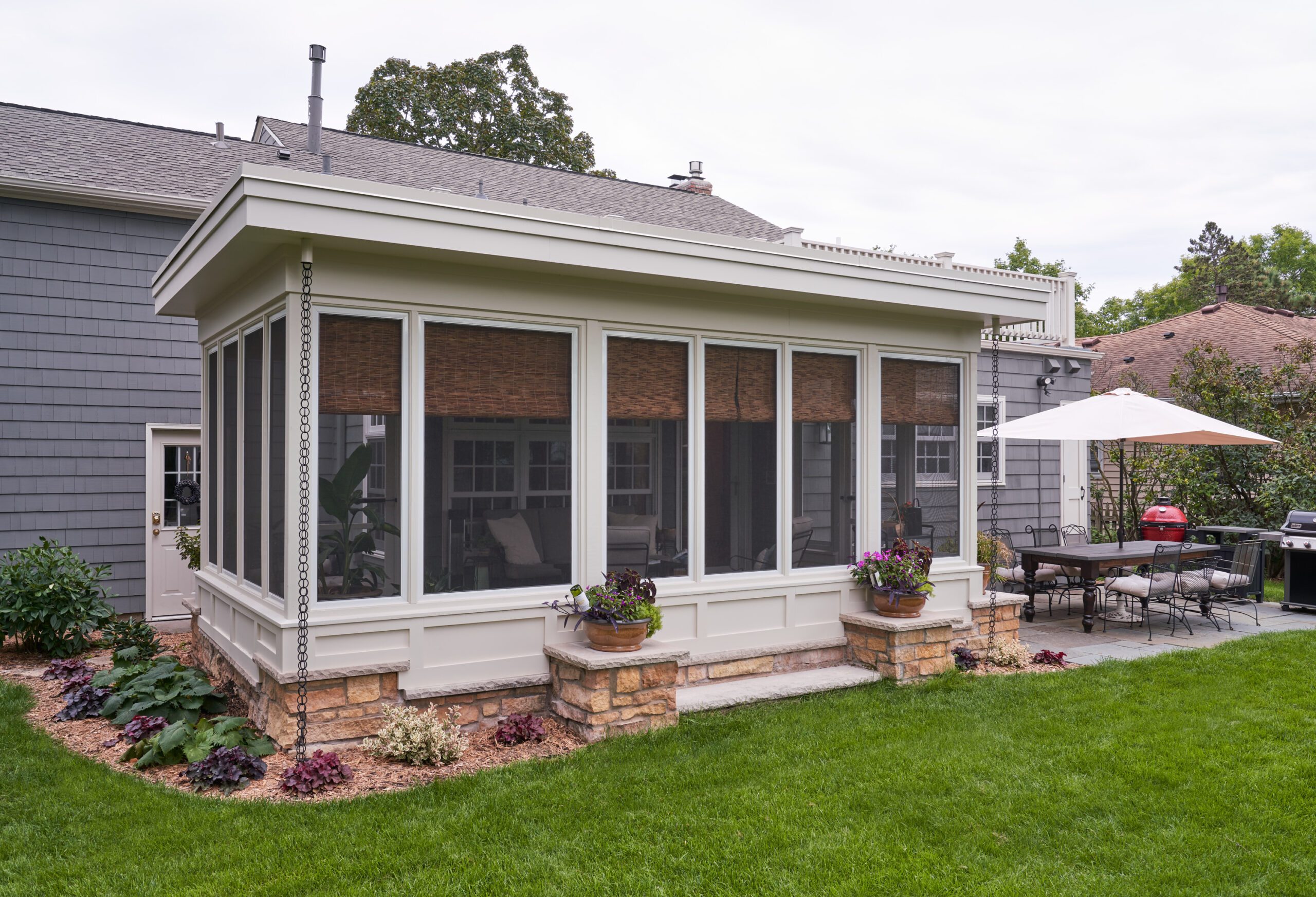
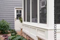
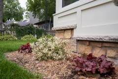
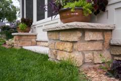
As mentioned above, the existing large, square stone column plinths needed to be incorporated into the logic of the wall placement, yet since it was built as an exterior masonry installation, their placement and alignment accuracy was not ideal. The design incorporates parts of the plinths into the wall planes developing a rhythm of the screen openings that coordinates with the plinth positions. The limestone caps were cut back and/or notched to receive the walls, framed between each bearing on the limestone border of the terrace floor. The lower part of the walls was thickened and brought to a level just above the plinth height. A paneled system, echoing the screen openings above, helped to create a symbiotic relationship for the design. Wider mullions between screens where the previous columns had been, aided in this. The screen panels are custom-sized, and aluminum-framed, allowing them to be easily removed and repaired as necessary.
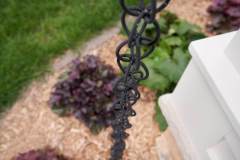
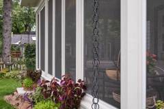
Overhead, the roof system had to allow for maximized ceiling height in the porch, yet also tie in below the existing flat roof of the previous addition. This constraint required shallow 2×8 roof framing. The roof details include a TPO membrane roof, built-up frieze, and a sloped drainage scheme leading to two decorative rain-chains in the outside corners. This detail eliminated the need for a clunky downspout and added a more delicate and desirable visual component.
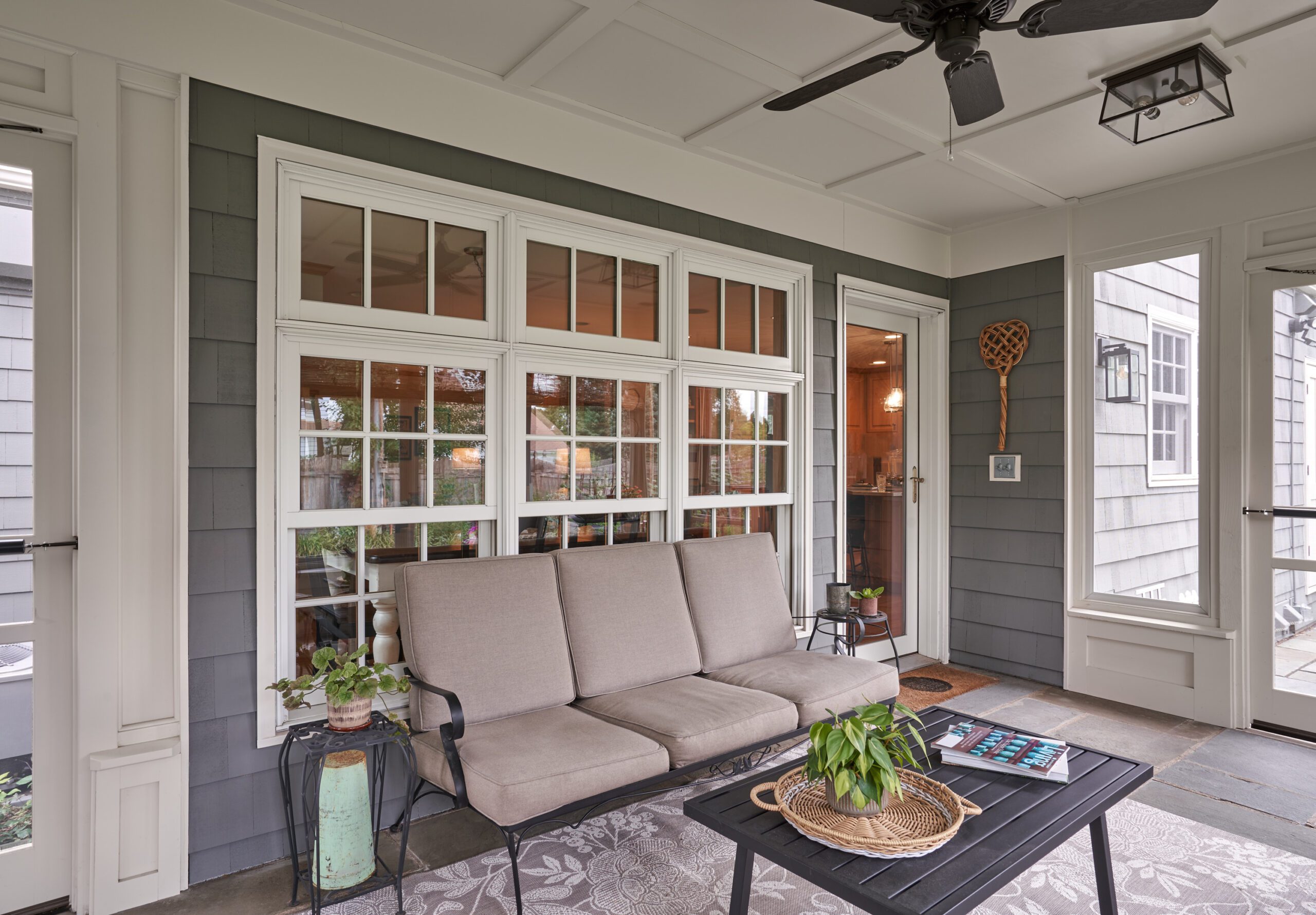
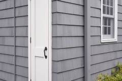
The former back of the house hosted multiple problems including an old pergola that had been tied into an early 1990’s addition on the back of the house and doors and windows with no casing. All of these connections were not waterproofed correctly, allowing moisture behind the siding into the wall structure as well as wicking from window to siding. When the pergola members and various areas of siding were removed, we found rot in several locations that needed to be repaired.
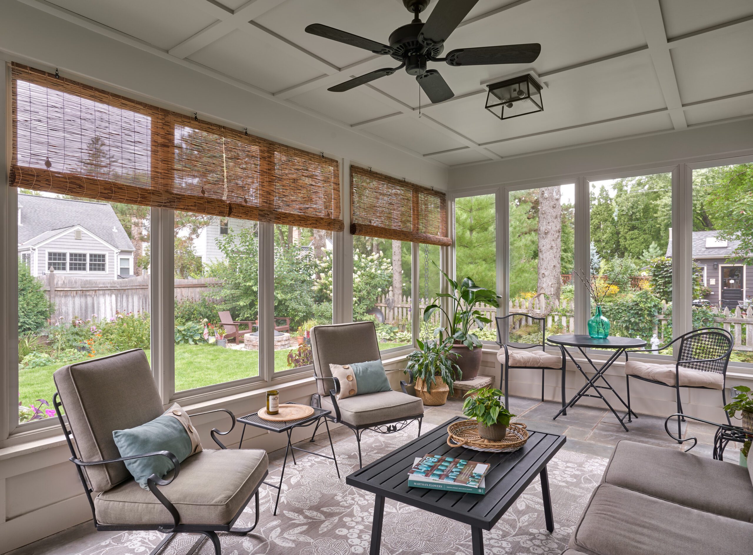
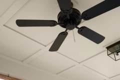
The former addition was topped by an extensive flat roof that would require any new roof for the porch to adjoin at a slightly lower level for proper drainage. A paneled ceiling that coordinates with the needed framing structure of the walls balances out the interior space and hosts decorative ceiling light fixtures and a central fan to circulate air
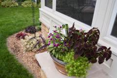
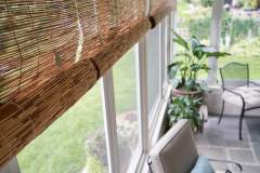
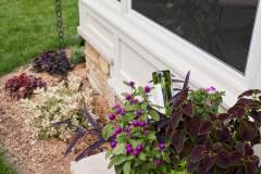
The final space is beautiful inside and out. The vestige column plinths are repurposed as perfect pedestals for potted plants and the porch ties seamlessly into its classic Colonial surroundings. On the inside, the feeling is relaxing and inviting. With views of the entire backyard, it has become a favorite place to take in the beauty of nature without having to suffer the elements – equally delightful rain or shine, day or night. This porch is exactly what our clients hoped for – a space for gathering or retreat, a place that transitions from interior to exterior naturally and beautifully.
Client Needs
• Covered space
• Screened porch
• Re-use terrace
• Space for retreat and gatherings
• Enough space for multiple occupants
• Views to backyard and beyond
• Light & airy, bright & clean
Aesthetic
• Clean and classic
• Incorporate limestone & bluestone terrace
• Crisp white trim and frieze
• Traditional trim details
• Open & accessible
• Panoramic views of backyard
• Transitional space from inside to outside
Functionality
• Room for seating
• Panoramic light and views
• Simplified circulation routes that maximizes seating
• Connects directly to adjacent patio
• New convenient access to backyard and garage
Craftsmanship
• Paneled lower wall custom fit to existing stone plinths and border
• Plumb and level porch structure built over existing sloped terrace
• Shallow roof system executed to land just below existing flat roof
• All openings created within 1/8” tolerance for custom screen sizes
• Ceiling battens coordinated on site with structure and lighting installation
READY TO GET STARTED?
A better design-build experience awaits. If you’re ready to re-imagine your home,
contact
us today to discover the benefits of an organized, reliable system with
a truly personalized design approach.
- Customized Design |
- Responsive Communication |
- PERSONALIZED APPROACH |
- Expert Results

