Project Details
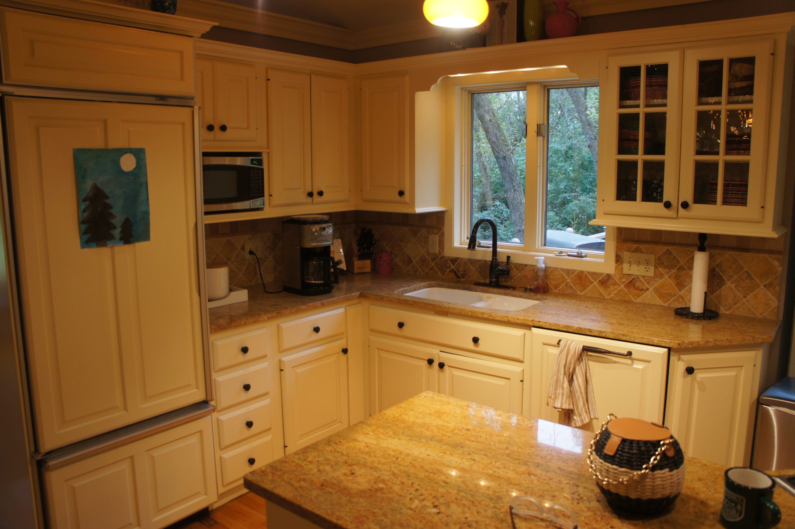
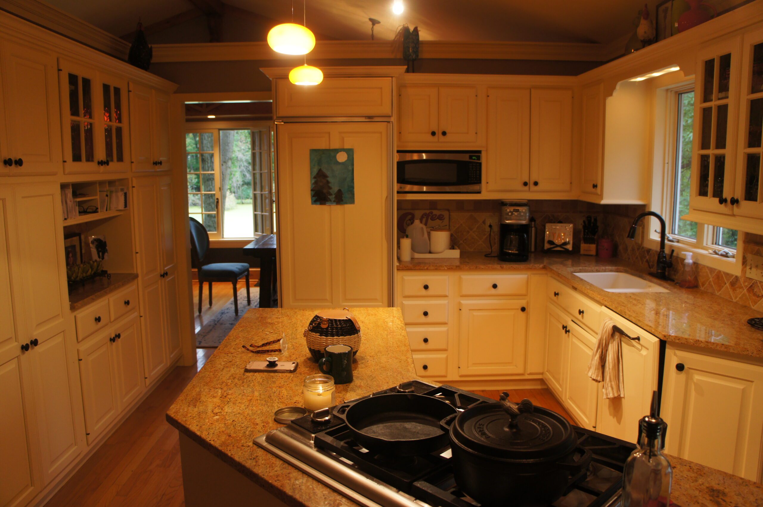
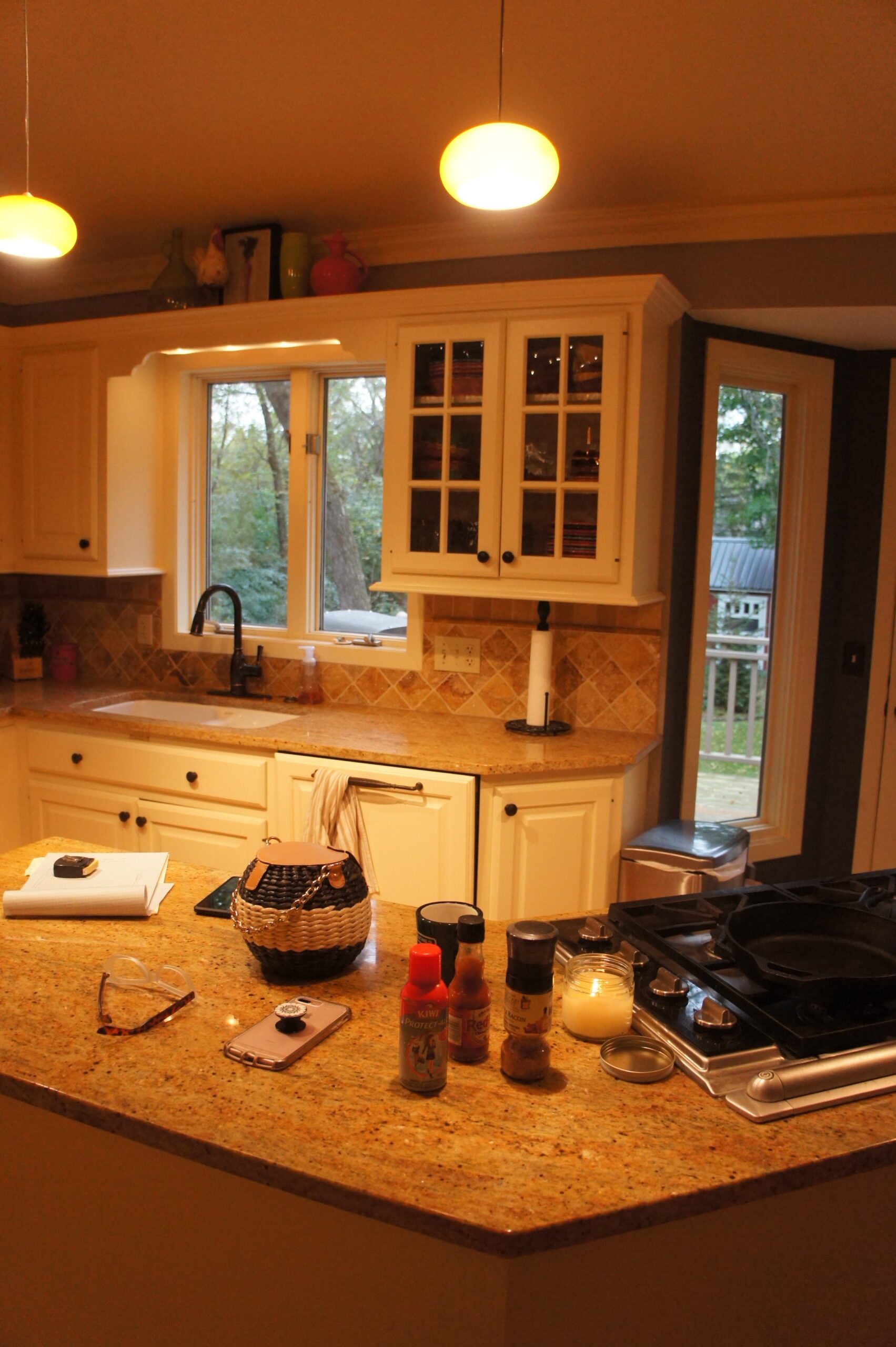
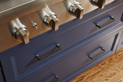
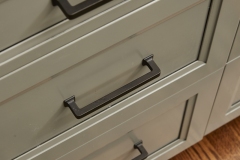
The cramped, isolated kitchen in this 1980’s era home did not fit our clients’ lifestyle nor take advantage of the beautiful views of the nearby pond and woods. They longed for a functional yet fabulous space to support collaborative cooking and family gatherings. A micro-addition facilitated a new layout that both opened to and enlivened their existing living and dining spaces. A bold tri-color palette along with pro-level appliances and impeccable finish detailing gives them everything they desired and more.
Click below to learn more about this Wayzata kitchen remodel.
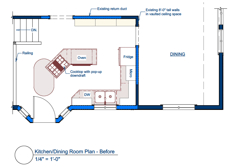
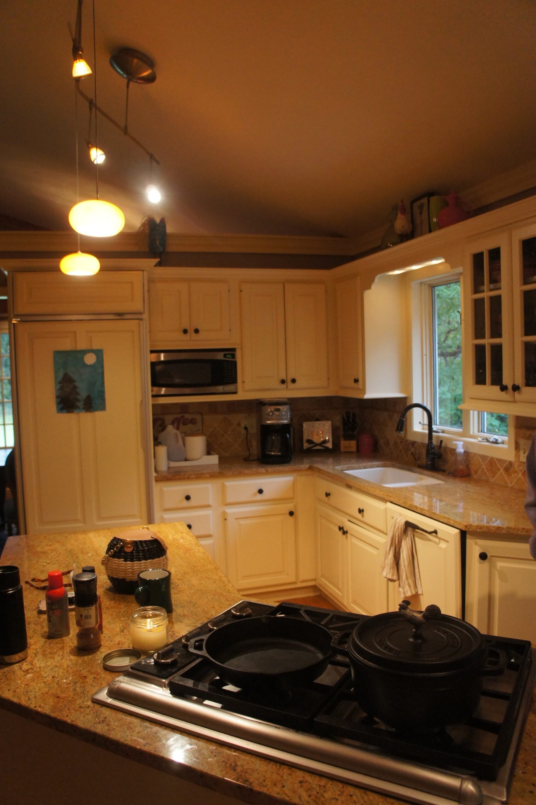
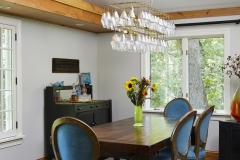
This family had recently relocated and was looking to make a fresh start in their late 80’s split- level, located on a wooded Wayzata cul-de-sac. With multiple beautiful views of the nearby pond and woods, the current kitchen did not take advantage of this secluded tranquil setting. Also, our clients desired to break down the barriers between their separate, deteriorating kitchen and the living and dining spaces which all lived under a single vaulted ceiling. They sought to invite light into the kitchen from all directions and to connect the three spaces into a common gathering space. They longed for a functional yet fabulous kitchen that would support collaborative cooking and family gatherings.
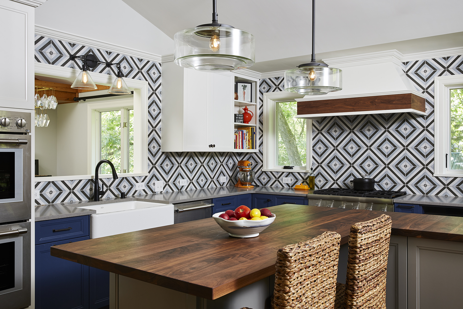
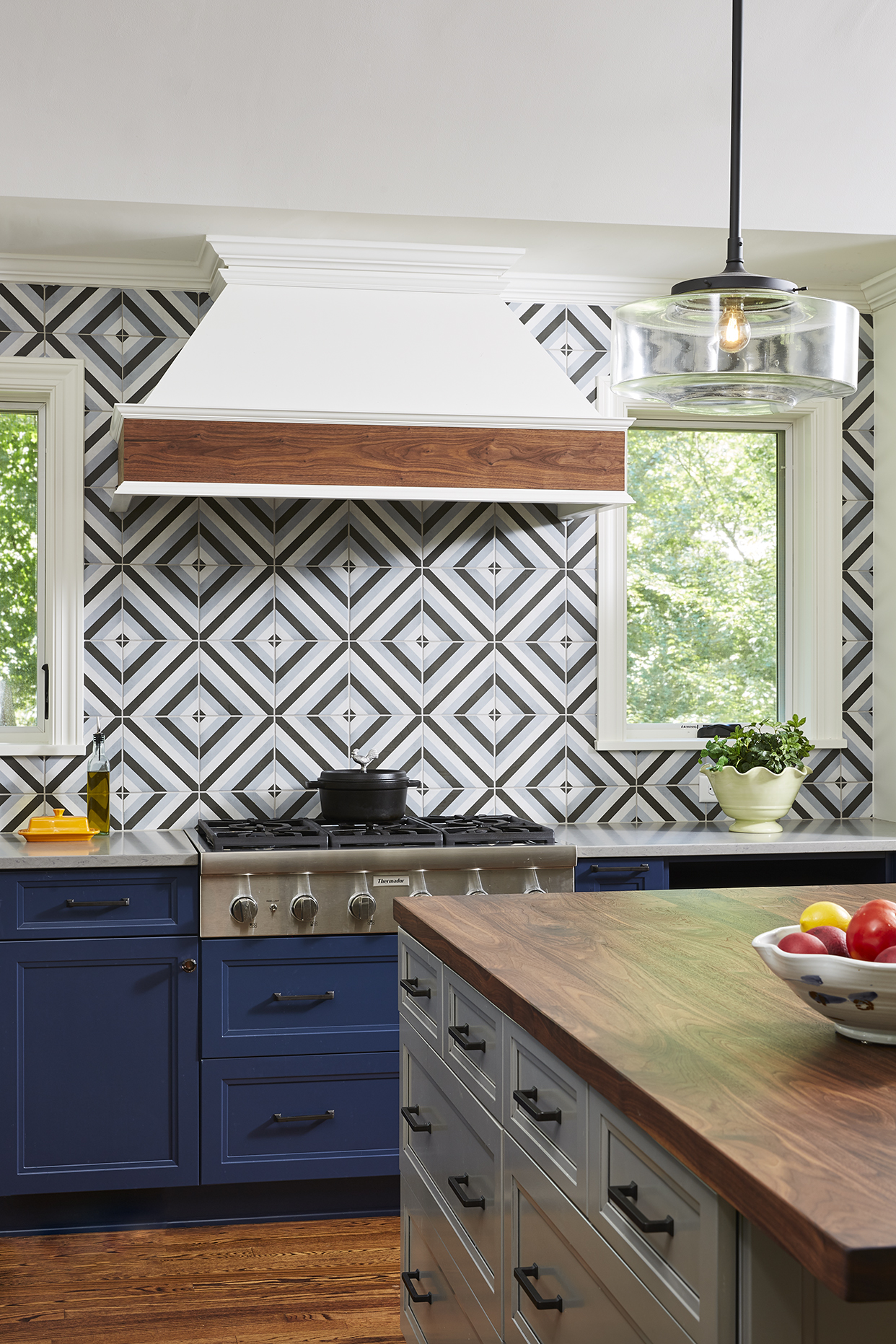
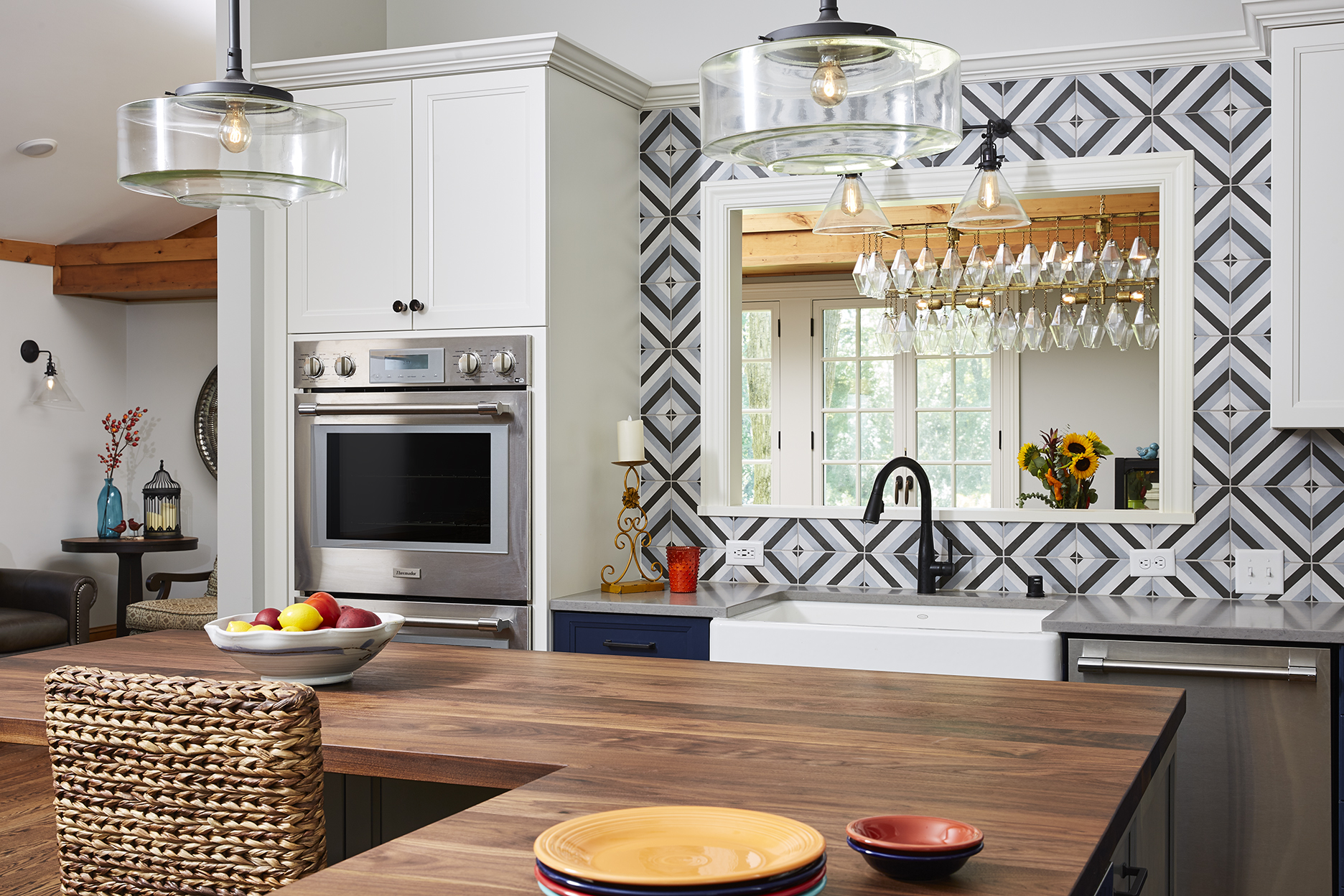
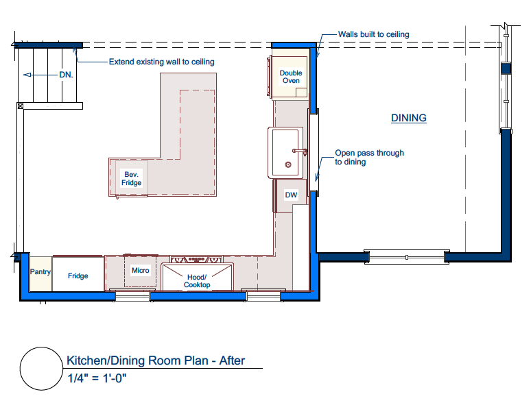
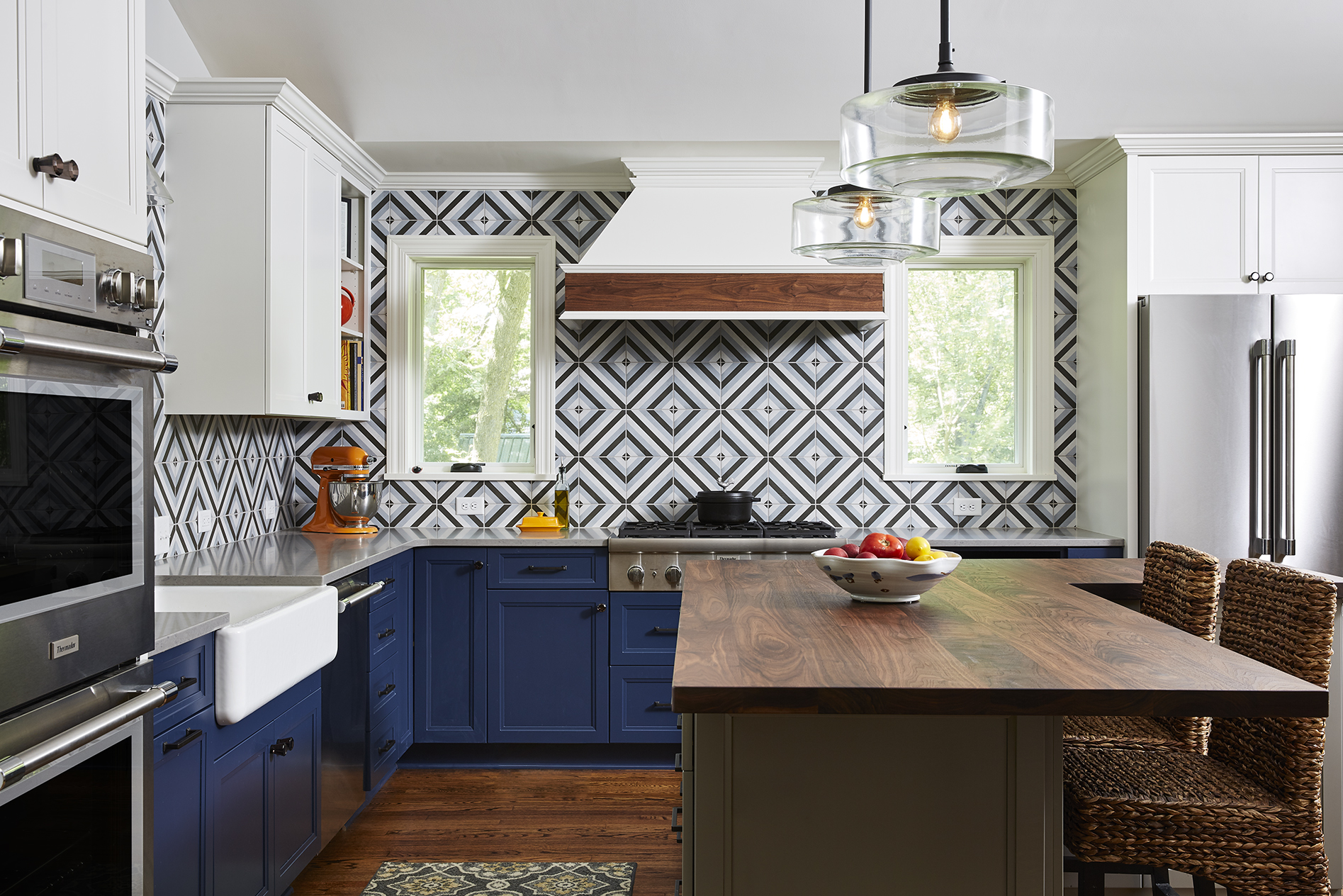
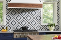
The initial driver of the project was to open the kitchen to the adjacent living and dining areas, along with upgrading failing appliances, and give the spaces an overall palette refresh to better fit the clients’ desired aesthetic. In order to open the kitchen layout, the 8’-high partition walls enclosing it needed to be rethought. Getting rid of both walls would leave the kitchen lacking in both workspace and storage space. The chosen design smartly retains the wall between the kitchen and dining room and now features a large pass-through opening allowing light and view from the living and dining room windows beyond. The final kitchen plan is L-shaped, fully open to the vaulted living room. The wide, full-height opening frames the primary feature wall consisting of the central range hood and balanced flanking windows, which allow light to pour through.
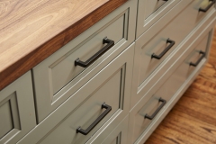
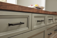
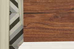
The existing kitchen had a bay with a door leading to the second tier of the deck outside. The deck was succumbing to rot and the clients had plans for a new screened porch off the lower level in the future. So, the bay and upper deck were removed and a micro addition was built in its place running the entire length of the exterior kitchen wall. This addition gave the kitchen enough extra square footage to house all of the major appliances along the outer perimeter and plenty of room for the large L-shaped island while maintaining proper up-down circulation. Topped with a wide-plank walnut top, echoed in the range hood detail nearby, wood accents warm the palette and tie the new kitchen to existing wood details found throughout the home.
Removing the bay did pose some construction challenges. First, upon demolition, both a moisture and mouse infiltration was discovered. Second, the new micro addition required a cantilevered structural solution which required tying in the addition joist back into the kitchen floor framing over 6’. The sub-floor was removed, new joists were sistered onto the existing, and extended out the additional 2’-6” for the addition. Proper framing, sheathing, spray foam insulation and new cement board siding keeps both precipitation and pests outside where they belong.
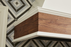
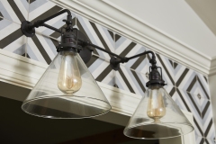
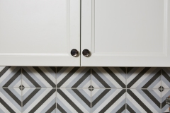
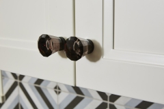
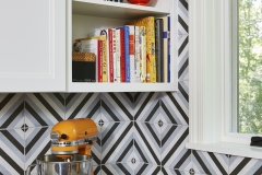
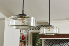
The visual success of this kitchen is completed by the harmonious balance of the multi-color kitchen alongside exacting placement of openings and fixtures with the final tile layout in mind. From framing, to interior selections and then final tile installation – it takes a village to create such precise detail. The pass-through opening and window heights were carefully placed to allow exactly one tile size between them and the counter top. Field adjustments were checked and re-checked to ensure every cut would time out and make sense with the final visual. The diamond tile pattern flows seamlessly from one side to the other meeting to a perfect diamond on the inside corner. A true team effort!The clients could not be more pleased with the final result. They now have a gathering space where two cooks can collaborate and everyone can join in. The style, fixtures, and finishes fit their personalities and lifestyle. They are so happy that they trusted the team to stretch their original vision to create this functional, fun, and fresh space for the whole family to enjoy.
Client Needs
- More cohesive work space
- Good natural light
- Better connection to dining & living area
- Multi-function spaces including eat- in area
- Ample storage
- Views to backyard and beyond
- Updated appliances
- Creative aesthetic
Aesthetic
- Functional but visually fun
- Allow for color pops in décor but not too ‘expected’
- Warm and inviting
- Open and accessible
- Custom cabinetry hood
- Wood details to balance wood accents currently throughout home
Functionality
- Island seating
- Better work triangle
- Better connection to dining and living spaces
- Good circulation for split level
- More natural light
- Goodbye mice
- Upgraded insulation
- Pro style appliances
Craftsmanship
- Cantilevered structure for micro addition
- Carefully placed openings and fixture fittings to allow for seamless tile design
- Custom hood with wood grain wrapped shroud
READY TO GET STARTED?
A better design-build experience awaits. If you’re ready to re-imagine your home,
contact
us today to discover the benefits of an organized, reliable system with
a truly personalized design approach.
- Customized Design |
- Responsive Communication |
- PERSONALIZED APPROACH |
- Expert Results


